Figures & data
Figure 1. Highlights of the FloodRisk plug-in vision.
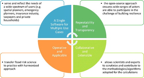
Figure 2. GUI components.
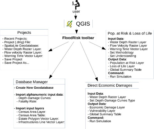
Figure 3. FloodRisk toolbar.
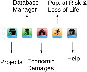
Figure 4. Symbolic scheme of the flood risk assessment framework.
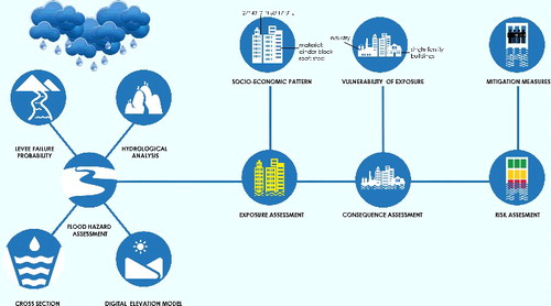
Figure 5. Example of economic damage results: the map shows the damages as a ratio of the total asset value in %, as expressed on the legend, reported in the table of contents (TOC), that uses a colour scale to highlight the degree of damage of the different elements at risk (e.g. dark red represents zones that could be potentially more damaged and, thus, more critical); the graph summarizes, in the form of a histogram, the economic damage for each land-use category. Moreover, all the results data can be visualized and exported in the form of a table (see user manual at https://github.com/FloodRiskGroup/FloodRisk-doc/tree/master/FloodRiskUserManual for more information).
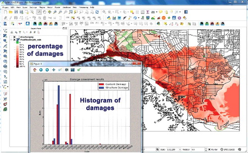
Figure 6. Example of human losses results: the map shows the density of the population at risk in the different areas as inhabitants/km2 as expressed on the legend that uses a colour scale to highlight the degree of population at risk in different areas (e.g. dark red represents the zones in which the flood events could potentially affect more people); the graph summarizes, in the form of a histogram, the estimated loss of life divided on the basis of flood water depth range. Moreover, all the results data can be visualized and exported in the form of a table (see user manual at https://github.com/FloodRiskGroup/FloodRisk-doc/tree/master/FloodRiskUserManual for more information).
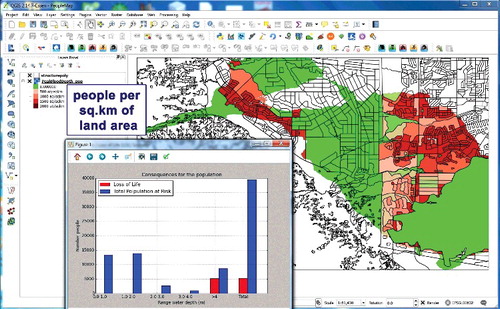
Figure 7. Overall scheme of the urban area downstream of the dam.
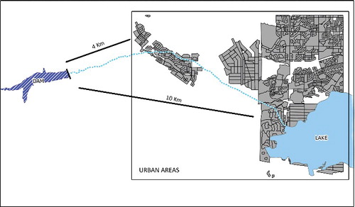
Figure 8. Example of risk information based on comparison of F–N curves for an idealized case study.
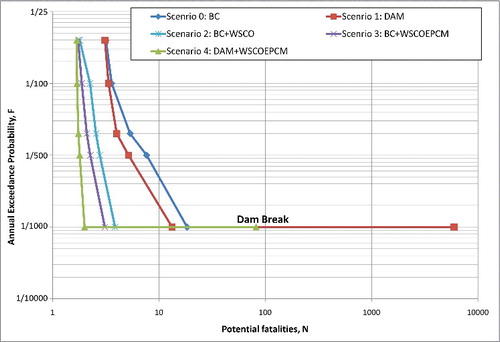
Table 1. Results of the estimation of loss of life (LOL) for the selected case study and the five chosen scenarios.
Table 2. Maximum damage values per damage category (Huizinga Citation2007).
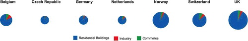
Figure 9. Depth–damage functions and corresponding maximum damage figures for the land-use class called ‘Residential buildings’ in the seven countries with collected literature by Huizinga (Citation2007).
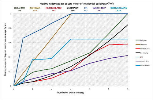
Figure 10. Depth–damage curve visualization through FloodRisk GUI.
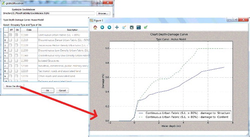
Table 3. Results of model runs for individual land-use classes.
Figure 11. Magnitude of estimated damages computed by different country-specific vulnerability functions, and the corresponding breakdown into individual land-use classes. The corresponding numbers can be found in . Note: damages to roads and agriculture are not displayed because they only play a minor role in total damages estimation.