
Figures & data
Figure 1. Map of GBD showing the aerial view of the study area. The Ganges-Brahmaputra river system is also visible on the map.
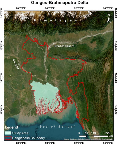
Figure 2. The surface geology map of the study area. The map is collected and modified from the data of USGS's global energy project (Persits et al. Citation2001).
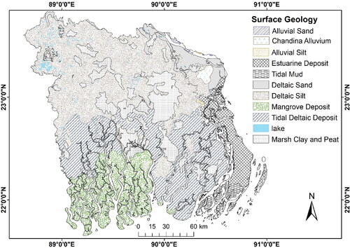
Table 1. The list SAR imagery that were employed for the InSAR analysis and their characteristics. All images are taken in good atmospheric condition.
Figure 3. Map showing the workflow of this study.
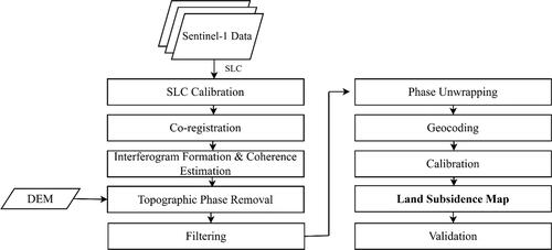
Figure 4. Map showing the rate of land subsidence for only coherent pixels in the study area. The map also displays the locations of the GNSS stations that were utilized for validation. Service layer source: ESRI, Garmin, GEBCO, NOAA, and other contributors.
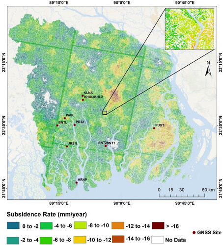
Figure 5. Histogram showing the frequency of the rate of land subsidence experienced by the entire study area. It is visible that the most frequent rate of land subsidence is very close to 6 mm/year.
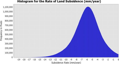
Figure 6. Graph showing the average subsidence rate of different districts in the study area.
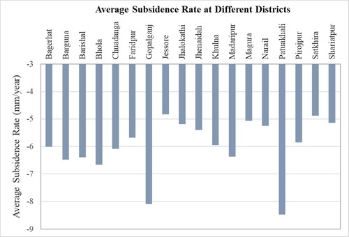
Figure 7. Comparison between the result attained from the InSAR analysis and the GNSS data that are available for the study area.
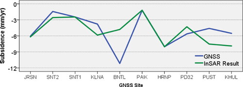
Figure 8. The comparison between the previously measured land subsidence and the InSAR measurement was obtained in this study.
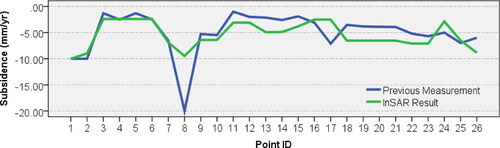
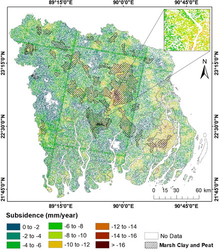
Figure 9. Map showing the rate of land subsidence from 2014 to 2022 in the entire study area. It is very clearly visible that the rate of land subsidence varies significantly in different districts.
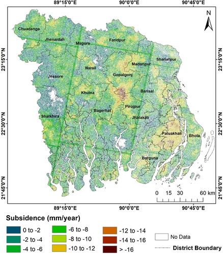
Figure 10. The rate of land subsidence along with the coverage of marsh clay and peat. The black cross lines indicate the marsh clay and peat layer.
Availability of data and materials
The data can be made available upon request to the corresponding author.