
Figures & data
Table 1. Characteristics of Subject Groups in the Non-Trial Cohort
Table 2. Top 20 Virulence Factors on FDR-Adjusted Kruskal–Wallis Comparisons
Table 3. MAAslin2 Analysis of Hospitalizations and death in patients without infections
Table 4. Hospitalizations and Death according to Virulence Factor patterns using MaAsLin2 including those with infections
Figure 1. Schema of both studies A) Non-trial cohort. B)FMT trial
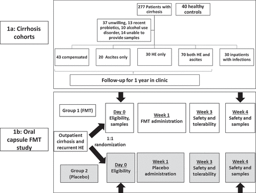
Figure 2. Comparison between healthy controls (n = 40) and all patients with cirrhosis (n = 193). Controls are coded in Orange and cirrhosis in purple A) Kruskal-Wallis comparison of all bacterial species on metagenomics B) DESeq2 comparison of Virulence factors C) Log2fold change on DESeq2 showing the highest virulence factor fold changes in patients with cirrhosis
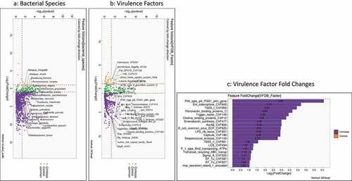
Figure 3. Comparison between compensated and decompensated cirrhosis. Compensated patients are in purple while decompensated patients are in Orange A) Kruskal-Wallis comparison of all bacterial species on metagenomics B) DESeq2 comparison of Virulence factors C) Log2fold change on DESeq2 showing the highest virulence factor fold changes in patients with decompensated cirrhosis
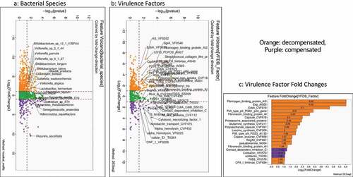
Figure 4. Comparison of metagenomic bacterial species between those who required hospitalizations (n = 65) compared to those who did not (n = 123) at 90 days; five patients had died during index admission in the infected group. A) Unadjusted DESeq2 comparison showing organisms with higher fold abundance in those who got hospitalized (Orange) versus those who did not (purple) B) On multi-variable analysis with clinical variable and virulence factors, VFs that were associated with higher hospitalizations are shown in the Cleveland plot. Blue circles: Adhesion VFs, Green circles: Biofilm VFs, Black circles: Clinical Factors, Orange circles: other VFs
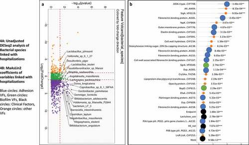
Figure 5. Comparison of metagenomic bacterial species between those died who required hospitalizations (n = 28) compared to those who did not (n = 165) at one year. A) Unadjusted DESeq2 comparison showing organisms with higher fold abundance in those who died (Orange) versus those who did not (purple) B) On multi-variable analysis with clinical variable and virulence factors, VFs that were associated with higher rate of death are shown in the Cleveland plot. Blue circles: Adhesion VFs, Green circles: Biofilm VFs, Black circles: Clinical Factors, Orange circles: other VFs
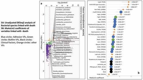
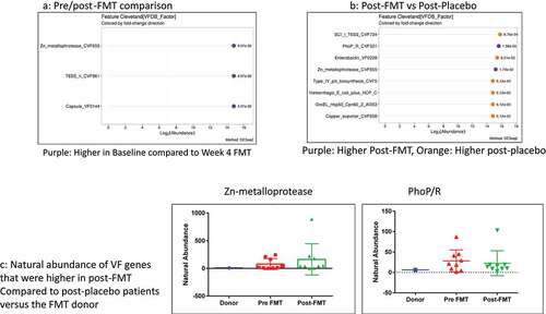
Figure 6. Capsule FMT trial: A) Cleveland plot arranged according to log2 fold abundance and p-values between pre (baseline) and post-FMT with purple: Higher in Baseline compared to Week 4 FMT B) Cleveland plot arranged according to log2 fold abundance and p-values between post-FMT vs post-placebo with Purple: Higher Post-FMT, Orange: Higher post-placebo C) Natural abundance of VF genes that were higher in post-FMT compared to post-placebo patients versus the FMT donor showing that none of these came from the donor
Supplemental Material
Download Zip (3.7 MB)Data availability Statement
Due to individual consent restrictions at VA Medical Centers, metadata cannot be shared. We will upload de-identified sequencing data to a public registry after acceptance and make the SRA IDs available.