Figures & data
Table 1. Participants’ demographics and nutritional parameters obtained after analysis of the food registry and GPAQ questionnaires.
Figure 1. (a) Patient similarity network constructed from Aitchison distance and volunteers’ clusters, (b) Proportion of pictures provided to each photovoice category by participants belonging to each cluster.
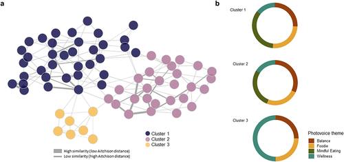
Table 2. Participants’ demographics, lifestyle parameters and microbiome-knowledge results obtained after analysis of the food registry, GPAQ and ad-hoc microbiome-knowledge questionnaires according to the three clusters identified with patient similarity network.
Figure 2. (a) Co-occurrence networks of the microbiome of each cluster of patients. (b) Alfa diversity indexes per cluster (c) Relative abundance of the top 20 genera according to each cluster.
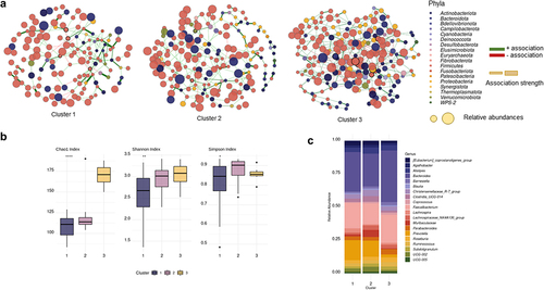
Table 3. Network topological properties of microbial co-occurrence networks from each cluster.
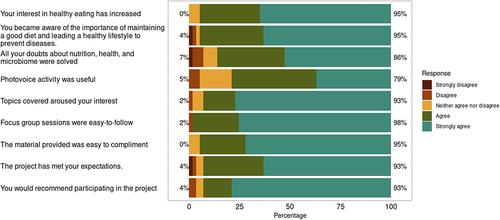
Figure 3. Results of the satisfaction and learning questionnaire presented on a Likert scale from 1 (strongly disagree) to 5 (strongly agree).