
Figures & data
Figure 1. Derivation of organoid lines from a cohort of healthy individuals.
(a) Organoids derived from small intestinal biopsies (scale bar: 100 µm). (b) Principal component analysis (PCA) of data from RNAseq analysis of organoids (squares) derived from the small intestine (red squares N = 45) and colon (blue squares; N = 4 donors in quadruplicate), small intestinal biopsies (circles; N = 54), and the Caco-2 cell line (triangles N = 8). PC 1 and 2 are shown on X and Y axes, and percent variance is indicated. (c) PCA of data from RNAseq analysis of organoids derived from the small intestine (red filled circles: jejunum, N = 22; red stroke circles: duodenum, N = 23) and the colon only (blue N = 4 donors in quadruplicate: donors are indicated by shape). X and Y axes show PC 1 and 2, and percent variance is indicated.
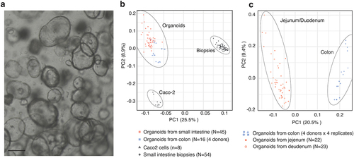
Figure 2. Characterization of impact of media composition on organoid cultures.
(a) Representative images of organoids cultured according to Sato et al., 2011 (Sato medium) or using IntesticultTM medium with insert showing the morphology of organoids grown under different conditions. (b) The top five Gene Ontology terms enriched in genes upregulated in each media type (indicated by color). X axis shows enrichment by associated-log10 (adjusted P value). Rows show ontology terms – for full lists see Table S1. (c) Venn diagram shows the overlap of an established a stem cell signature consisting of 326 genes (white circle,24) with the 994 uniquely annotated genes upregulated in Sato medium (yellow circle) and the 600 uniquely annotated genes upregulated in IntesticultTM medium (orange circle). P value is from a hypergeometric test for the larger overlap (56 genes).
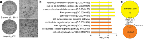
Figure 3. Development and characterization of a 2D model for primary intestinal epithelial cells.
(a-c) Detection of tight junction marker, ZO1 (red), F-actin with phalloidin (green), and nuclei, DAPI (blue) (a), enterocyte marker, ALDOB (red), and nuclei, DAPI (blue) (b) and goblet cell marker, MUC13 (red), and nuclei, DAPI (blue) (c) in confluent layers of intestinal epithelial cells. Scale bar 25 µm. Insert in (a) shows a Z-section of the cell layer with clear localization of ZO1 and F-actin at the apical surface. Scale bar 10 µm. (d) Left: Primary epithelial cells seeded in 2D form a confluent layer within 7 days from seeding. Right: MA-plot based on RNA-seq analysis of 2D vs 3D cells. Y axis shows 2D vs 3D log2FC, and X shows baseline expression in TPM (transcript per million). Color shows the number of genes in each bin. Full list of GO-terms enriched in 2D and 3D cultures in Table S2. (e) Gene set enrichment analysis of the uniquely annotated genes associated with 2D or 3D cultures versus published gene signatures representing enterocyte differentiation, general differentiation in the intestine, proliferation, and stem cells. X axis show observed vs expected overlap based on randomly selected genes. (f,g) UMAP plots of single-cell RNAseq data acquired using the 10× platform. c: Colors show cells cultured in 2D and 3D. d: Colors show nine cell clusters, defined by the Leiden method. (h) Cell distribution between the different clusters from panel j. Bars show a percentage of the entire cell population in the 2D and 3D samples analyzed. (i,j) Relative expression of components of the gene signature analysis for proliferation (i) and the differentiation marker FABP1 (j) represented as violin plots for each cell population identified by the Leiden clustering. (k) Marker expression analysis identifies a number of differentially expressed genes highly enriched in the differentiation cluster associated primarily with the 2D cell cultures. Colors indicate mean expression; dot size indicates fraction of cells in the group.
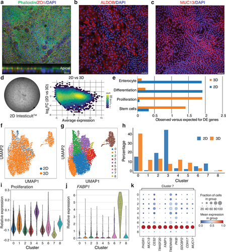
Figure 4. Response to coculture with different microbes.
Principal component analysis (PCA) of RNAseq data from cultures that stimulated with either LGGⓇ, BB-12Ⓡ, or Salmonella typhimurium (indicated by color) across a range of different seeding densities (indicated by point size). X and Y axes show PC1 and 2, variance is indicated at respective PC.
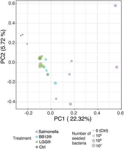
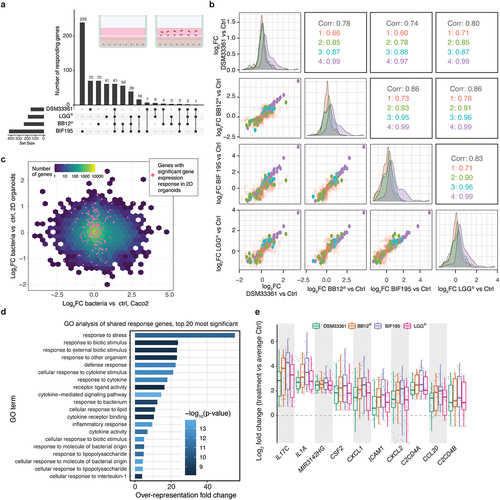
Figure 5. Screening bacteria using 2D model for primary intestinal epithelial cells.
(a) Overlap of differentially expressed genes between bacterial responses from nine individuals, using an UpSet plot visualization. The insert depicts the experimental setup. The upper bar plot shows the number of significantly changing genes (FDR < 0.05; log2FC > 0.5) in a given set, defined by the lower dot chart. Sets are defined by intersections of the four strain treatments (indicated to the left with total number of differentially expressed genes per set). A single dot indicates genes that are only differentially expressed in one treatment compared to control, while dots connected by lines defined intersects between treatments. (b) Pairwise correlations between gene expression change following bacterial exposure of 2D cultures. X and Y axes show the RNA-seq log2FC response (treatment vs control) of a given bacterial treatment. Dots indicate differentially expressed genes from panel a, colored by whether they are differentially expressed in 1, 2, 3 or 4 treatments. Density plots across the diagonal show the overall distribution of each set and treatment combination. Numbers in remaining cells show the overall Spearman correlation (black) using all points of a given treatment comparison, and Spearman correlations of the subsets of genes defined above. (c) Binned correlation plot comparing the mean log2 fold response to all bacterial treatments between Caco-2 cells (x-axis) and primary epithelial cells (y-axis). Hex color shows the number of genes within each hex. Cyan dots show the expression of genes that are differentially expressed in organoids in at least two bacterial strain treatments. Note that these are distributed around 0 log2FC in the Caco-2 comparison. (d) Top 20 GO terms enriched for the differentially expressed genes shared between all treatments. X axis shows over-representation fold change. Bar color corresponds to significance (-log10 FDR). Full list of GO-terms enriched in Table S3. (e) Expression fold change distribution relative to average control expression for the 10 most differentially expressed genes of the shared set upon stimulation with the four types of bacteria. Y axis shows expression fold change, dots indicate individuals, and color indicates treatment. X axis shows gene names.
Supplemental material
Supplemental Material
Download Zip (11 MB)Data availability statement
The expression data from CaCO2 cells stimulated with bacterial isolates are deposited at the NCBI Gene Expression Omnibus (GEO) under accession number GSE231605. https://www.ncbi.nlm.nih.gov/geo/query/acc.cgi?acc=GSE231605