Figures & data
Figure 1. Violin plots of the transformed relative abundances of the base case bacterial families per group (genera in S4 Fig. and families outside the base case criterium in S7 Fig.). In blue the healthy controls, in green the RR group, and in red the RE group, all visualized per timepoint (V1 = visit 1 and V2 = visit 2). Patients in the RE group are in remission during the first visit and experience an exacerbation during the second visit. The 50% quantile is shown with a black horizontal line.
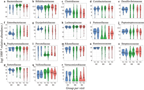
Figure 2. Examples of quantile regression profile plots for the families: Coriobacteriaceae (a), Erysipelotrichaceae (b), Pasteurellaceae (c), Ruminococcaceae (d), Streptococcaceae (e), and Sutterellaceae (f). The various dots represent sample estimates (y axis) of differences in relative abundance compared to healthy controls across the 10th to the 90th percent quantile (x axis). Differences at baseline (visit 1) are visualized in light green (RR) and red (RE), while the interaction with visit number (in dark green and orange) displays difference in changes over time. The dotted line at zero indicates no difference compared to healthy controls. When the points are above the dotted line there is a positive effect of disease group on relative abundance, whereas points below the dotted line imply a negative effect of disease group on relative abundance at that particular quantile. Significant variables (P-value <0.05) are indicated with a closed circle.
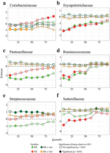
Figure 3. Heatmap of quantile regression estimates per quantile of relative abundance for base case families (other families outside the base case criterium in S8 Fig. and S9 Fig.) and common variables. The model included all groups, i.e. healthy control (HC), remission-remission (RR), and remission-exacerbation (RE), with healthy controls as reference group. The red boxes indicate negative regression estimates, the green boxes indicate positive regression estimates, and the empty boxes are the variables that were not selected during variable selection. Significant variables (P-value <0.05) are indicated with an asterisk (“*”), results adjusted with the BH procedure are given in S2 Fig.
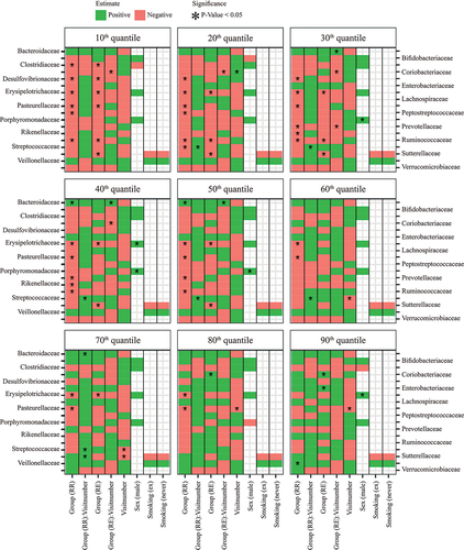
Figure 4. Heatmap of quantile regression estimates per quantile of relative abundance for base case families for CD patients only, with correction for clinical variables. The red boxes indicate negative regression estimates, the green boxes indicate positive regression estimates, and the empty boxes are the variables that were not selected during variable selection. Significant variables (P-value <0.05) are indicated with an asterisk (“*”), results adjusted with the BH procedure are given in S11 Fig.
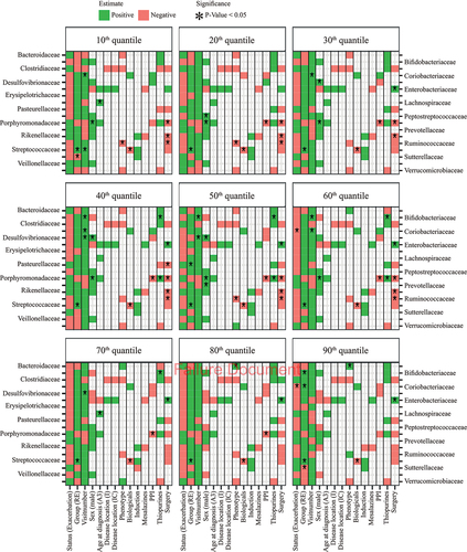
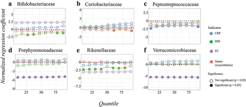
Figure 5. Quantile regression profile plots obtained for the different disease activity indicators with correction for clinical variables for the families: Bifidobacteriaceae (a), Coriobacteriaceae (b), Peptostreptococcaceae (c), Porphyromonadaceae (d), Rikenellaceae (e), and Verrucomicrobiaceae (f). Only families with significant findings are given, the other families are in S16 Fig. The dotted line at zero indicates no difference compared to healthy controls. When the points are above the dotted line there is a positive effect of disease group on relative abundance, whereas points below the dotted line imply a negative effect of disease group on relative abundance at that particular quantile. The regression estimates for status, HBI, CRP, and FC were estimated in different models, therefore the data was normalized beforehand to make the regression coefficients comparable. On this purpose, the values for HBI, CRP, and FC were divided by the difference between the 5th and 95th percentiles. Significant variables (P-value <0.05) are indicated with a closed circle, results adjusted with the BH procedure are given in S17 Fig.