
Figures & data
Figure 1. Heatmap showing all the classes of antibiotics per country (we only display here logarithmic mean ARG abundance higher than 30 cpm). Columns in the heatmap represent countries while rows represent antibiotic classes with top row annotation showing continents. Some of the antibiotic classes are abbreviated in the heatmap and are as follows: AMG = “aminoglycoside”, TET = “tetracycline”, RIF = “rifampin”, FQ = “fluoroquinolone”, DAA = “disinfecting agents and antiseptics”, DAP = “diaminopyrimidine”, SN = “sulfonamide” and AMC = “aminocoumarin”.
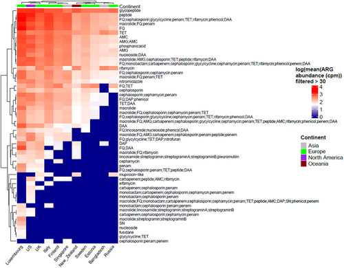
Figure 2. (a) Box plots showing alpha diversity of cpm normalized antibiotic resistance classes relative abundance using Shannon index. (b) Heatmap showing adjusted p-values based on alpha diversity pairwise comparisons between countries.
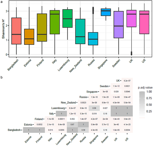
Figure 3. World map showing the top 5 antibiotic resistance classes per country while the remaining classes are represented as “others” in the pie charts for each country. The abundance depicted is normalized to cpm. The radius of each pie corresponds to the (ARG)1/4 of the total mean ARG abundance per country. Based on the total ARG abundance per country, we have assigned ranks to the countries (number denoted in parentheses) with rank 1 meaning highest total ARG abundance and rank 11 meaning lowest.
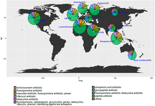
Figure 4. (a) Bar plot representing top 20 species that carry highest ARG abundance globally in infants under 3 years of age using mean of cpm normalized abundance per MAG grouped by species and with the rest of the species represented as “others”. Top 5 species carrying highest ARG abundance per country using (b) cpm normalized data and (c) raw abundance data (i.e., number of ARGs per MAG).
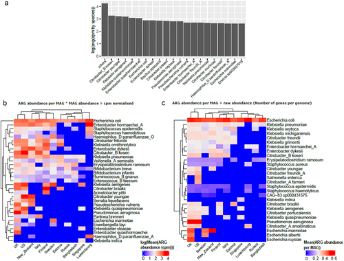
Figure 5. Bar plot displays the average top 5 ARG in cpm for each country along with the proportion contribution of the top 1 bacteria. Rest of the species are denoted as “others”. The abbreviations used for ARG classes are as follows: MDR1 = “FQ; cephalosporin; glycylcycline; penam; TET; rifamycin; phenicol; disinfectingagentsandantiseptics”; TET = “Tetracycline”; AMC = “aminocoumarin” and FQ = “fluoroquinolone”.
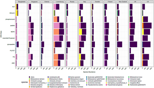
Figure 6. (a) Plot showing exponential decay curve demonstrating the relation between ARG abundance in cpm and age shown as time in days (pseudo R-squared = 0.75, AIC = 8392.51). Gray area denote confidence intervals. (b) Heatmap showing adjusted p-values (adjusted using Bonferroni Hochberg method) obtained from Wilcoxon test comparing time points pairwise, with the formula arg_abundance ~ month with ggpubr package in R. (c) Plot showing association between log transformed ARG abundance normalized to cpm and Healthcare access and quality (HAQ) index (d). Box plot showing relation between log transformed ARG abundance in cpm and socio-economic status of countries. p-value ≤ 0.05; ** p-value ≤ 0.01; *** p-value ≤ 0.001. Significance was determined using the ggpubr package in R using Wilcoxon test.
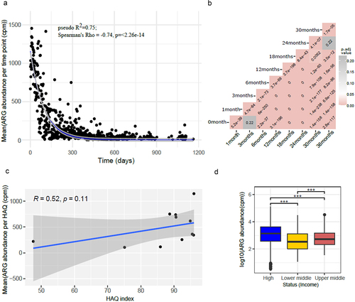
Figure 7. Beta diversity as represented using PCoA computed using Jaccard distances showing grouping by (a) country, (b) for each country, (c) continent, (d) socio-economic status and (e) HAQ index category. All plots show the same PCoA computed with the same distance matrix.
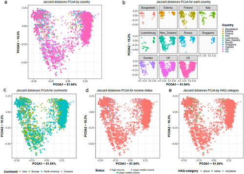
Table 1. Results from PairwiseAdonis test in R showing p-value and p.adjusted values for comparison for beta diversity analysis.
Figure 8. Heatmap showing common antibiotic resistance mechanisms observed in all the countries included in our meta-analysis. The abundance is shown as log of mean of normalized cpm values.
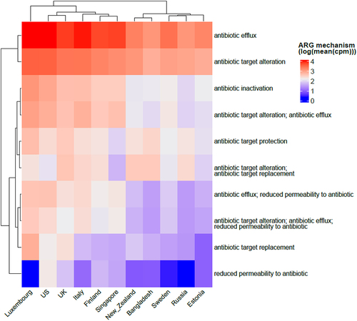
Figure 9. Diagrammatic representation of the study design delineating the inclusion and exclusion criteria for studies included in the meta-analysis. Figure was created using Biorender.
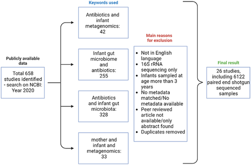
Table 2. Table displays the socio-economic status and Health care access and quality index score for all the countries included in our analysis.
supplementary_figures.docx
Download MS Word (427.4 KB)Data availability statement
No new data were generated as part of this study, and previously published publicly available data were used for the analysis.