
Figures & data
Figure 1. The validation of the mNFE method on a simulation dataset.
(A) The model of an eight-node network, in which the arrow represents positive regulation, and the blunt line represents negative regulation. (B) The curve of the mNFE score based on the gene regulatory network. (C) The landscape of the mNFE scores for eight nodes. (D) The robustness of the mNFE method under different noise strengths.
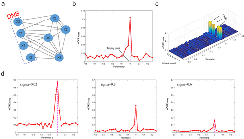
Figure 2. The identification of critical states for seroconversion and T1D based on mNFE at the overall taxonomic level.
(A) Table of mNFE diagnoses and clinical diagnoses for all subjects. (B) Line chart for early-warning signals in all symptomatic subjects. The red curve represents the mNFE scores for two T1D subjects. The green curve represents the mNFE score for nine seroconverters. (C) Line chart for early-warning signals in all asymptomatic subjects. The blue curve represents the mNFE score for 22 non-converters.
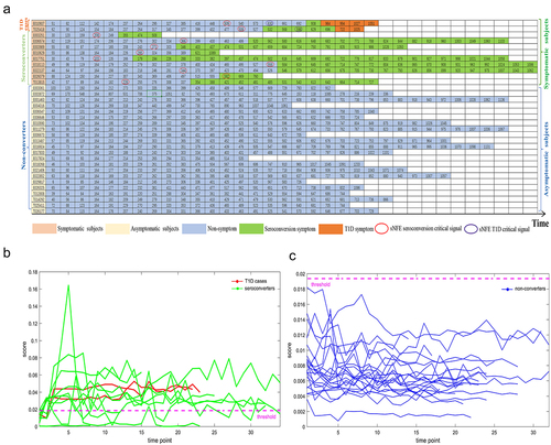
Figure 3. The curves of mNFE scores for all symptomatic subjects based on their respective DNBs at the overall taxonomic level.
(A) The individual mNFE score curves of two T1D subjects based on their respective DNBs. (B) The individual mNFE score curves of nine seroconverters based on their respective DNBs. The yellow circle represents the pre-seroconversion state identified by the mNFE score, and the green square represents the time point of seroconversion onset (clinically observed). The purple circle stands for the tipping point or the critical state identified by the mNFE score, and the blue square denotes the time point of T1D onset (clinically observed).
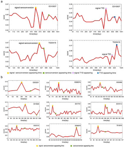
Table 1. Overview of the detection of early-warning signals based on the mNFE at different taxonomic levels.
Figure 4. Diversity analysis and accuracy analysis of mNFE.
(A) Alpha-diversity (Chao index) in three groups at the overall taxonomic level. (B) Alpha-diversity (Chao index) in three groups at the genus level. (C) The alpha-diversity (Chao index) curves of 11 symptomatic individuals. (D) PCA plots comparing three groups for all individuals. (E) Comparison of Bray-Curtis distance difference for T1D individuals in different groups. (F) Comparison of Bray-Curtis distance difference for seroconversion individuals in different groups.
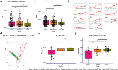
Figure 5. Functional analyses of high-frequency species.
(A) Spearman’s correlations between high-frequency species and clinical metadata. (B) Heatmap of the Spearman’s correlation coefficients between high-frequency species and microbiota pathways. (C) Relative abundance of Eggerthella lenta, Bacteroides fragilis and Leuconostoc mesenteroides. Each species corresponds to a boxplot showing the p-values for the overall differences between the groups obtained from Kruskal-Wallis nonparametric tests, as well as the markers of the differential significance levels obtained from the Dunn’s post hoc tests (* p < .05, **p < .01, ***p < .001).
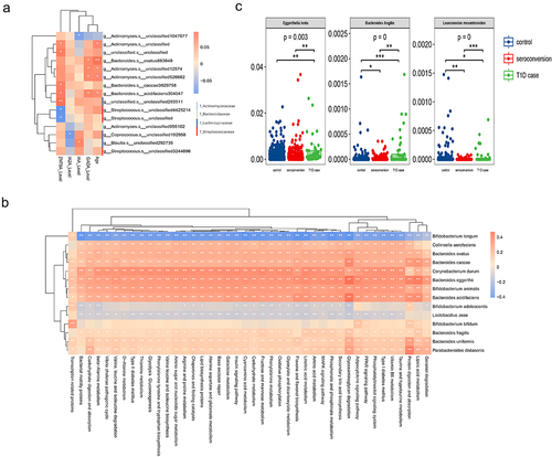
Figure 6. Analysis of the microbiome association network for each group.
(A–C) The dynamic evolution of microbial association network constructed of T1D among three groups, where gray nodes represent unrelated species that are present in the other two groups, blue nodes represent species present in each corresponding group, and red nodes represent identified DNBs. (D–E) Connectivity properties (node number, edge number) of the association network of each group. (F) Fragility of the association network of each group. The y-axis shows the fragility, which means the percentage of remaining nodes in the giant (largest) component, and the x-axis shows the percentage of nodes/vertices removed. The fragility of each network characterizes the robustness. (G–H) Violin chart reflecting the connectivity property of the association network for each group of subjects, including node number and edge number.
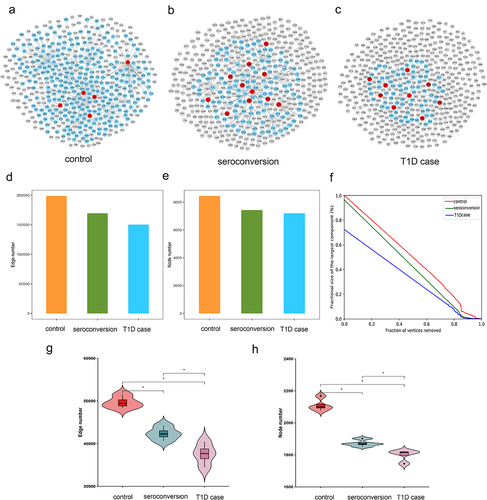
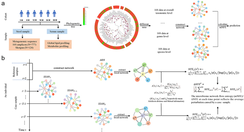
Figure 7. Schematic illustration of detecting the pre-disease state by using the association network based mNFE.
(A) Outline of analytical study flow. This illustrates the number of serum and stool samples collected at each time-point. Based on the collected 16S samples, we construct phylogenetic trees and extract different taxonomic data to construct the network so as to develop the mNFE algorithm. (B) By extracting the local network from the association network of the reference samples (ARN) and sample-specific association network (SSAN), we calculate the joint probability and conditional probability so as to calculate the microbiome network flow entropy (mNFE).
Supplemental material