
Figures & data
Table 1. The ARG panel and resistance spectrum.
Figure 1. Heatmap of ARGs over time.
Each row shows an ARG and each column a timepoint associated with a treatment arm. The color gradient indicates the frequency of each ARG in samples collected at each timepoint in each arm, after scaling row-wise. More intense red colors indicate higher frequencies while more intense blue colors indicate lower frequencies. The treatment arms are FMT vs. placebo. T0: baseline, T1: pre-treatment, T2: 10 days after treatment, T3: 28 days after treatment, T4: long-term (9 months)
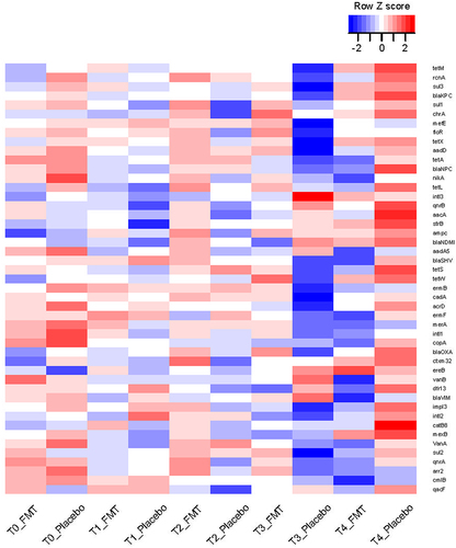
Figure 2. Comparison between the two arms for prevalence of each ARG at each timepoint.
Panel a compares the total number of ARGs between the two arms at each timepoint, using a Wilcoxon test. The horizontal line in each boxplot shows the median. Panels b-f quantify the magnitude of difference in the prevalence of each ARG between the two arms at each timepoint, a chi-squared test was used, followed by false discovery correction of p values for multiple testing. Each panel shows the results for the indicated timepoint (T0 in panel B, T1 in panel C, T2 in panel D, T3 in panel E, and T4 in panel F). Each circle represents an ARG, its color shows the arm in which it was more prevalent, and its size is proportional to the odds ratio (OR) after logarithmic transformation. In each panel, ARGs with levels below the quantification threshold in > 25% of the samples were omitted as long as their frequency of absence between the two groups was not statistically different (p < 0.05). Dashed horizontal lines indicate q = 0.10. Datapoints above this threshold are statistically significant.
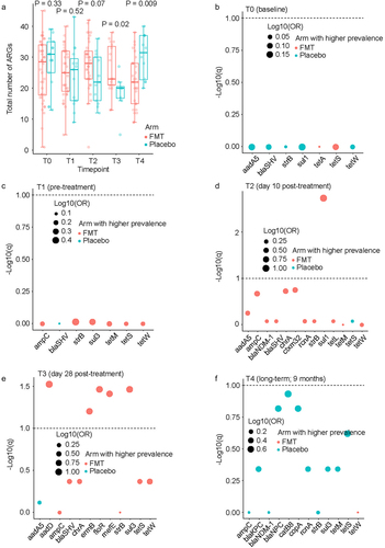
Figure 3. Cross-sectional quantitative comparison between the two arms.
Each panel shows the results for the indicated timepoint (T0 in panel a, T1 in panel b, T2 in panel c, T3 in panel d, and T4 in panel e). Each circle represents an ARG. Data points to the right of the vertical dashed lines indicate ARGs with higher quantity in the FMT arm; those to the left have a higher quantity in the placebo arm. p values were estimated from a Wilcoxon test followed by false discovery correction to derive q values (y axis). The x-axis shows fold change in the quantity of each ARG after logarithmic transformation; the size of each circle is proportional to this value. Dashed horizontal lines indicate q = 0.10. Datapoints above this threshold (shown in magenta) are statistically significant. The size of each circle is proportional to the log (foldchange), the arm with a higher level relative to the arm with the lower level.
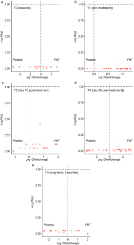
Figure 4. Longitudinal analysis of ARG quantitative levels comparing T1 (pre-dose 1) to subsequent timepoints.
Table 4 shows the results of mixed-effects regression for all ARGs. The model suggested an interaction between treatment arm and timepoint, meaning ARG dynamics may differ between the two arms. Those 5 ARGs are examined individually in this figure. Each panel (a-e) shows the results for one ARG. In each panel, the plot on the left shows the results for the FMT arm, and the right plot shows the results for the placebo arm. Panels a, b, and c compare T3 (day 28 after treatment) to T0 (pre-treatment). Panels d and e compare T2 (day 10 after treatment) to T0. Each comparison is from a mixed-effects model for ARG level without interaction terms, where patient number is the random effect and timepoint is the fixed effect. p values for the regression coefficients representing timepoint (T2 or T3 vs. T1) are shown. The horizontal line within each boxplot shows the median.
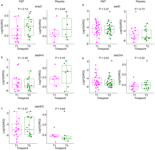
Table 2. Mixed-effects modeling of quantitative ARG levels comparing T1 to subsequent timepoints.
Supplemental material