Figures & data
Figure 1. Definition of eight movement patterns of zebrafish: (a) stop (P1), (b) move-and-stop (P2), (c) stop-and-move (P3), (d) move straight (P4), (e) turn leftward with (P5), (f) turn rightward with
(P6), (g) turn backward to the left with
(P7), and (h) turn backward to the right with
(P8).
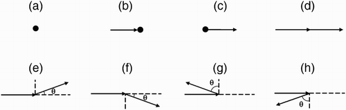
Figure 2. Movement of zebrafish in group in 20 seconds before (a–c) and after (d–f) the treatment. Different individuals are marked by different colors with starting arrow and ending circle.
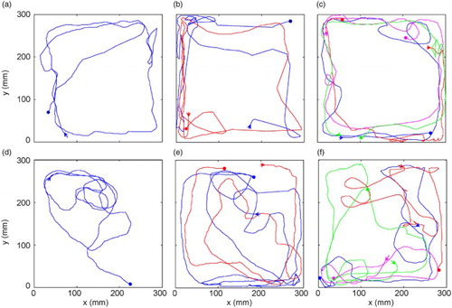
Figure 3. The probability distributions of linear speed of zebrafish before and after treatment in groups (a) G1, (b) G2, and (c) G4) and average linear speeds (d). The alphabets in (d) indicate statistical significances between groups according to Tukey's test (). The symbol (**) show statistical significances between before and after treatment according to the paired-sample t-test (
).
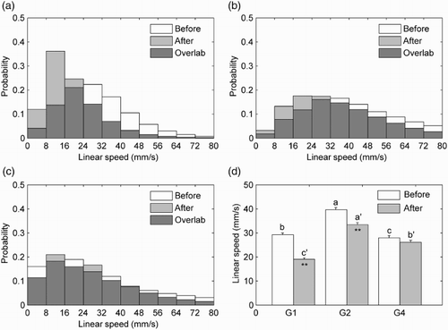
Figure 4. The probability distributions of angular velocity before and after treatment in groups (a) G1, (b) G2, and (c) G4) and the averages of the absolute value of angular velocity (d) (n = 20). The alphabets and symbol are the same as indicated in .
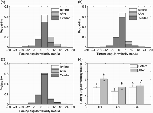
Figure 5. The inter-distances between two individuals in G2 (a), randomly selected from G4 (b), and average of all combinations in G4 (c) before and after treatment.
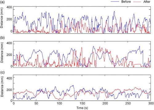
Figure 6. Average inter-distances (a) and autocorrelation in G2 (b), randomly selected in G4 (c) and averages of all combinations in G4 (d) before and after treatment.
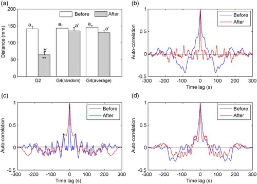
Figure 7. Zero-value time-lag (a–c) and peak-value time-lag (d–f) in G2, G4 with random selection and average of all combinations before and after treatment.
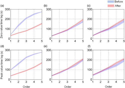
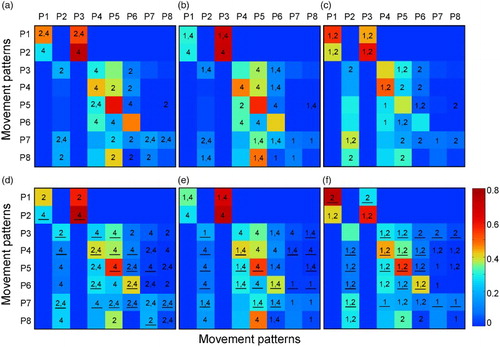
Figure 8. TPMs of the movement patterns before ((a) G1, (b) G2 and (c) G3) and after ((d) G1, (e) G2, and (f) G3) treatment. The color bar in the bottom right corner represents probability values. The numbers on checkerboard show statistical differences before and after treatment. The underlines of numbers in (d)–(f) indicate statistical differences between before and after treatment according to the paired sample t-test (p < 0.05).