Figures & data
Table 1 Clinical characteristics of atrophic glossitis patients and healthy individuals
Figure 1. Overall distribution and relative abundance (>1%) of the predominant bacteria at the genus level in oral rinse samples obtained from all participants. (a) Bacteria (b) Fungi
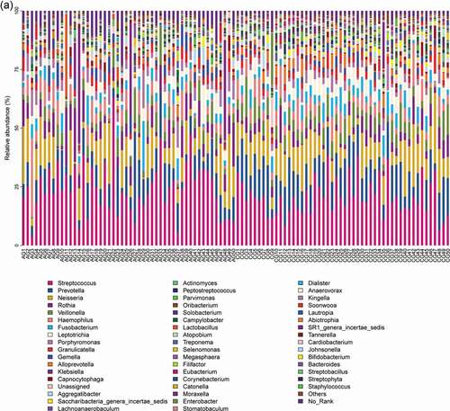
Figure 1. (continued)
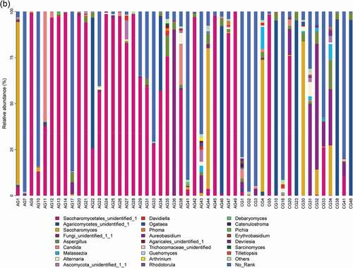
Figure 2. Genus level relative richness comparison of two groups. Mean taxonomic profiles for the main microbiome abundant genera in saliva from the atrophic glossitis group and the control group subjects. (a) Bacteria (b) Fungi
Figure 3. Heatmap shows the relative abundance (>1%) of species isolates (columns) in all samples (rows) and species are clustered accordingly at the genus level, normalized and Z-score transformed. Color gradient from blue to red indicates species abundance from small to large. (a) Bacteria (b) Fungi
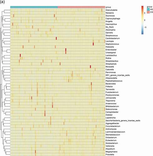
Figure 3. (continued)
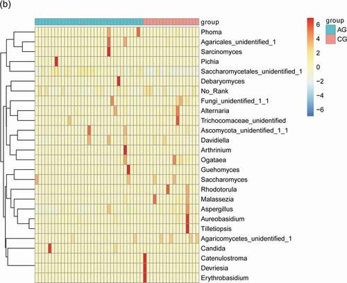
Figure 4. The significant differences species with a box diagram at the genus level among the sample groups, showing species degree of dispersion within the group and their relative abundance between different groups. (a) Bacteria: the box-plot shows 19 significantly different bacterial species. (b) Fungi: the box-plot shows 1 significantly different fungal species
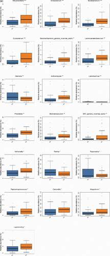
Figure 4. (continued)
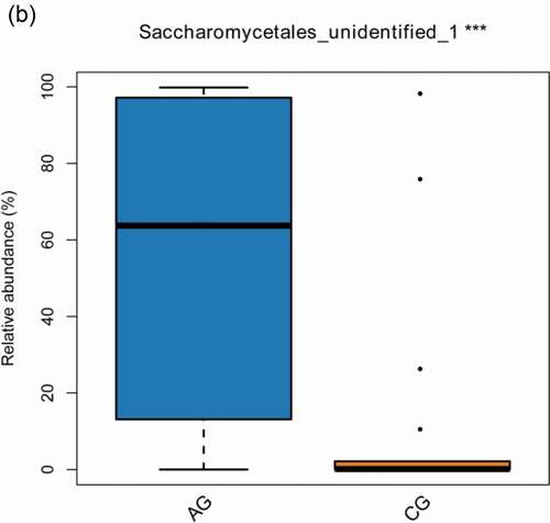
Figure 5. Alpha diversity comparisons in saliva from the atrophic glossitis group and the control group are shown. The Shannon indices revealed lower microbial diversity for saliva in the atrophic glossitis group than the control group. (a) Bacteria: p = 0.001899 (c) Fungi: p = 0.010085. The Chao1 indices revealed no difference in richness among two groups. (b) Bacteria: p > 0.05 (d) Fungi: p > 0.05
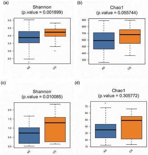
Figure 6. Beta diversity comparisons in the saliva from the atrophic glossitis group and the control group. PCoA of Bray Curtis distance express similarity or difference among two groups and within a group. Each sample is represented by a dot. Visualizing the Bray Curtis distances between samples in a scatterplot where points (representing samples) that are more distant from one another are dissimilar. The approximate proportion (%) of variance explained by each principal coordinate axis is reported in the axis label. (a) Bacteria: Axis1 explained 12.92% of the variation observed, Axis 2 explained 9.14% of the variation. (c) Fungi: Axis1 explained 34.58% of the variation observed, Axis 2 explained 16.72% of the variation. ADONIS tests further reveal that significant differences exist between two groups. (b) Bacteria: p = 1.00e-04. (d) Fungi: p = 1.00e-04
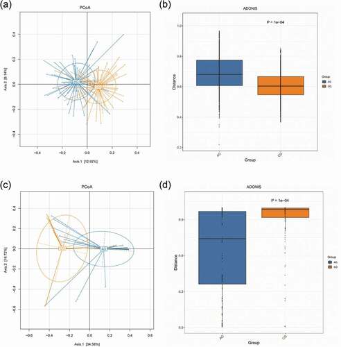
Figure 7. Biomarker analysis defined by LEfSe. Cladogram shows taxonomic representation of significant differences in relative abundance between the atrophic glossitis group and the control group. The significantly different taxa are signified by different color nodes between the atrophic glossitis group (red) and the control group (green). The diameter of the node is proportional to the relative abundance. The colored nodes from the inner to the outer circles represent taxa from the phylum to the genus level. Histogram of LDA scores show significant differences of abundant features among groups. (ab)Bacteria (cd) Fungi
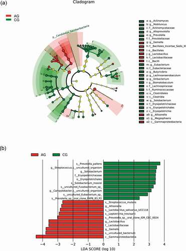
Figure 7. (continued)
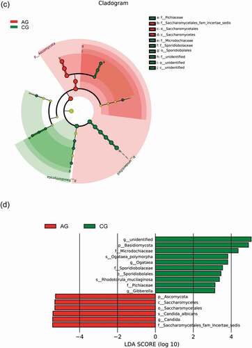
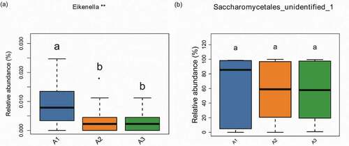
Figure 8. The correlation between the atrophic degree and oral microbiome with a box diagram at the genus level, showing the atrophic degree of some species between different groups and their relative abundance dispersion within the group. A1: slight group (n = 16); A2: moderate group (n = 21); A3:severe group (n = 13). Significantly different groups are indicated with asterisk*. (a) Bacteria (b) Fungi