
Figures & data
Table 1. Visual analytics tasks and use case
Figure 1. Data processing workflow
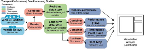
Figure 2. Illustration of features of a long-term performance monitoring dashboard integrating current and continuously collected real-time data
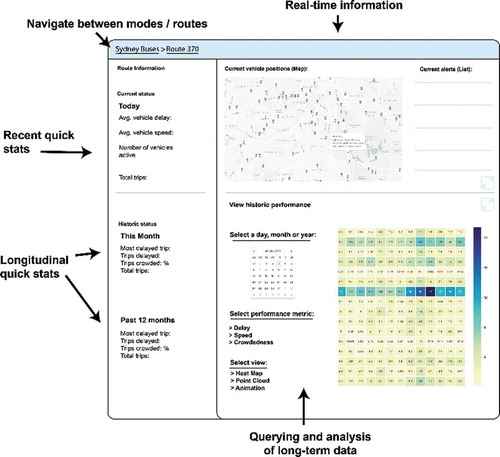
Figure 3. Outline of visualisation methods employed in the work
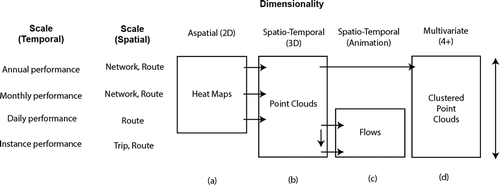
Figure 4. Visualisation concept of PPC
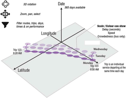
Table 2. Summary of performance variables used for cluster analysis, calculated for every route
Figure 5. Heatmap – Rail delays (defined as per cent of trips delayed 15 minutes at any part of the journey). Additional heatmap example found in Appendix 2,
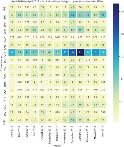
Figure 6. Heatmap – Bus delays overview (defined as per cent of trips delayed 15 minutes or more at any part of the journey)
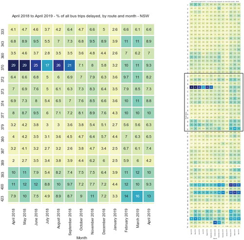
Figure 7. Heatmap – Individual average route delays, detailed daily view for Route 370
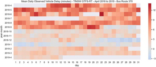
Figure 8. (top-left) Unfiltered performance point cloud – bus route 370 (top-right) Filtered performance point cloud – delayed trips on bus route 370 (bottom) Performance point cloud – annual rail data
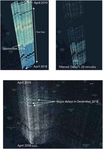
Figure 9. Screenshot of individual day’s rail flow animations developed in DeckGL
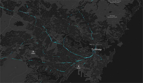
Figure 10. View of clustered point cloud
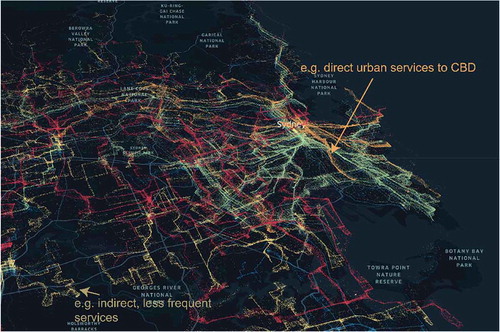
Figure A1. Distribution of delayed trips over 12-month sample – highlighting extreme events
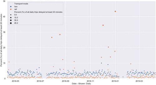
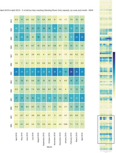
Figure A2. Heat map view – bus crowdedness; Metrobus “M” Routes
Data availability statement
Real-time data used for this study is available as open data through the Transport for NSW open dataportal for future replications. For historically-collected big data sets, the author has published this data as open source through the following reference with documentation. See: Lock, Oliver (2020), “High-volume public transport vehicle locations(rail, bus, ferry and light rail) and performance metrics for Sydney dated from March 2018 to April 2019 (GTFS Real-time)”, Mendeley Data, v1http://dx.doi.org/10.17632/gstfpzg339.1.