Figures & data
Table 1. General characteristics of the seven study sites. More details on the land use classes based on Level 3 CORINE 2006 reported in .
Figure 1. Location of the Autonomous Province of Trento in Italy (left) and of the seven study sites within the Province (right).
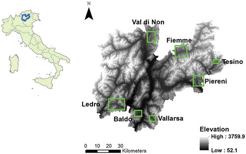
Table 2. Indicators selected for the cultural services.
Table 3. Indicators selected for biodiversity conservation.
Table 4. Overview of the selected ES classified according to the CICES system and their respective indicators.
Figure 2. Illustrative maps of ES and biodiversity indicators for the Baldo study area: P1 – overall market value of foodstuff (left) and B1 – number of fauna focal species (right).
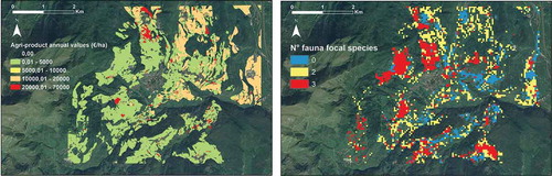
Figure 3. Flower diagrams representing the normalized value of the 10 selected ES and biodiversity indicator for the seven study areas. Individually, each flower diagram allows visualizing the tradeoffs and synergies among ES and biodiversity within a study area; overall, the diagrams allow comparison of the performance of the study areas. Note that the study sites are displayed based on the actual values in €/ha of the indicators of the provisioning services (P1 + P2), representing a good proxy of agricultural land-use intensity. Accordingly, the study areas are divided into three groups of agricultural land-use intensity while also specifying the degree of ‘multifunctionality’, i.e. number of ES and biodiversity indicators exceeding the threshold value of 0.5 (see bottom).
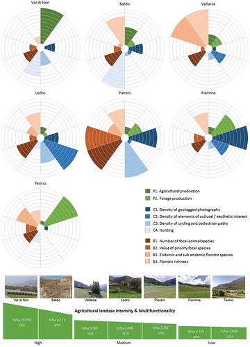
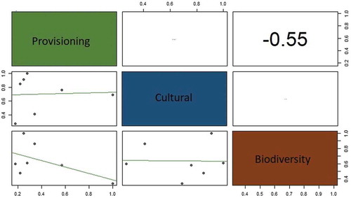
Figure 4. Results of the correlation analysis among the 10 selected ES indicators represented using a so-called ‘Scatterplot matrix’. The matrix contains the correlation values between the indicators expressed in the range ± 1 (upper diagonal) and a graphical representation of the data (in the lower diagonal).
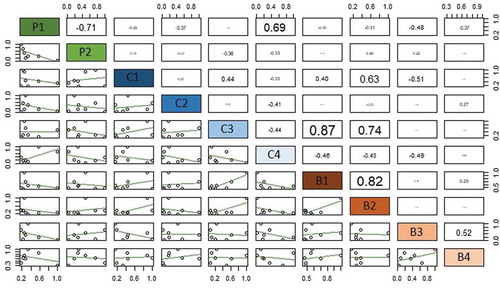
Figure 5. Comparison of the two study areas with respect to individual and aggregated ES indicators. Note how the aggregation of the indicators may hide ES tradeoffs and synergies, ultimately, leading to different decisions.
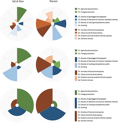
Figure 6. An example of how different aggregation criteria (including both F1 and F2 indictors or only F1) can affect the different results, leading to support different conclusions (e.g. overlooking negative correlation between regulating/maintenance and cultural services).
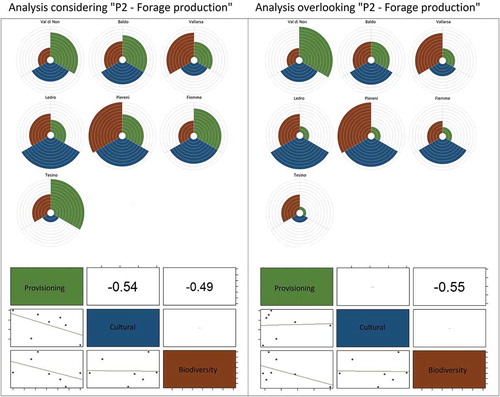
Figure 7. Spatial distribution of hotspots, i.e. areas characterized by high level of ES provision and biodiversity, in the seven study agricultural areas.
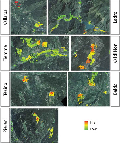
Table A1. Land-use classes in the seven study sites, based on Level 3 CORINE 2006.
Table A2. List of the focal species considered in the index B1 – number of focal animal species. In bold, the priority focal species and their conservation value used in the index B2 – conservation value of priority focal species.
Table A3. Value of the 10 selected ES and biodiversity indicator for the study areas expressed in their respective units.
Table A4. Normalized value of the 10 selected ES and biodiversity indicator for the seven study areas.
Table A5. Average normalized values of the ES and biodiversity indicators aggregated into six categories.
Table A6. Average normalized values of the ES and biodiversity indicators aggregated into three categories.
Figure A1. Flower diagrams representing the normalized value of the 6 aggregated ES and biodiversity indicator for the seven study areas. Individually, each flower diagram allows visualizing the tradeoffs and synergies among ES and biodiversity within a study area; overall, the diagrams allow comparison of the performance of the study areas. Note that the study sites are displayed based on their value of agricultural land-use intensity (i.e. P1 + P2 expressed in €/ha). Accordingly, the study areas are divided into three groups of agricultural land-use intensity, specifying the degree of multifunctionality, i.e. number of ES and biodiversity indicators that exceed the threshold value of 0.5 (see bottom).
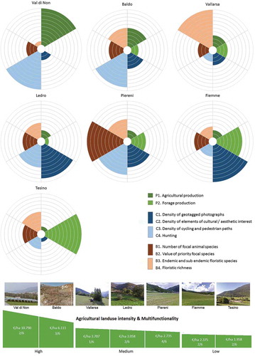
Figure A2. Results of the correlation analysis among the six aggregated ES and biodiversity indicators.
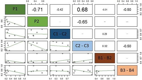
Figure A3. Flower diagrams representing the normalized value of the three aggregated ES and biodiversity indicator for the seven study areas, considering both food and forage production (P1 & P2). Singularly, each flower diagram allows visualizing the tradeoffs and synergies among ES and biodiversity within a study area; overall, the diagrams allow comparison of the performance of the study areas. Note that the study sites are displayed based on their value of agricultural land-use intensity (i.e. P1 + P2 expressed in €/ha). Accordingly, the study areas are divided into three groups of agricultural land-use intensity, specifying the degree of multifunctionality, i.e. number of ES and biodiversity indicators that exceed the threshold value of 0.5.
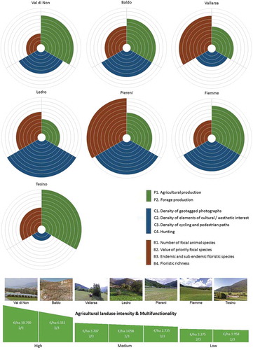
Figure A4. Results of the correlation analysis among the three aggregated indicators, considering both P1 Cultivated crops and P2 Forage production.
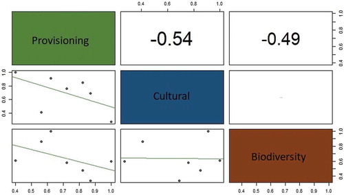
Figure A5. Flower diagrams representing the normalized value of the three aggregated ES and biodiversity indicator for the seven study areas, overlooking forage production (P2). Singularly, each flower diagram allows visualizing the tradeoffs and synergies among ES and biodiversity within a study area; overall, the diagrams allow comparison of the performance of the study areas. Note that the study sites are displayed based on their value of agricultural land-use intensity (i.e. P1 + P2 expressed in €/ha). Accordingly, the study areas are divided into three groups of agricultural land-use intensity, specifying the degree of multifunctionality, i.e. number of ES and biodiversity indicators that exceed the threshold value of 0.5.
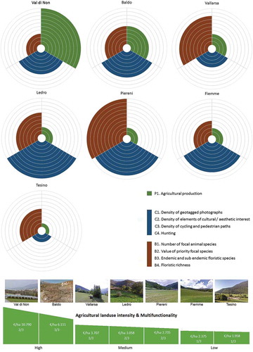
Figure A6. Results of the correlation analysis among the three aggregated indicators, considering only P1 Cultivated crops and overlooking P2 Forage production.