Figures & data
Table 1. Differentially expressed genes after bariatric surgery
Figure 1. Box plots of the gene expression data before and after normalization. (a) Standardization of GSE29409, (b) standardization of GSE59034. The x-axis label represents the sample symbol and the y-axis label represents the gene expression values. The black line in the box plot represents the median value of gene expression. The blue bar represents the data before normalization, and the red bar represents the data after normalization
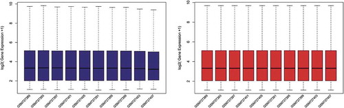
Figure 2. Volcano plots of differentially expressed genes. (a) GSE29409, (b) GSE59034. Data points in red represent up-regulated, and green represent down-regulated genes. The differences are set as |log FC|>1
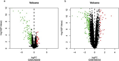
Figure 3. Heatmap of differentially expressed genes identified in (a) GSE29409, (b) GSE59034. Legend on the top right indicates the log fold change of the genes
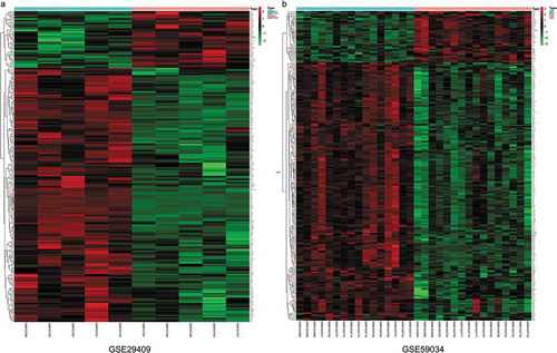
Figure 4. Venn diagram of common differentially expressed genes from the two datasets. (a) 1 DEG was up-regulated in the two datasets, (b) 2 DEGs was down-regulated in the two datasets
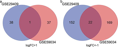
Figure 5. Gene Ontology (GO) enrichment analysis of differentially expressed genes (DEGs). (a) Advanced bubble chart shows GO enrichment significance items of DEGs in three functional groups: molecular function (MF), biological processes (BP), and cell composition (CC). The x-axis label represents the gene ratio, and the y-axis label represents GO terms. (b) Chord plot shows the distribution of DEGs in different GO-enriched functions. Symbols of DEG are presented on the left side of the graph with their fold change values mapped by colour scale. Gene involvement in the GO terms was determined by coloured connecting lines. (c) Cluego network diagram shows the relationship between the DEGs and GO terms
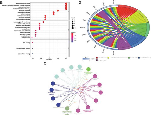
Figure 6. Kyoto Encyclopaedia of Genes and Genomes (KEGG) pathway analysis of differentially expressed genes (DEGs). (a) Advanced bubble chart shows enrichment of DEGs in signalling pathways. The x-axis label represents the gene ratio and the y-axis label represents pathway. (b) Chord plot shows the distribution of DEGs in different KEGG pathways. Symbols of DEG are presented on the left side of the graph with their fold change values mapped by colour scale. Gene involvement in the KEGG pathways was determined by coloured connecting lines. (c) Cluego network diagram shows the relationship between the DEGs and KEGG pathways
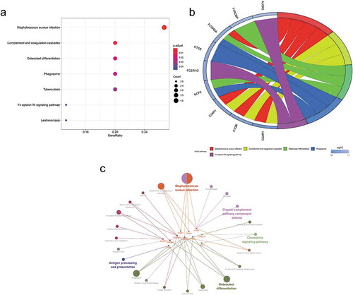
Figure 7. GSEA plots showing the most enriched gene sets of all detected genes in the obese subjects before and after bariatric surgery in the GSE29409 dataset. The top 3 most significant up-regulated enriched gene sets in the before bariatric surgery group: (a) toll-like receptor signalling pathway, (b) NOD-like receptor signalling pathway, (c) cytokine-cytokine receptor interaction. The top 3 most significant up-regulated enriched gene sets in the after bariatric surgery group: (d) fatty acid metabolism, (e) biosynthesis of unsaturated fatty acids, (f) citrate cycle (TCA cycle)
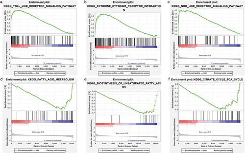
Figure 8. Protein-protein interaction (PPI) network. (a) PPI network of differentially expressed genes (DEGs), (b) subnetwork of top nine hub genes from the PPI network. Node colour reflects the degree of connectivity (Red colour represents a higher degree, and yellow colour represents a lower degree)
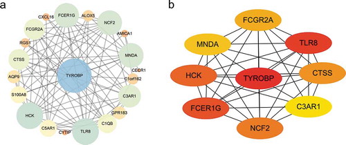
Figure 9. The expression of genes (a) TYROBP, (b) TLR8, (c) FCER1 G, (d) HCK, (e) NCF2, (f) CTSS, and (g) C3AR1, significantly up-regulated in the adipose of the 10-weeks obese diabetic mice. *** p < 0.001, ** p < 0.01, *p < 0.05
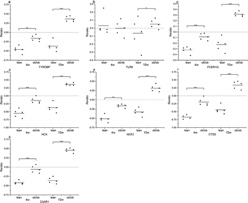
Figure 10. Methylation analysis of 8 hub genes (a) TYROBP, (b) TLR8, (c) FCER1 G, (d) NCF2, (e) CTSS, (f) FCGR2A, (g) MNDA, and (h) C3AR1 in type 2 diabetes (left) vs normal (right)
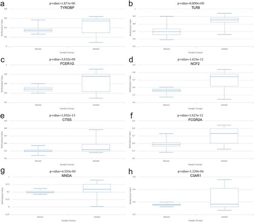
Figure 11. The networks of (a) target gene-miRNA and (b) target gen-TF. The red circle nodes are the genes, and yellow diamond nodes are the miRNAs
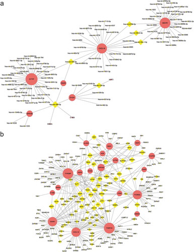
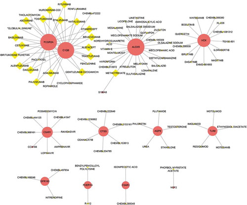
Figure 12. The drug-gene interaction network. The red circle nodes are the genes, and yellow diamond nodes are the drugs