Figures & data
Figure 1. For figure legend, see next page. Figure 1 (See previous page). Density of CD3+ T cells associates with clinical outcome in neuroblastoma (A). Representative examples of low (Lo) and high (Hi) density of CD3+ T cells in neuroblastoma samples. CD3+ T cells (red) and tumor cells (blue) are shown in nest (N) and septa (S) regions. Blue and green arrows indicate CD3+ T cells infiltrated in the nest and in the septa, respectively. The density of CD3+ T cells was recorded as the number of positive cells per unit of tissue surface area. Cut-off values of immune cell densities, defined as the median of the cohort, are reported for each tumor region. (B) Kaplan–Meier curves show the duration of disease-free survival according to the CD3+ T cell density in a single tumor region in the nests or septa (left and middle panels, respectively), and in both tumor regions (right panels). In each tumor region, high (Hi) and low (Lo) cell densities were plotted according to the cut-off value of cell density. In single-region analysis (left and middle panels), black lines indicate high cell density and red lines indicate low cell density. In combined analysis (right panels), black and red lines indicate high and low cell densities, respectively, in nests and septa, and purple line indicates heterogeneous (Het) cell density in both tumor regions (high density in nests and low density in septa or, vice versa, low density in nests and high density in septa). (C) and (D) Box plots of the CD3+ T cell density in the nest (N) or septa (S) regions according to the high- (Hi) or low/intermediate- (Lo) COG risks (C) and the INSS stages (1, 2, 4, 4S) (D) NB patients with stage 3 (n = 4) were omitted from the analysis because not representative. The boxes show the 25th to 75th percentile, the horizontal line inside the box represents the median, the whiskers extend to the most extreme data point which is no more than 1.5 times the interquartile range from the box and the circles are individual samples. *p < 0.05, **p < 0.001, ***p < 0.0001.
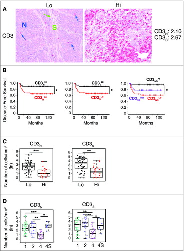
Figure 2. Tumor infiltrating CD3+ T cells proliferate in situ and enter in contact with tumor cells in low-risk neuroblastoma (A). Comparative estimation of manual and automatic counts of CD3+ T cells in a representative set of five neuroblastoma stage 4 (fuchsia dots) and six neuroblastoma stage 4S (blue dots). (B) Automatic analysis pipeline of CD3+ T cell density in neuroblastoma samples. Each dot represents the average number of lymphocytes for single subject. (C) Representative examples of CD3/Ki67 double staining of primary neuroblastoma lesions visualized with Fast Red (red) and diaminobenzidine (brown), respectively. Nuclei were counter stained with haematoxylin (blue). CD3+ T cells (white arrows) and proliferating tumor cells (black arrows) are indicated. (D) and (E) Automatic quantification of CD3+ T cells (D) and proliferating CD3+ T cells close to at least one tumor cell (E). Each dot represents the average number of lymphocytes for single subject. * p < 0.05
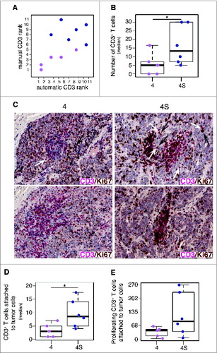
Figure 3. Density of CD4+ T cells associates with clinical outcome in neuroblastoma (A). Representative examples of low (Lo) and high (Hi) density of adaptive immune cells in neuroblastoma lesions. The density of T cells was recorded as the number of positive cells per unit of tissue surface area. Cut-off values of immune cell densities, defined as the median of the cohort, are reported for nest (N) and septa (S) tumor regions. (B) Kaplan–Meier curves show the duration of disease-free survival according to the CD4+, CD8+, CD25+ and FOXP3+ cell density in a single tumor region in the nests or septa (top and middle panels, respectively), and in both tumor regions (bottom panels). In each tumor region, high (Hi) and low (Lo) cell densities were plotted according to the cut-off value of cell density. In single-region analysis (top and middle panels), black lines indicate high cell density and red lines indicate low cell density. In combined analysis (bottom panels), black and red lines indicate high and low cell densities, respectively, in nests and septa, and purple lines indicate heterogeneous cell density in both tumor regions. * p < 0.05.
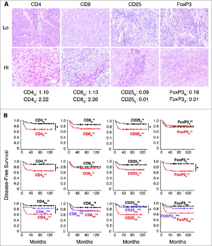
Figure 4. Density of immune cells identifies the outcome of neuroblastoma according to the COG risk and INSS stages Box plots of the CD4+, CD8+, CD25+ and FOXP3+ cell densities in the nest (N) or septa (S) regions according to the high- or low/intermediate-COG risks (A) and the INSS stages (B). NB patients with stage 3 (n = 4) were omitted from the analysis because not representative. * p < 0.05, ** p < 0.001.
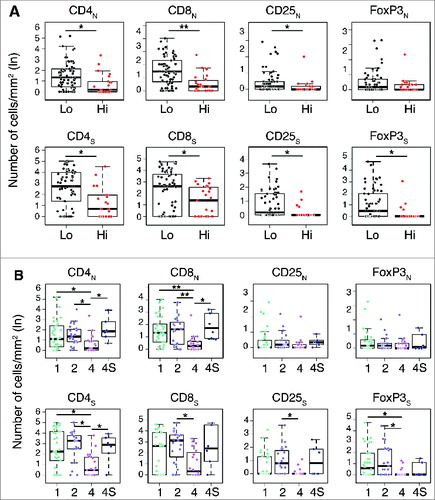
Figure 5. Density of immune cells is a prognostic factor independent from MYCN amplification status (A). Box plots of the immune cell density in the nest (N) or septa (S) tumor regions for MYCN amplified and not-MYCN amplified neuroblastomas. (B) Mean and standard deviation of the Area Under the Curve (AUC) for the COG risk group predictors. (C). Mean and standard deviation of the Matthew Correlation Coefficient (MCC) for the same COG risk group predictors. In (B) and (C) from the left: Null Model predictor (NM), Random Labels predictor based on immune cell density and MYCN (RL), predictor based on MYCN (MYCN), immune cell density (CD), or both markers (CD and MYCN). Performance in the 3-fold cross validation scheme.
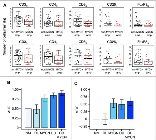
Figure 6. Correlation network and survival analyses confirm the importance of collaborative T-cell infiltration in defining neuroblastoma clinical outcome (A). Correlation networks for COG risk groups (Low, High) and INSS stages (1, 2, 4, 4S). Vertices represent the immune cell densities in nests (dark green) and septa (light green), respectively. Edge thickness is proportional to the Spearman correlation coefficient between the connected immune cell densities, also numerically reported on top of each edge. (B) Comparison of the correlation scores most varying in the six correlation networks. From the left, correlation between CD8 nest and CD8 septa (CD8NS), median correlation for the whole network, median correlation for the edges insisting on CD8 nest (CD8N), and median correlation for the edges insisting on CD8 septa (CD8S). Additional comparisons are shown in Fig. S5. (C) Multi-Dimensional Scaling (MDS) of the pairwise distances between the six correlation networks. Networks were compared by the Hamming–Ipsen–Mikhailov (HIM) indicator. The size of each circle is proportional to the number of samples in each class.
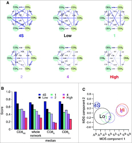
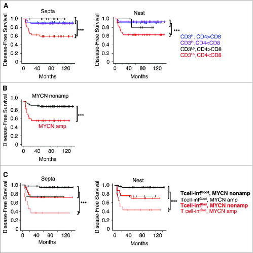
Figure 7. High density of tumor-infiltrating T cells predicts the clinical outcome of neuroblastoma patients (A). Kaplan–Meier curves show the disease-free survival of patients according to the CD3+ T cell density and the CD4+/CD8+ ratio in the septa and nest tumor regions. (B) Kaplan–Meier curves of the disease-free survival of patients according to the MYCN amplification status (MYCN amplified and not-MYCN amplified neuroblastoma patients were 23 and 60, respectively). (C) Kaplan–Meier curves of the disease-free survival of patients according to the T-cell density and MYCN amplification status in the septa and nest regions. The number of subjects in each class in A and C is reported in Tables S8 and S9. *** p < 0.0001.