Figures & data
Figure 1. (A) Representative invasive margin of a CRC liver metastasis with annotations (CD3 positive lymphocytes appear dark brown). (B) The invasive margin of liver metastases is analyzed separately, encompassing 100 µm into normal adjacent liver from the tumor epithelium. Shaded areas highlight distinct distance classes of 10 µm in relation to the tumor epithelium.
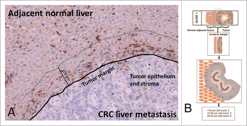
Figure 2. Boxplots of identified CD3 T cell densities in different distance classes of 36 patients. Statistically significant differences between adjacent distance classes are marked with asterisks (p values given for Kruskal–Wallis with post-hoc Mann–Whitney U tests).
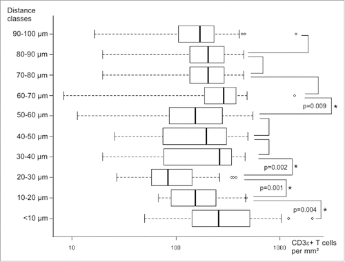
Figure 3. Heatmap based on unsupervised clustering encompassing randomly selected single fields from all 36 patients. Color code indicates clustering of patients according to their relative T cell densities within single distance classes.
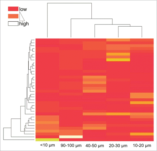
Figure 4. Kaplan–Meier plots for estimated overall survival probabilities of CD3 T cell high and CD3 T cell low patient groups within all distance classes. Graphs indicate cumulative survival (y-axis) and survival in months (x-axis). p values for statistically significant differences between groups are shown (Breslow test). Cutoff values are taken from previous works.Citation6,13
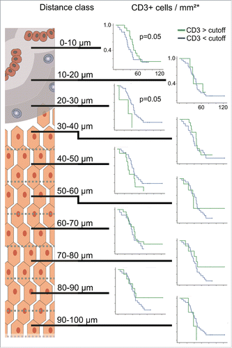
Figure 5. Boxplots of identified CD8+, GranB, CD163 and CD20 cell densities in different distance classes. Statistically significant differences between adjacent distance classes are marked with asterisks (Wilcoxon signed-rank test; blue p values given for paired t-tests; patient numbers for CD8+ n = 10, GranB n = 6, CD163 n = 4 and CD20 n = 4).
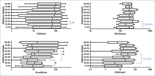
Figure 6. Kaplan–Meier plots for estimated overall survival probabilities of CD8+ high and low patient groups within the first three distance classes. Graphs indicate cumulative survival (y-axis) and survival in months (x-axis). p values for statistically significant differences between groups are shown (Breslow test). Cutoff values are taken from previous works.Citation6,13
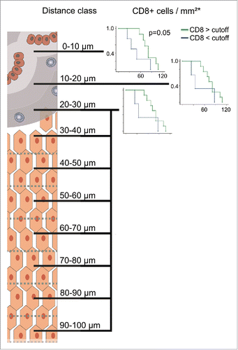
Figure 7. Processing of serial section images for the quantification of distances between CD3 T cells and CD163 macrophages.
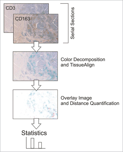
Figure 8. Immunofluorescent double staining for CD163 (red) and PD-L1 (green) at the invasive margin. Dashed lines separate the tumor (top left) from the adjacent liver. DAPI was used as counterstain.
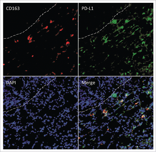
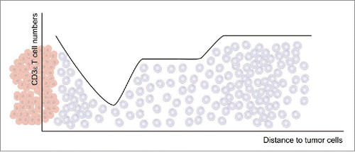
Figure 9. Overview of the observed T cell densities (gray cells) in relation to the distance to the tumor epithelium (red cells).