Figures & data
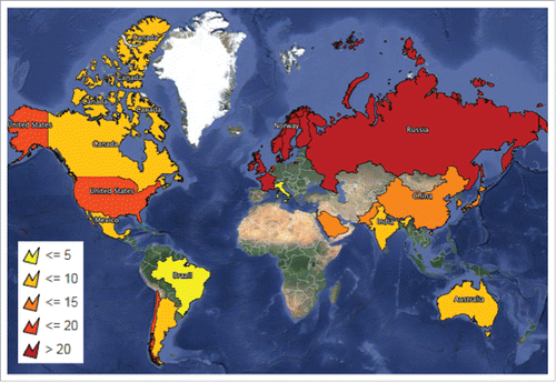
Figure 1. World heat map shading in light yellow the countries with the lowest projected population coverage for HLA-DQB1*0602 (less than or equal to 5%) and progressively getting darker with dark red indicating the countries with the highest projected population coverage for HLA-DQB1*0602 (greater than 20%). Map produced using Mapline (https://mapline.com/).