
Figures & data
Figure 1. Distribution of MCV1 coverage at the district level for the “big six” countries in the WHO SEAR. Each dot displays the MCV1 coverage in second administrative units for each country. The box portion of the plot is defined by the upper lines at the 25th percentile, the middle lines at the 50th percentile, and the lower lines at 75th percentile. WHO and UNICEF estimates of MCV1 coverage are shown as red triangles.
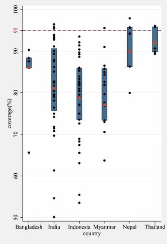
Figure 2. MCV1 coverage at the district level, spatial clustering of low MCV1 coverage, and clusters based on both socioeconomic status (SES) and MCV1 coverage for in the “big six” countries in the WHO SEAR. (a) The district-level MCV1 coverage. (b) Using the Kulldorff’s statistic, we identified the low-coverage clusters and classified them by the relative risk, i.e., the ratio of the probability of receiving MCV1 inside the cluster to that outside the cluster. (c) Using the k-means analysis, we identified clusters with similar SES and MCV1 coverage.
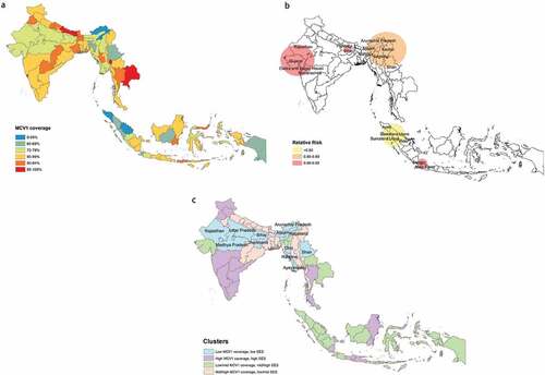
Table 1. Inequality in MCV1 coverage quantified by Erreygers concentration index.
Table 2. Inequality in MCV1 coverage quantified by whole spectrum comparisons (for wealth index, mother’s education, and antenatal care visits) and pairwise comparisons (for child’s gender, residence, VAS, and malnutrition) conducted in the absolute scale, adjusted for sociodemographic factors.
Appendix E Sociodemographic characteristics of the cluster centers