Figures & data
Figure 1. (A) Combined bar and line graph to show the number of reported dengue cases from 2000–2019 (blue color bar chart presents dengue cases and red color line graph shows death cases). The dengue cases (blue) with death (red) for 2019 (January1st–September 9th) is represented by an inset diagram. (B) Map of Bangladesh indicating dengue-affected people in 64 districts from January 1st–September 9th, 2019 (health emergency operation center and control room, DGHS, Bangladesh) and survey locations (black-filled circle)
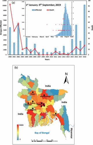
Figure 2. Double-bounded dichotomous choice and bidding game approach presented for elicitation of WTP amount. Since there was no previous data about the cost of the dengue vaccine available in Bangladesh, the starting bid (A-US$ 35, B-US$ 60, C-US$ 70, and T-US$ 95) was established by referring to some previous studies and tests online. Here, No indicates an unwillingness to pay and Yes indicates WTP
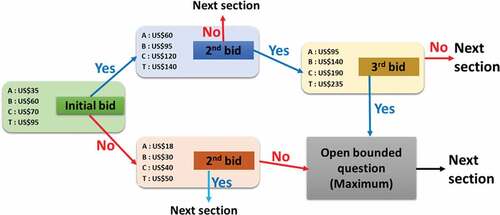
Table 1. Respondents’ socio-demographic profile of dengue vaccine acceptance (n=3251)
Table 2. Respondents’ socio-demographic profile of dengue vaccine acceptance (n=3251)
Figure 3. The percentage share of (A) dengue knowledge and (B) dengue prevention practices categorized by the respondents’ socio-demographic characteristics
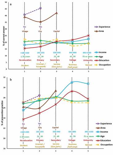
Figure 4. Statistics of WTP of respondents, classified by socio-demographic characteristics: (A) Gender, (B) age, (C) area, (D) marital status, (E) education, (F) occupation, (G) income, and (H) dengue experience. Values with *, **, and *** refer to statistical significance with a level 5%, 1%, and 0.1%, respectively
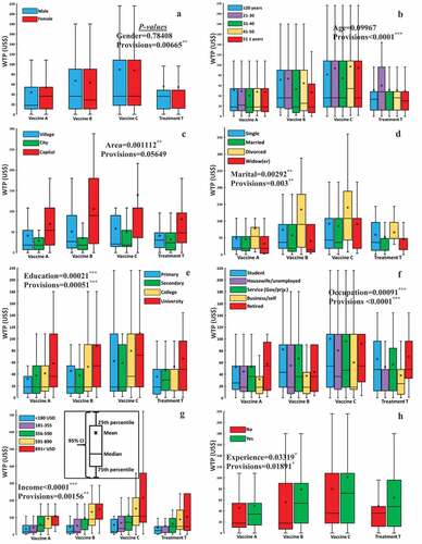
Figure 5. Bar chart of mean WTP for respondents’ groups categorized according to two attributes; (A) vaccine A for occupation vs. area, (B) vaccine A for income vs. area, (C) vaccine B for occupation vs. area, (D) vaccine B for age vs. experience, (E) vaccine C for occupation vs. area and (F) vaccine C for
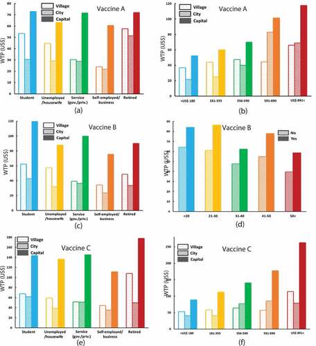
Table 3. ANOVA analysis (p-value) of multiple factors of respondents’ socio-demographic conditions on willingness to pay for vaccines A, B, and C. Values with *, **, and *** refer to statistical significance with a level 5%, 1%, and 0.1%, respectively. Green, blue, and white colors mean that both factors were significant, only one factor was significant, and none were significant, respectively
Figure 6. (A) Statistical summaries of respondents’ mean WTP, WTA for vaccines A, B, and C, and treatment T. (B) Histogram of respondents’ WTP for hypothetical vaccinations indicating willingness to accept the vaccine
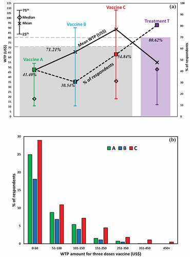
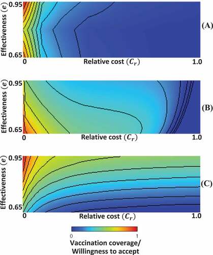
Figure 7. 2D phase diagram of vaccination coverage/willingness to accept (WTP); (A) survey results (B) epidemic vaccination game model with repeated seasonsCitation43 and (C) single-season epidemic model.Citation45