
Figures & data
Table 1. Personnel characteristics of permanently* employed (N = 381)
Figure 1. Flu vaccine campaigns adherence patterns (by professional categories).
Sankey plot. In each panel, data on vaccination uptake by professional categories during the study period. X-axis represents the Vaccination campaign (year); Y-axis represents the number of employees. The branches of the Sankey plot display the flow of employees (between consecutive years) from the Not vaccinated status to the Vaccinated one and vice versa. Note that some employees remained in the same node (i.e. same vaccination status in consecutive years). The height of the bars and the width of the branches are proportional to the group dimension and the vaccination status of employees.
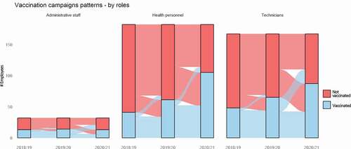
Figure 2. Flu vaccine campaigns adherence by personnel roles and year of campaigns (N = 381 employees).
Dumbbell plot. In the left side of the graph, for each category of HCWs, the percentage of vaccination adherence campaigns is plotted. The first row (yellow) displayed for each HCWs group represents the vaccination adherence rate in 2018/19 compared to 2019/20, while in the second one (light blue) percentage of vaccination adherence in 2019/20 and 2020/21 (light-blue) campaigns are displayed. The arrows indicate the direction of change between the consecutive years (i.e. toward right in case of improvement, toward the left otherwise). DIFF columns indicate the percentage change between the two consecutive years. The first three pairs of rows (in bold) indicate the macro groups of employees’ roles (Technicians, Administrative staff and Health personnel), while the following ones (italics) detail data on specific categories of health personnel (Radiology technicians, Psychologists, Nurses, Medical Doctors, Healthcare assistants).
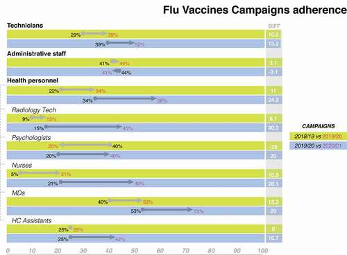
Table 2. Factors influencing flu vaccine campaigns adherence
Supplemental material