
Figures & data
Figure 1. MSEIVR dynamic transmission model diagram with switching vaccines.
M: Maternal-induced immunity. S: Susceptible to VZV infection. V: Vaccinated with varicella vaccine strategy V1 or V2 or V3 for the specified time period. E: Exposed to VZV. I: Infectious with VZV. R: Recovered (after VZV infection). W: Waning zoster immunity. Z: Zoster (VZV reactivation). RZ: Recovered (after zoster). The dashed line reflects exogenous boosting. The bracket reflects the sequence of vaccination strategies used over time in the UVV program, where Ti is the time when the ith vaccination strategy is introduced.
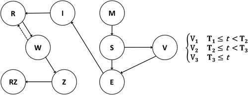
Table 1. Epidemiological inputs.
Table 2. Model inputs for direct and indirect costs for varicella and herpes zoster.
Figure 2. Total varicella incidence (2022–2072).
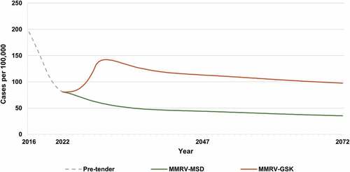
Figure 3. Breakthrough varicella incidence* (2022–2072).
* Breakthrough varicella incidence includes varicella cases following the first or second varicella dose.
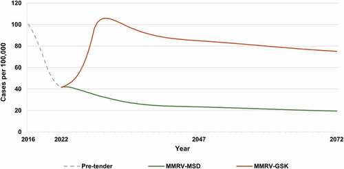
Table 3. Cumulative varicella and HZ health outcomes over 50 years (2022-2072).
Table 4. Vaccine doses, QALYs lost, and discounted costs per capita (2022–2072).
Figure 4. Tornado plot of incremental cost per capita over 50 years following switch from MMRV-MSD to MMRV-GSK (in USD, societal perspective).
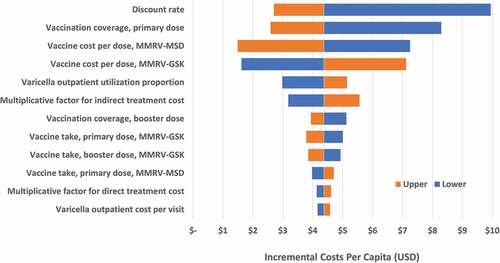
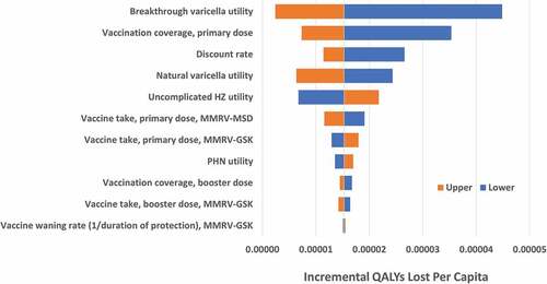
Figure 5. Tornado plot for incremental QALYs lost per capita over 50 years following switch from MMRV-MSD to MMRV-GSK.
Supplemental material