
Figures & data
Figure 1. Search strategy framework flowchart.
#1 = [TS = ((Monoclonal antibody) OR (Monoclonal antibodies))].
#2 = [TS = ((((((((((((((TS = (Arteriosclerosis)) OR TS = (Atheromatous Plaques)) OR TS = (Atheromatous Plaque)) OR TS = (Fibroatheroma)) OR TS = (Fibroatheromas)) OR TS = (Arterial Fatty Streak)) OR TS = (Arterial Fatty Streaks)) OR TS = (Atherosclerotic Plaques)) OR TS = (Atherosclerotic Plaque)) OR TS = (Atheroma)) OR TS = (Atheromas)) OR TS = (Atheromatous Plaques)) OR TS = (Atheromatous Plaque)) OR TS = (Atherosclerosis)) OR TS = (Arteriosclerosis)].
#3 = [TS = ((Monoclonal antibody) OR (Monoclonal antibodies)) AND ((((((((((((((TS = (Arteriosclerosis)) OR TS = (Atheromatous Plaques)) OR TS = (Atheromatous Plaque)) OR TS = (Fibroatheroma)) OR TS = (Fibroatheromas)) OR TS = (Arterial Fatty Streak)) OR TS = (Arterial Fatty Streaks)) OR TS = (Atherosclerotic Plaques)) OR TS = (Atherosclerotic Plaque)) OR TS = (Atheroma)) OR TS = (Atheromas)) OR TS = (Atheromatous Plaques)) OR TS = (Atheromatous Plaque)) OR TS = (Atherosclerosis)) OR TS = (Arteriosclerosis)].
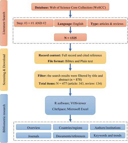
Figure 2. Annual output of publications and annual average article on mAbs and AS.
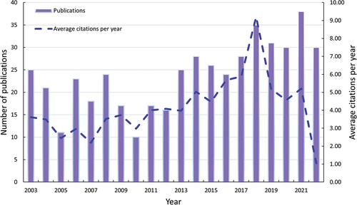
Figure 3. Visualization of active countries/regions analysis.
(a) Country collaboration map. The collaboration bonds between countries are represented by red lines, with thicker lines indicating stronger collaboration. (b) Network visualization of country. (c) Overlay visualization of country. (d) Corresponding author’s country. SCP, single country publications. MCP, multiple country publications
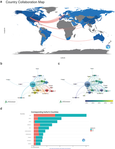
Figure 4. Visualization of active institutes analysis.
(a) Most relevant affiliations in the field of mAbs in AS. The nodes’ size and darkness are proportional to the number of documents produced by the affiliation. (b) Top 10 affiliations’ production over time. (c) Collaboration network among institutions.
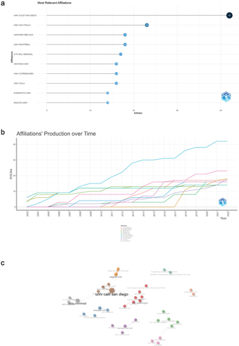
Figure 5. Visualization of active authors analysis.
(a) Most relevant authors. (b) Authors’ production over time. The nodes’ size and darkness are proportional to the number of documents produced by the affiliation. (c) Three-field plot.
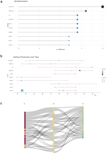
Table 1. The top 10 journals with the most publications on mAbs in AS.
Figure 6. Visualization of documents analysis.
(a) Most global cited documents. (b) Most local cited documents.
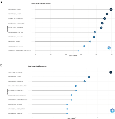
Figure 7. Cluster analysis of co-cited references.
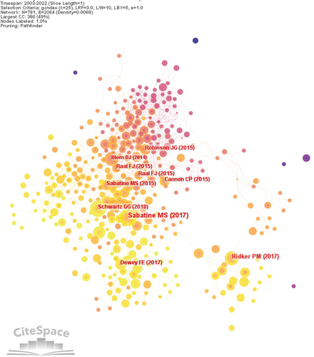
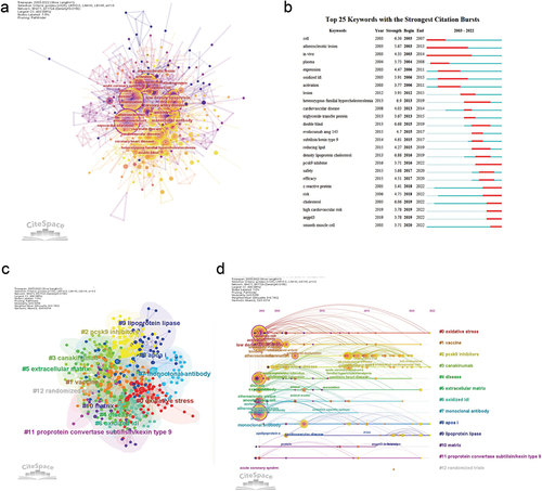
Figure 8. Visualization of keywords analysis.
(a) The network map of keywords. (b) Top 25 keywords with the strongest citation bursts. (c) Clusters of keywords. (d) Keyword timeline view of mAbs in AS research.
Supplemental material
Supplemental Material
Download PDF (408.5 KB)Data availability statement
The original contributions presented in the study are included in the article/Supplementary Material. Further inquiries can be directed to the corresponding author.