Figures & data
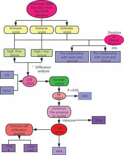
Figure 1. Analysis of correlations between clinical information and stromal/immune scores. Distribution of immune scores according to clinical OS (a), age (d) and stage (g). Distribution of stromal scores according to OS (b), age (e) and stage (h). Distribution of ESTIMATE scores according to OS (c), age (f) and stage (i). OS: overall survival
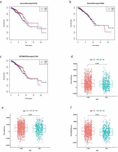
Figure 1. (Continued)
Figure 2. The DEGs between high and low stromal/immune score groups and the overlapping genes related to both stromal and immune score. The heatmap shows the DEGs between the high immune score group and the low immune score group (a). The DEGs between the high stromal score group and the low stromal score group (b). The color indicates the fold change of gene expression; the greater the change is, the darker the color (red is up, blue is down). The Venn diagram shows the upregulated genes related to both immune score and stromal score (c). Downregulated genes related to both immune score and stromal score (d). DEGs: differentially expressed genes
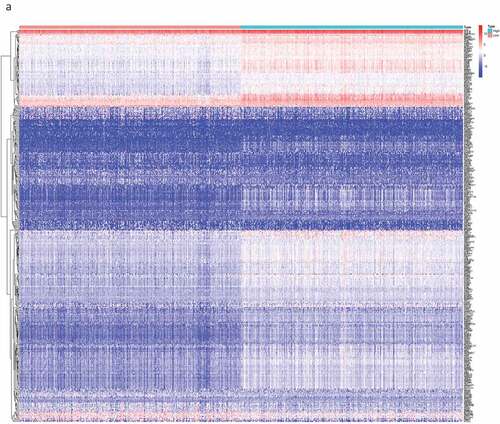
Figure 2. (Continued)
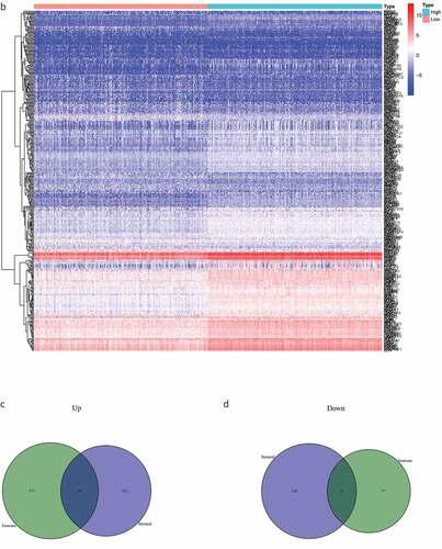
Figure 3. DEG functional enrichment analysis results. (a) GO enrichment results show the top 10 BP terms, CC terms and MF terms. (b) The circos plots show the enrichment relationship between genes and the main enriched terms in GO. (c) The KEGG enrichment results show the 13 paths. (B) The circos plots show the enrichment relationship between genes and the main enriched terms in KEGG. DEG: differentially expressed gene. GO: gene ontology. MF: molecular function, BP: biological process, CC: cellular component. KEGG: Kyoto City Encyclopedia of Genes and Genomes
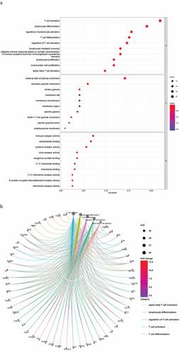
Figure 3. (Continued)
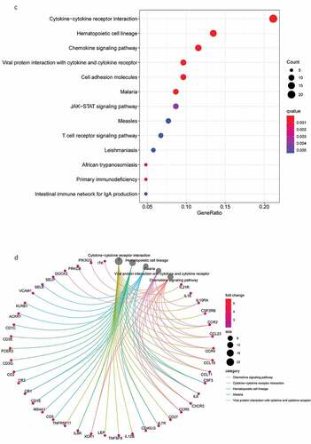
Figure 4. The survival curve shows the effect of the expression levels of 9 DEGs. In the figure, the overall survival time of patients with high gene expression (red line) was compared with the overall survival time of patients with low gene expression (blue line). P < 0.05 means the difference is significant. DEGs: differentially expressed genes
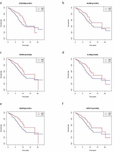
Figure 4. (Continued)
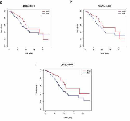
Figure 5. The PPI network was constructed, and two important modules were obtained by using Cytoscape. (a) PPI network of differentially expressed genes with integrated scores larger than 0.40. (b) The top 30 central genes identified in the PPI network. (c) CD48 module. (d) CD1E module. The darker the color of the node is, the greater the log2FC value of the gene expression and the larger the size of the node, the greater the number of edges between the gene and other genes. PPI: protein-protein interaction
Table
Table
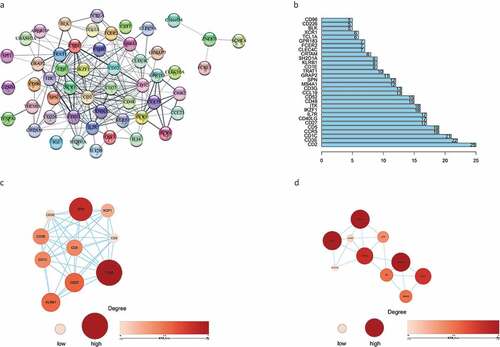
Figure 6. Construction gene signatures related to the TME through COX analysis. (a) K-M survival analysis showed differential expression between low- and high-risk groups. (b) Analysis of ROC curves. (c) Univariate Cox regression analyses of the common prognostic factors of BC. (d) The Multivariatemultiple Cox regression model analyses of the common prognostic factors of breast cancer. TME: the tumor tumor microenvironment. K-M: Kaplan–Meier analysis. ROC: receiver operating characteristics
Figure 7. Through GSEA, we explored the difference in enrichment pathways between high- and low-risk groups. GSEA: gene set enrichment analysis
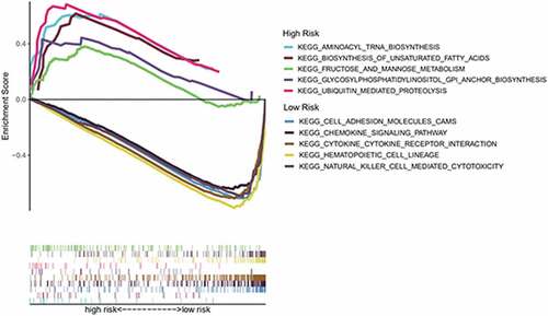
Figure 8. The relationship between the genes and immune cell infiltration. (a) KLRB1. (b) SIT1. (c) GZMM. (d) Bar plot showed the proportion of 22 immune cells with each sample. (e)The heat map showed the level of immune cell infiltration of each sample between normal tissues and BC tissues. (f) Correlation matrix of all 22 immune cells proportions. high is red, low is blue, and the same association levels is white. (g) Violin plot showed the proportions of 22 immune cells between normal tissues with BC tissues
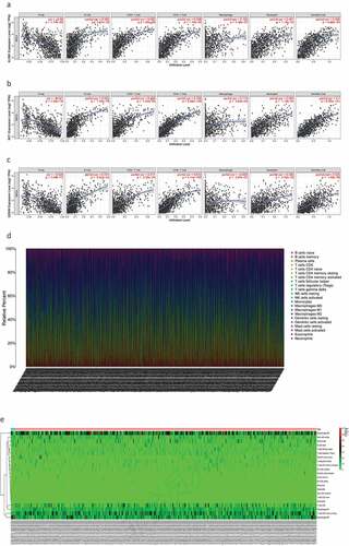
Figure 8. (Continued)
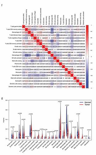
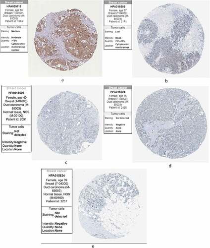
Figure 9. The expression of the genes in breast cancer and normal tissues in HPA. (a) KLRB1. (b) SIT1. (c) GZMM. HPA: the Human Protein Atlas