
Figures & data
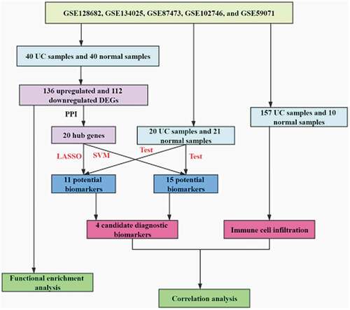
Figure 1. Data collection, processing, and DEG identification
(A) Volcano plot of DEGs. (B) Heatmap of the DEGs.
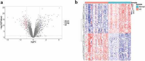
Figure 2. GO and KEGG analysis
(A, B) Bubble plots for GO terms enrichment of DEGs. (C, D) Bubble plots for KEGG enrichment of DEGs.
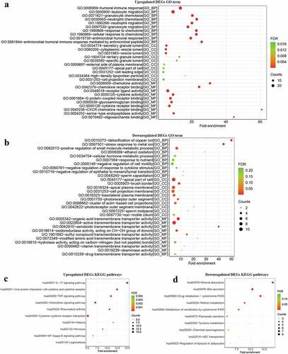
Figure 3. Construction, visualization, and analysis of the PPI network
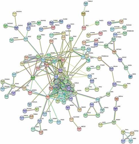
Figure 4. Immune-related pathway enrichment analysis. (a-h) GSEA for immune-related pathways
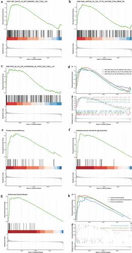
Figure 5. Identification and validation of candidate UC biomarkers
(A, B) LASSO logistic regression model. (C) ROC curves for LASSO and the SVM-RFE algorithm in the training set and testing set. (D) Venn diagram showing the intersection of candidate biomarkers between LASSO and the SVM algorithm. (E–H) Box plots of candidate biomarker (DPP10, S100P, AMPD1, and ASS1) expression between UC samples and normal samples.
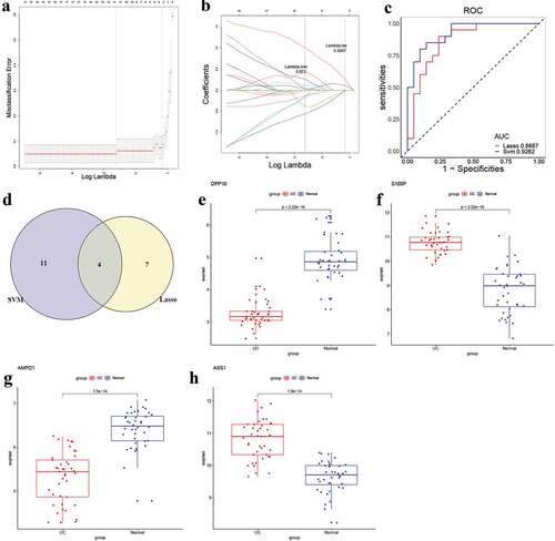
Figure 6. Assessment of immune infiltration
(A) Bar plot for the IICs between UC and normal control. (B) Correlation heatmap for IICs in UC samples. (C) Box plot for the cytolytic activity and CIBRSORT P-value in GSE59071 and GSE87473 datasets. (D) Correlation heatmap between IICs and cytolytic activity in UC samples. (E) Heatmap for the different proportions of IICs between UC and normal control. (F) Violin plot for the different proportions of IICs between UC and normal control. (G) PCA cluster plots for the different proportions of IICs between UC and normal control.
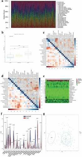
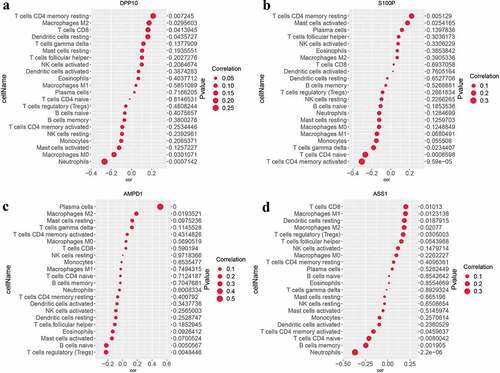
Figure 7. Analysis of the correlation between candidate biomarkers and IICs in UC
(A–D) Bubble plots for the correlation between candidate biomarkers (DPP10, S100P, AMPD1, and ASS1) of UC and IICs.
Supplemental material
Supplemental Material
Download ()Data availability statement
All of the datasets analyzed were acquired from the Gene Expression Omnibus (GEO) database (https://www.ncbi.nlm.nih.gov/gds).