Figures & data
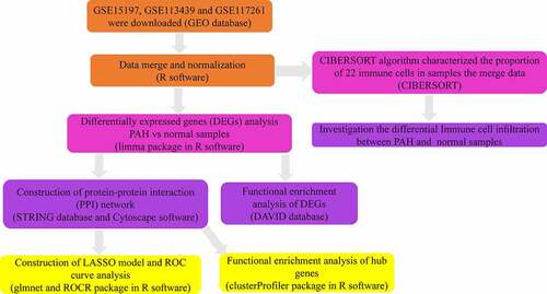
Figure 1. The workflow of this study

Table 1. Details of three GEO datasets
Table 2. Screening DEGs in PAH by integrated analysis of microarray
Figure 2. Identification of DEGs from three mRNA expression datasets. (a) Volcano plot of three mRNA expression datasets after integrated as one via R software. log FC, log2 Fold Change. (b) Heatmap of differentially expressed gene expression. The heatmap was generated using pheatmap package in R. The expression profiles greater than the mean are colored in red and those below the mean are colored in green. PAH, Pulmonary arterial hypertension
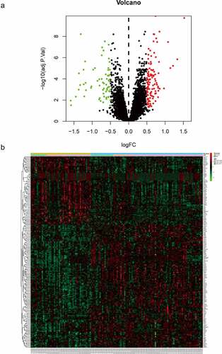
Table 3. GO analysis of DEGs in PAH
Table 4. KEGG enrichment analysis of DEGs in PAH
Figure 3. Top 10 enriched GO terms and top 10 KEGG pathways of differentially expressed genes. (A‑C) GO term enrichment analysis for (a) biological process, (b) molecular function, (c) cellular component. (d) KEGG pathway analysis. Node size represents gene ratio; node color represents P-value. GO, gene ontology; KEGG, Kyoto Encyclopedia of Genes and Genomes
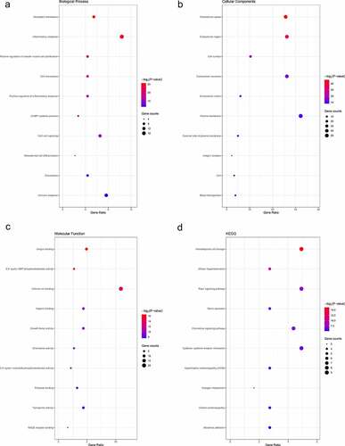
Figure 4. Construction of the PPI network. (a) The nodes represent proteins, and the edges represent the interaction of proteins, while blue and red circles indicate downregulated and upregulated DEGs, respectively. (b) The only one module in the PPI network. The nodes represent proteins, and the edges represent the interaction of proteins, while blue and red circles indicate downregulated and upregulated DEGs, respectively
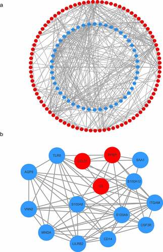
Figure 5. GO and KEGG analyses of module genes. (a) GO term enrichment analysis of module genes. (b) KEGG pathway analysis of module genes. Node size represents gene ratio; node color represents Padj-value. GO, gene ontology; KEGG, Kyoto Encyclopedia of Genes and Genomes
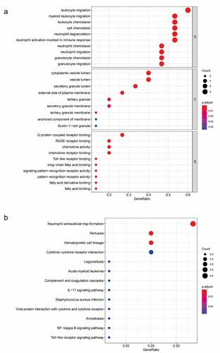
Figure 6. A model for predicting PAH. (a) LASSO model. (b) ROC curves analysis of training set. (c) ROC curves analysis of test set. AUC, area under the curve. PAH, Pulmonary arterial hypertension
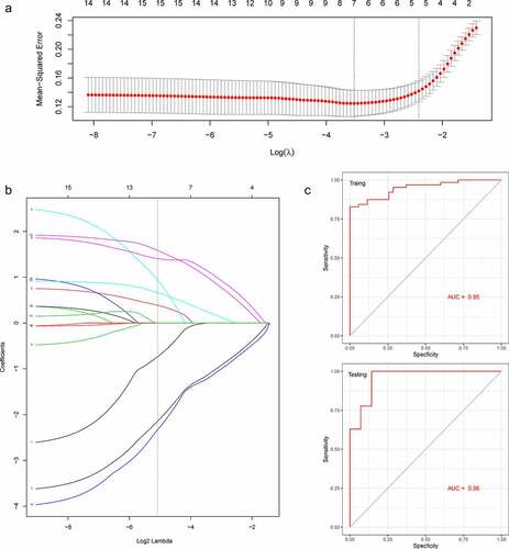
Figure 7. The bar plot visualizing the relative percent of 22 immune cell in each sample. Different colors represent different types of immune cells
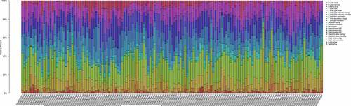
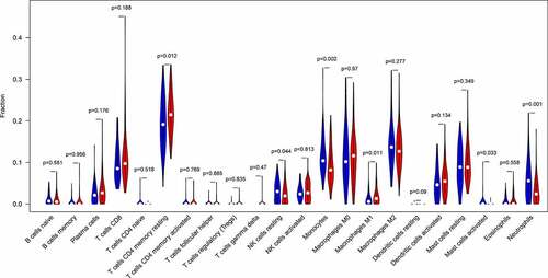
Figure 8. The difference of immune infiltration between PAH samples and normal control samples. Blue, normal controls group; Red, PAH group. PAH, Pulmonary arterial hypertension