
Figures & data
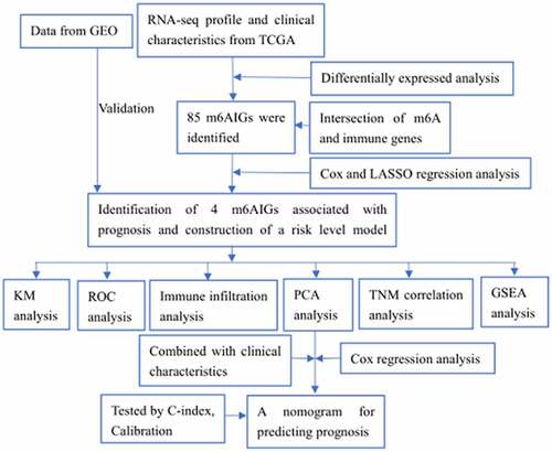
Figure 1. The m6A-related immune genes gained. (a) 2856 DEGs in BC were shown in volcano plot. The green, red, and blue dots mean downregulated and upregulated genes and no differential expression, respectively. (b) The Venn diagram shown the result of the intersection of the DEGs, immune genes and m6A-related genes
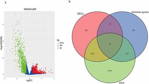
Figure 2. m6AIGs associated with prognosis and functional annotation. (a) Forest plot illustrated the result of multivariate Cox regression analysis for the 22 m6AIGs. (b–f) The survival analysis for the BGN, GRK5, IL32, SREBF1 and risk score level, respectively. (g) In TCGA cohort, ROC curve predicted the 3- and 5-year survival. (h) Risk score level model was developed within GEO cohort. (i) The area under ROC curve was calculated within GEO cohort
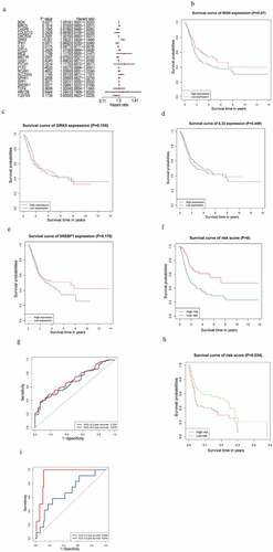
Figure 3. The correlation of the four m6AIGs expression with the tumor purity, B cell, CD8 + T cell, CD4 + T cell, Macrophage, Neutrophil and Dendritic cell
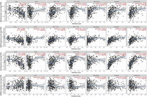
Figure 4. Identification of the category. (a, b) Determination of the optimum classification number. (c) The outcome of PCA. (d) KM survival analysis for BC samples in accordance with the two categories
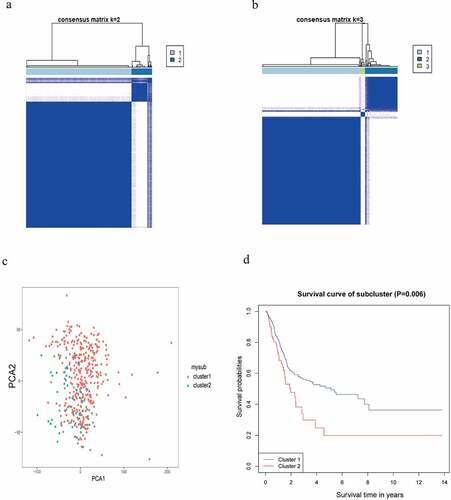
Figure 5. Analysis of TNM stage correlation . (a, b) The correlation of the expression of BGN with T and N staging. (c, d) The correlation of the expression of GRK5 with T and N staging. (e, f) The correlation of the expression of SREBF1 with T and N staging. (g, h) The correlation of the expression of IL32 with T and N staging
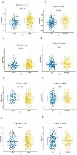
Figure 6. Screening the clinical characteristics and predicting prognosis. (a, b) Forest plot shown the result of the univariate and multivariate Cox regression analysis. (c) A nomogram based on age, T, N, risk score level, cluster, for predicting 3- and 5-year prognosis. (d, e) Calibration curve of nomogram for 3- and 5-year prediction. X-axis represents nomogram−predicted probability of overall survival and Y-axis stands for actual survival. The more the blue solid line fits the black dotted line, the better the prediction effect is. (f) Heatmap displayed the correlation between the four m6AIGs and the clinical characteristics and the risk score level
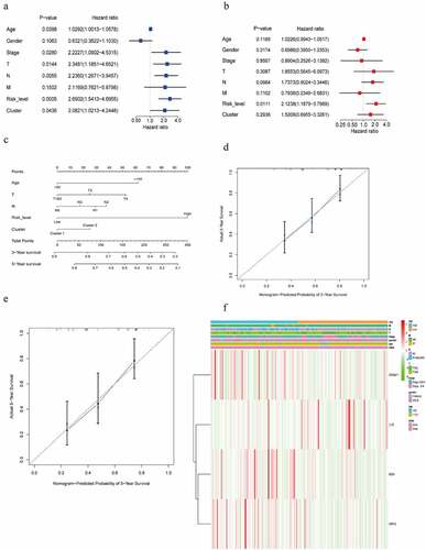
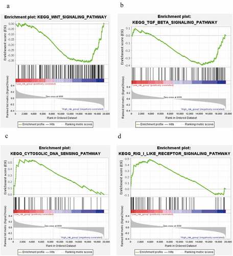
Figure 7. Signaling pathways analysis. (a, b) WNT signaling pathway and TGF-beta signaling pathway in high risk level group. (c, d) cytosolic DNA-Sensing cGAS-STING signaling pathway and RIG-I-like receptors signaling pathway in low risk level group
Supplemental Material
Download ()Data availability statement
The data used and analyzed during the present study are available from TCGA (https://portal.gdc.cancer.gov/), GEO (https://www.ncbi.nlm.nih.gov/geo/query/acc.cgi?acc=GSE31684), the RMVar (http://rmvar.renlab.org/index.html) and the InnateDB (https://www.innatedb.com/), the Tumor IMmune Estimation Resource (TIMER, https://cistrome.shinyapps.io/timer/).