Figures & data
Figure 1. Correlations between mRNAsi/corrected mRNAsi and clinical characteristics in SOC of stage III–IV. (a, b) The clinical correlation of mRNAsi and corrected mRNAsi with histopathological grades; (c, d) The clinical correlation of mRNAsi and corrected mRNAsi with stages; (e, f) PFS analyses of mRNAsi and corrected-mRNAsi among SOC patients of stage III–IV; p < 0.05 indicates statistical significance
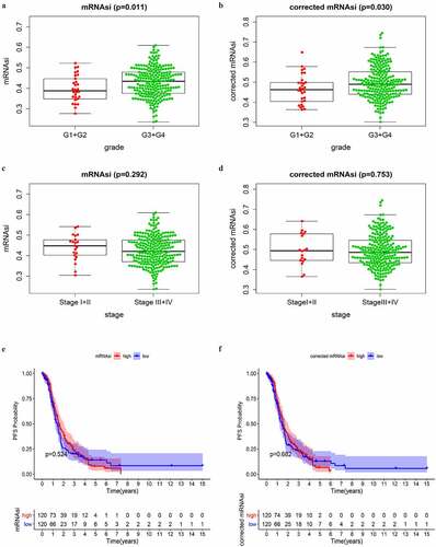
Figure 2. Identification of DEGs and stemless-associated gene modules in SOC of stage III–IV. (a, b) Volcano plot and heatmap of DEGs.Red represents upregulated genes; green represents downregulated genes and black represents genes without significant upregulation or downregulation; (c) The GO categories of the DEGs screened between normal ovarian tissue from GTEx and all SOC samples from TCGA; (d) Identification of weighted gene co-expression modules in SOC of stage III–IV. Each piece of the leaves on the cluster dendrogram matched a certain gene. Genes with similar expression patterns compose a branch; (e) Correlations between gene modules and mRNAsi or EREG-mRNAsi in SOC of stage III–IV. The upper row in each cell indicates the correlation coefficient quantifying the correlation between a certain gene module and the corresponding mRNAsi or EREG-mRNAsi score. The lower row in each cell indicates the p value; (f, g) The scatter plots of the top modules positively correlated and negatively correlated to mRNAsi: the green module and the blue module. Each colored circle represents a gene and the circles located in the upper right square indicate the key genes in the corresponding module. p < 0.05 indicates statistical significance
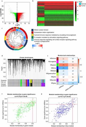
Figure 3. The GO and KEGG analyses and PPI network of the selected key genes. (a, b) The top GO categories and KEGG results of 42 selected key genes; (c) The protein–protein interaction network of 13 selected key genes according to the KEGG pathway enrichment results; (d) The number of edges of each key gene in the PPI network; (e) Correlation coefficient between paired key genes at the transcriptional level
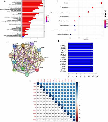
Figure 4. The differential expression of the selected key genes in the green module. (a) The heatmap showed the expression level of selected key genes among 88 normal ovarian samples and 352 SOC samples of stage III–IV. Samples were divided into two groups, normal (N), and tumor (T). Red indicated a high expression level and green indicates a low expression level; (b) The average expression level of the selected key genes visualized by boxplots. Blue indicated the normal group and red indicates the tumor group. ‘***’ indicates p < 0.001
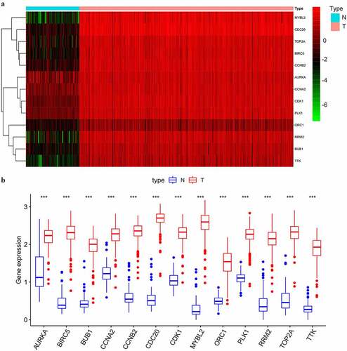
Figure 5. The expressional validation of selected key genes in different databases. (a, b) Expression level of the key genes in the GSE18520 and GSE69428 datasets of the GEO database. ‘**’ indicates p < 0.01. ‘***’ indicates p < 0.001; (c) The mRNA expression of key genes in multiple cancer types in Oncomine database. The number in the cells represents the number of analyzed datasets in which the expression level of genes meets the thresholds shown below the graph. Red indicates a higher expression level of the certain gene in tumor tissues than the normal tissues. Blue indicates the opposite expression pattern. The color depth of each cell indicates the gene rank. The deeper the color depth, the higher the gene rank
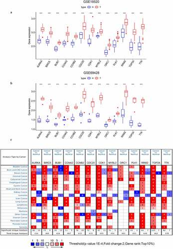
Table 1. The significant impact of the key genes on the overall survival time of the advanced-stage, SOC patients as well as patients treated with different strategy of chemotherapy
Figure 6. The OS curves of the key genes with significant prognostic value analyzed on 1023 SOC patients of stage III+IV by Kaplan-miere plotter
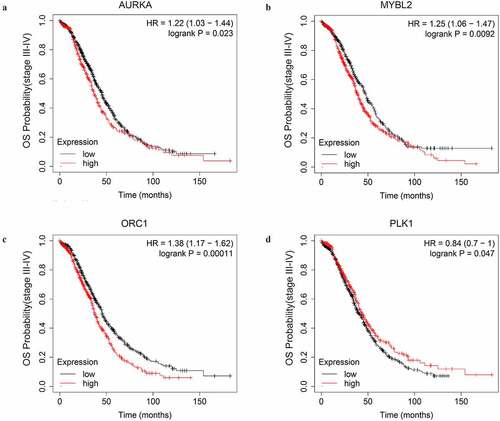
Table 2. The significant impact of the key genes on the PFS time of advanced-stage, SOC patients treated with different strategy of chemotherapy
Figure 7. The PFS curves of the key genes with significant prognostic value analyzed on 907 SOC patients of stage III+IV treated with chemotherapy containing platin
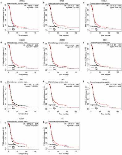
Figure 8. The PFS curves of the key genes with significant prognostic value analyzed on 562 SOC patients of stage III+IV treated with chemotherapy containing both platin and taxol
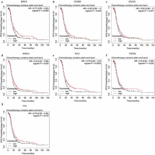
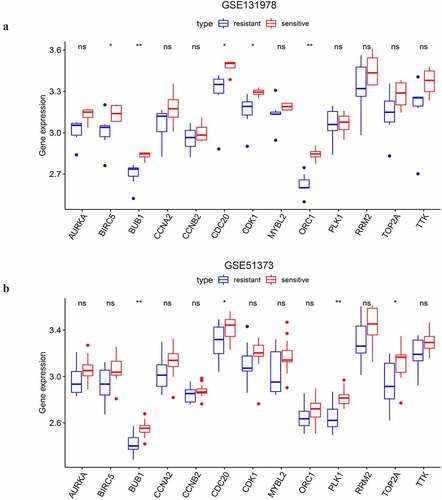
Figure 9. The differential expressional validation of the selected key genes between platinum resistant and platinum sensitive samples of advanced-stage SOC. (a) Differential expression of the key genes in the GSE131978 dataset. (b) Differential expression of the key genes in the GSE51373 dataset. ‘*’ indicates p < 0.05. ‘**’ indicates p < 0.01