Figures & data
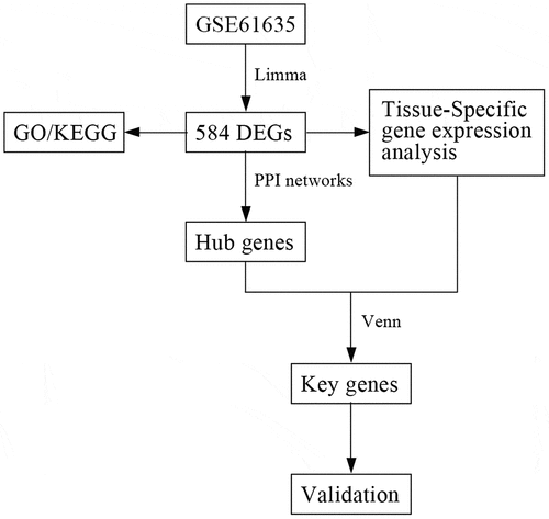
Figure 1. Normalization of microarray dataset. (a) Before normalization of the GSE61635 dataset. (b) After normalization of the GSE61635 dataset
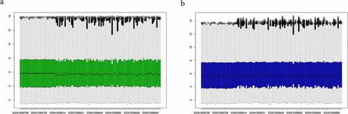
Figure 2. Differentially expressed genes (DEGs) between systemic lupus erythematosus (SLE) and control groups. (a) Volcano plot of GSE61635; 19 significantly expressed genes were identified. Red, green, and black dots represent upregulated, downregulated, and unchanged genes, respectively. (b) Heatmap of the top 50 DEGs from GSE61635
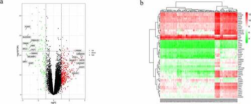
Table 1. Tissue-specific genes identified by BioGPS
Table 2. GO analysis of significant DEGs in SLE
Table 3. KEGG pathway analysis of significant DEGs in SLE
Figure 3. Distribution of differentially expressed genes (DEGs) in systemic lupus erythematosus (SLE) for GO enrichment
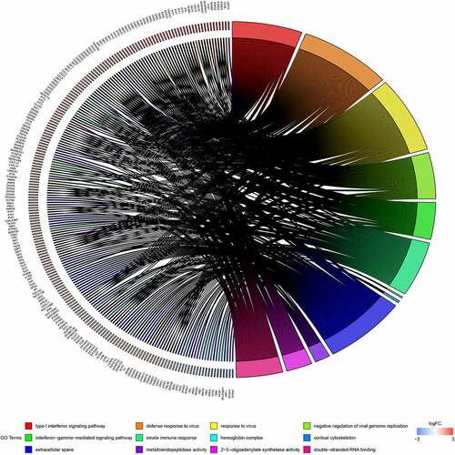
Figure 4. KEGG enrichment analysis of differentially expressed genes (DEGs). Strength of the color represents the p-value (from the lowest in green to the highest in red), and the bubble size represents the number of DEGs
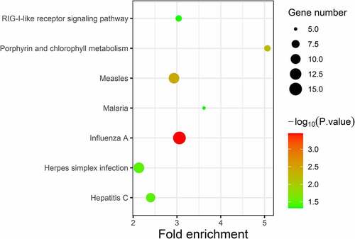
Figure 5. The PPI network of differentially expressed genes (DEGs). (a) Top 20 DEGs visualized based on the Closeness algorithm analysis in Cytoscape. (b) Top 20 DEGs based on Closeness score ranking
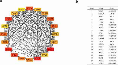
Figure 6. Key genes between hub genes and tissue-specific genes
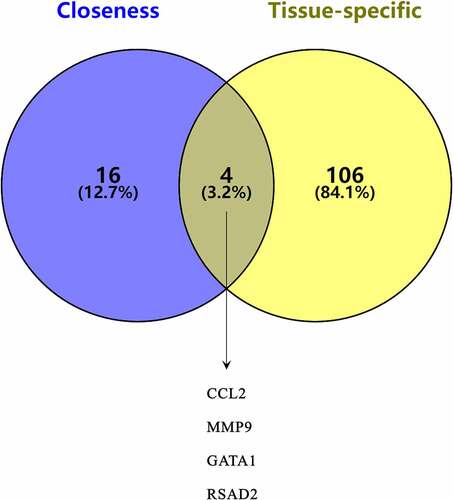
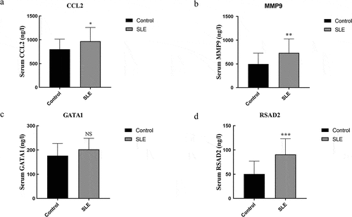
Figure 7. Concentration of CCL2, MMP9, GATA1, and RSAD2 in the serum. (a–d) Concentration of CCL2, MMP9, GATA1, and RSAD2 in the serum. Data are presented as mean ± SD (n ≥ 15). * p < 0.05, **p < 0.01, *** p< 0.005 vs Control; NS, no statistical significance vs Control