
Figures & data
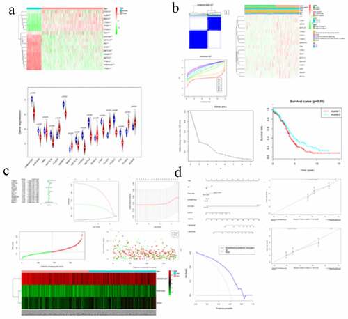
Figure 1. Expression of m6A RNA methylation regulator in OC samples and normal samples. (a) Heatmap showed that the 17 m6A RNA methylation regulators expressed differently between OC samples and normal samples. (b) Expression level of 17 m6A RNA methylation regulators in OC samples and normal samples
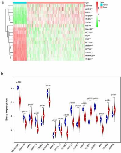
Figure 2. Differential clinicopathological features and overall survival of OC in the cluster ½ subgroups. (a) Consensus clustering matrix of 379 TGGA samples for k = 2. (b) Consensus clustering cumulative distribution function (CDF) for k = 2 to 10. (c) Relative change in area under CDF curve for k = 2 to 10. (d) Heatmap and clinicopathologic features of the two clusters defined by the m6A RNA methylation regulators consensus expression. (e) Kaplan–Meier overall survival (OS) curves for 315 out of 379 OC samples in the TCGA dataset
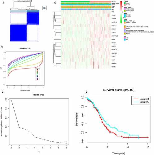
Figure 3. Interaction among m6A RNA methylation regulators and functional annotation of OC in cluster ½ subgroups. (a) The m6A modification-related interactions among the 17 m6A RNA methylation regulators. (b) Spearman correlation analysis of the 17 m6A modification regulators. (c) GO analysis by GSEA of cluster 1 and cluster 2
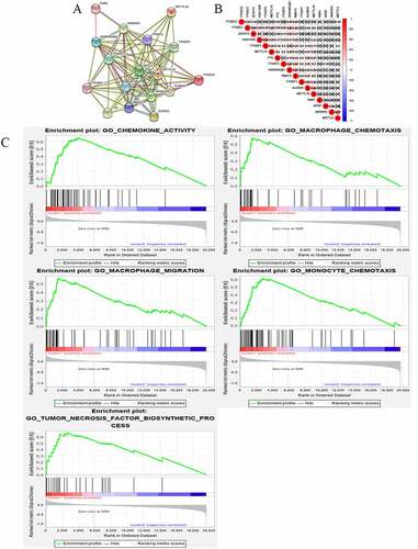
Figure 4. Gene set enrichment show genes with higher expression in cluster 1 were enriched for KEGG of malignant tumors
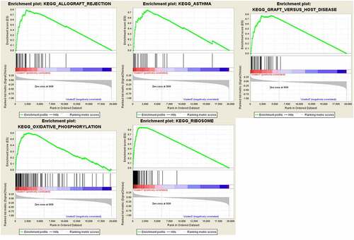
Figure 5. Risk signature with 17 m6A RNA methylation regulators. (a) The process of building the signature containing 17 m6A RNA methylation regulators. The hazard ratios (HR), 95% confidence intervals (CI) calculated by univariate Cox regression. (b) LASSO regression analysis was used to calculate the coefficient of interferon gamma response genes. (c) Three genes were selected as active covariates to determine the prognostic value after 10-fold cross-validation for the LASSO model. (d-e) The risk scores for all patients in TCGA cohort are plotted in ascending order and marked as low risk (blue) or high risk (red), as divided by the threshold (vertical black line). (f) The distribution of risk score, survival status, and the expression of 3 genes of each patient in TCGA cohort by z-score, with red indicating higher expression and light blue indicating lower expression
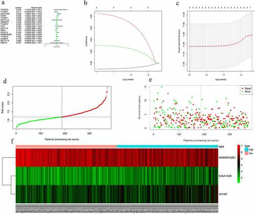
Figure 6. Screening of Prognosis-related m6A RNA methylation regulators. (a) Kaplan–Meier overall survival (OS) curves for patients in the TCGA datasets assigned to the low- and high-risk groups. (b) ROC curve for 5-year survival prediction and clinical characteristics, including age, stage, grade, and risk score. (c) Univariate Cox regression analysis of the associated between clinicopathological factors (including risk score) and overall survival of patients. (d) Multivariate Cox regression analysis of the associated between clinicopathological factors (including risk score) and overall survival of patients. (e) WTAP expression levels in different age groups. (f) The expression levels of HNRNPA2B1 in the TUMOR FREE group and the TUMOR group. (g) RISK SCORE in different age groups
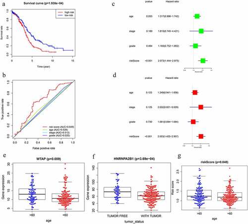
Figure 7. GSEA results and KEGG enrichment. (a) Top enriched KEGG pathways in the high risk group are represented by the curves above the x-axis in the graph. Top enriched KEGG pathways in the low risk group are represented by the curves below the x-axis in the graph (p-value < 0.05) in TCGA dataset. The names of enriched KEGG pathways are listed on the right side. (b) GSEA plots of KEGG Pathways in which the WTAP, KIAA1429 and HNRNPA2B1 were co-enriched
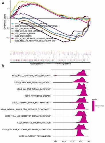
Figure 8. The nomogram to predict 3‐ or 5‐year OS in the entire set. (a) The nomogram for predicting proportion of patients with 3‐ or 5‐year OS. (b-c) The calibration plots for predicting patient 3‐ or 5‐year OS. Nomogram‐predicted probability of survival is plotted on the x‐axis; actual survival is plotted on the y‐axis. (d) DCA for assessment of the clinical utility of the nomogram. The x‐axis represents the percentage of threshold probability, and the y‐axis represents the net benefit. DCA: decision curve analysis; OS: overall survival
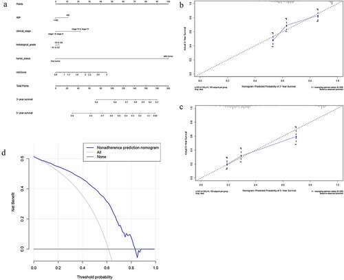
Table 1. Clinical significance of three prognosis-related genes
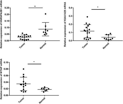
Figure 9. Expression level of WTAP, KIAA1429 and HNRNPA2B1 in clinical group
Supplemental Material
Download ()Data availability statement
The data and materials are available in The Cancer Genome Atlas (https://cancergenome.nih.gov/https://cancergenome.nih.gov/).