
Figures & data
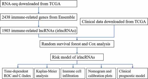
Figure 1. Establishment of the risk model. (a) Important variables selected using the random survival forest model. (b) Forest map of the multivariate Cox regression results. (c) ROC curve of the risk model for survival at 36 months, 30 months, 24 months, 18 months, 12 months and 6 months. (d) ROC curve of the clinical characteristics
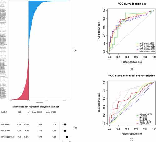
Figure 2. Clinical evaluation of the risk model in the training and test sets. (a-c) Kaplan-Meier analysis in the training set. (d-f) Kaplan-Meier analysis in the test set
Table 1. Univariate and multivariate Cox regression analysis for the clinical prognostic model
Figure 3. Nomogram and calibration plot of the clinical prognostic model. (a) Nomogram of the clinical prognostic model. (b-d) Calibration curves for the 1-, 3 – and 5-year survival plots comparing the actual and predicted values
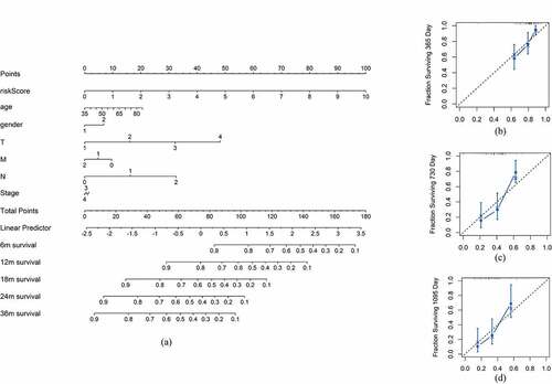
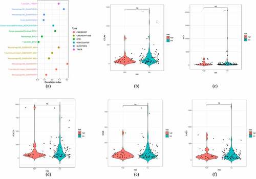
Figure 4. Exploration of the risk score and immune infiltration status. (a) Lollipop graph of the correlation between the immune cell infiltration status and risk score. (b-f) Violin plot of risk and ICI targets, including CTLA4, IDO1, PDCD1, ICOS, and LAG3
Supplemental Material
Download ()Data availability statement
The datasets supporting the conclusions of this article are available in the cancer
genome atlas (http://portal.gdc.cancer.gov/), immPort (http://import.org/) and TIMER (http://timer.cistrome.org/) database.