
Figures & data
Figure 1. Article overall idea design
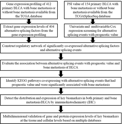
Figure 2. The UpSet plot of SEs and OS-SEs. (a) The number of ASEs in different types of splicing patterns; (b) The number of OS-SEs in different types of splicing patterns
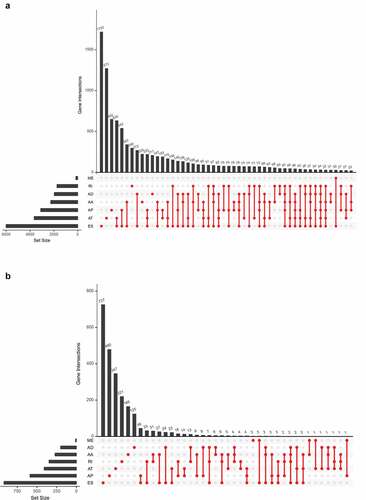
Figure 3. Enrichment analysis of ASEs and bubble charts showing top 20 OS-SEs in seven types of splicing patterns. (a) The volcano plot displaying the prognosis-related and no significant ASEs, respectively. (b) Bubble chart of AA. (c) Bubble chart of AD. (d) Bubble chart of AP. (e) Bubble chart of AT. (f) Bubble chart of ES. (g) Bubble chart of ME. (h) Bubble chart of RI
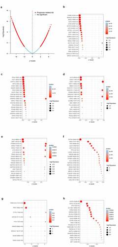
Figure 4. Establishment and assessment of the predict model. (a-b) Lasso regression for OS-SEs screening and removing high correlation genes to prevent over-fitting of the model. (c) Kaplan-Meier survival curves for patients in the low and high subgroups of the predict model demonstrating that risk score could significantly forecast the prognosis of patients with BLCA. (d) ROC curves demonstrating the accuracy of the model (AUC: 0.713). (e) The risk curve of each sample ranking by risk from low to high. (f) The scatter plot showing the trend of change in risk value and the increase in patient mortality as the risk increased and illustrating the clinical status with green and red dots representing survival and death, respectively. (g) The heatmap of expression level of 4 OS-SEs filtered by Lasso regression
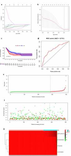
Figure 5. Cox regression analysis for evaluating the independent prognostic value of the risk score. (a) univariate and (b) multivariate Cox regression analysis verify that risk score can be the independent prognostic factor of BLCA
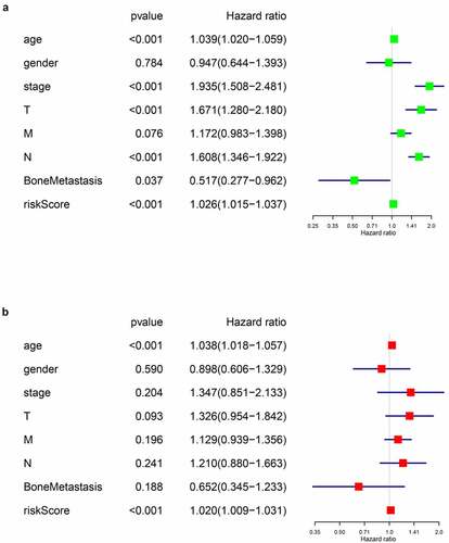
Figure 6. Alternative splicing network and clinical relevance. (a) Regulatory network of significantly co-expressed alternative splicing factors and alternative splicing events. The shape of arrow represents the splicing factor, the red circle shows high risk alternative splicing and the purple circle shows low risk alternative splicing. The red and green lines represent the positive and negative regulatory relationships between AS and SF respectively. (b) Venn plot OS-SEs related to clinical status and bone metastasis. (c) Beeswarm plots displaying SMOX-58,619-AP significantly related to bone metastasis. (d) Beeswarm plots displaying INO80C-45,170-AP significantly related to bone metastasis. (e) Beeswarm plots displaying ITGB4-43,489-ES significantly related to bone metastasis
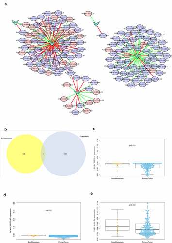
Figure 7. CorHeatmap of KEGG pathways and alternative splicing events that had prognostic value and were significantly associated with bone metastasis. GSVA pathway analysis and univariate Cox regression analysis identified survival related KEGG pathways, and co-expressed alternative splicing events related to prognosis and bone metastasis with survival related KEGG pathways
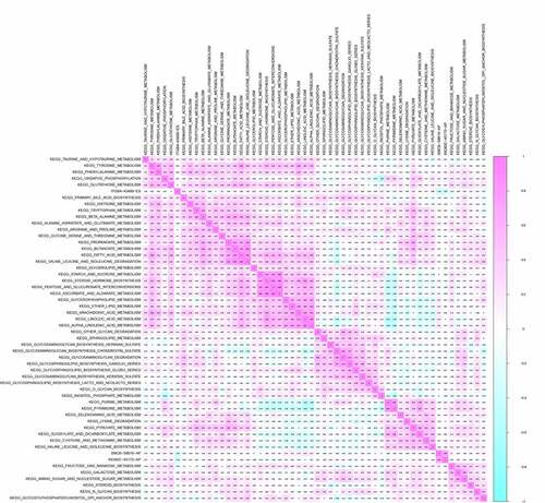
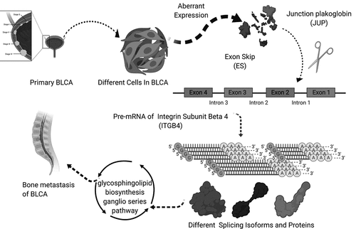
Figure 8. The speculative mechanism diagram including JUP, ITGB4 − 43,489− ES and glycosphingolipid biosynthesis ganglio series pathway
Abbreviation