
Figures & data
Figure 1. Panoramic view of the mutation of autophagy-related genes in pan-cancer. (a) Copy number variation gain frequency across cancer types. The redder the color, the higher the mutation frequency of the corresponding molecule in corresponding cancer. (b) Copy number variation loss frequency across cancer types. The bluer the color, the higher the loss frequency of the corresponding molecule in corresponding cancer. (c) Single nucleotide variation in pan-cancer. As the frequency of the mutation increases, the color on the small square changes from blue to red
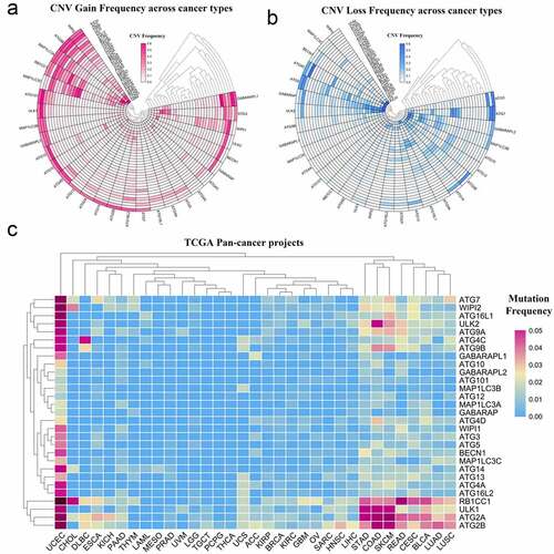
Figure 2. Panoramic view of the expression of autophagy-related genes in pan-cancer. (a) Gene expression across cancer types. (b) To more clearly show the difference in expression of these autophagy-related genes in tumors, a heat map of the corresponding – logP value of each gene in each tumor was constructed. The redder the color, the more intense the corresponding change in gene expression in corresponding cancer. (c) Gene expression across the oncomine database wherein red means activated and blue means suppressed. The larger the number, the darker the color, the greater the degree of change in its expression. (d) ATG9B gene expression in multiple tumors. Red represents tumor tissue and blue represents normal tissue
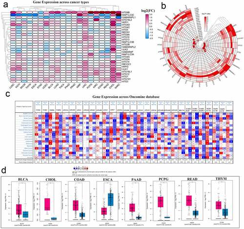
Figure 3. Correlation between autophagy-related genes and their relationship with methylation levels, cancer pathways, and drug sensitivity. (a) PPI networks between autophagy-related proteins. (b) Quantitative table of interactions between autophagy-related proteins. (c) Gene co-expression relationship across cancer types. Red represents a positive correlation and blue represents a negative correlation. (d) Co-expression relationship between ATG14 and ATG2B. (e) Methylation difference between tumor and normal samples. Red represents high expression and blue represents low expression. (f) Overall survival difference between hypermethylation and hypomethylation. Red represents high methylation levels as a high-risk factor, and blue represents high methylation levels as a low-risk factor. (g) Pathways analysis across 33 cancer types. Red represents activation and blue represents inhibition. (h) Sensitivity analysis of autophagy-related genes and mainstream anti-cancer drugs
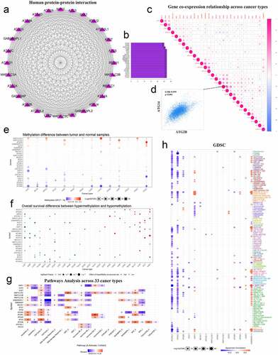
Figure 4. Hazard ratio analysis of autophagy-related genes in pan-cancer. (a) Risk analysis of autophagy-related genes in pan-cancer. Red represents the molecule acting as a risk factor in the corresponding tumor, and blue represents the molecule acting as a protective factor in the corresponding tumor. (b) A heat map corresponding to – logP value was drawn to more clearly show the results of risk analysis of autophagy-related genes in pan-cancer. The redder the color, the higher the credibility. (c) Expression of autophagy-related genes in KIRC patients. The redder the color, the higher the expression level, and the bluer the color, the lower the expression level. (d) Univariate Cox analysis of autophagy-related genes in KIRC patients. *P < 0.05, **P < 0.01, and ***P < 0.001
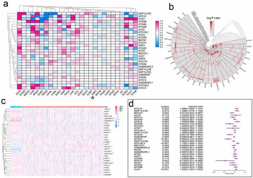
Figure 5. Cluster analysis of autophagy-related genes and their clinical relevance. (a) Consensus clustering matrix for k = 5. (b-c) Relative change in area under the cumulative distribution function (CDF) curve for k = 2–9. Consensus clustering CDF for k = 2–9. (d) Survival curves under different clusters. (e) Heat map between clinical features under different clusters. *P < 0.05
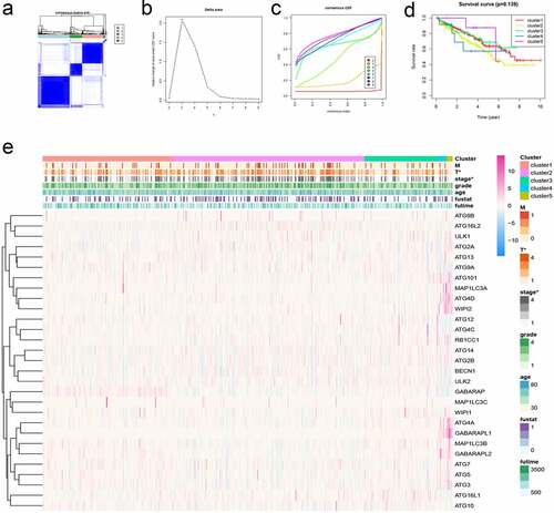
Figure 6. Using autophagy-related genes to establish prognostic risk model in KIRC. (a-b) Results of LASSO regression analysis and cross-validation. (c) Kaplan–Meier survival analysis between high-risk and low-risk groups according to the optimal cutoff value; (d) ROC curve for predicting 5-year survival time; (e) ROC curve for predicting 10-year survival time; (f) Heat map based on the correlation of this risk feature with clinical features. **P < 0.01, and ***P < 0.001
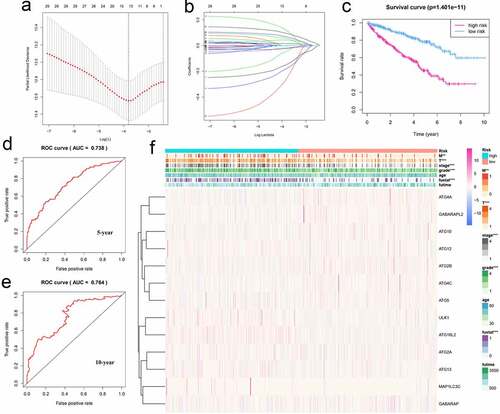
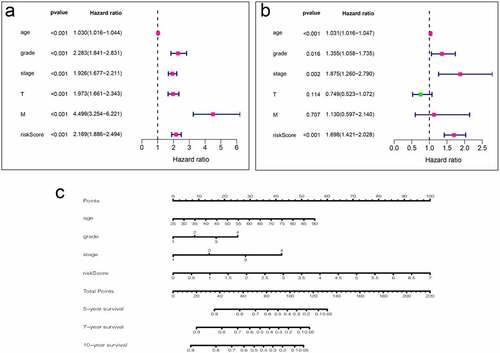
Figure 7. Analysis of clinical relevance of risk models. (a) Univariate Cox analysis. (b) Multivariate Cox analysis. (c) A new nomogram was drawn based on this prognostic risk signature. The value of each variable gets a score on the dot scale axis. The total score can be easily calculated by adding up each score and projecting the total score to a lower total score system. We can estimate the risk for predicting 5-, 7 – or 10-year survival in KIRC
Supplemental Material
Download ()Data Availability Statement
The data used to support the findings of this study are available from the corresponding author upon request.