
Figures & data
Figure 1. Associations of clinical information with stromal/immune scores of patients with sarcoma
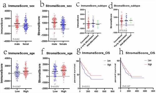
Figure 2. Gene levels in sarcoma and related scores. Heatmaps (a and b), volcanos (c and d), and Venn diagrams (e and f) regarding DEGs of high – versus low-stromal/immune score groups
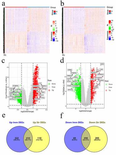
Figure 3. Functional analysis of DEGs. Bubble charts showing the 20 most significant GO terms among DEGs (a and b). Bubble charts showing the KEGG pathways among DEGs (c and d)
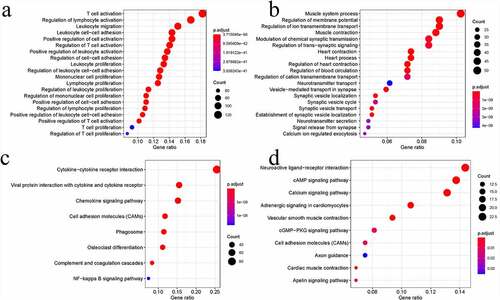
Figure 4. PPI sub-networks. (a–c) indicate the 3 PPI sub-networks constructed by the most significantly upregulated DEGs. (d) shows the PPI sub-network constructed by the downregulated DEGs. Node size stands for the connectivity degree. Blue and red colors indicate downregulated and upregulated genes, respectively. Color depth stands for fold change size. Edge thickness stands for combined score
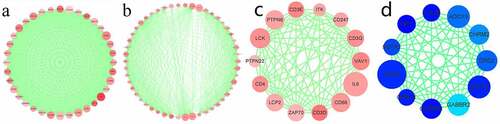
Figure 5. Matrix graphs for Pearson’s correlation analysis. a, b, and c are CCR gene, CXCL gene, and CCL gene, respectively. The correlations coefficients between the genes are shown in grid
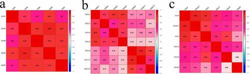
Figure 6. The survival analysis of CCR genes in sarcoma
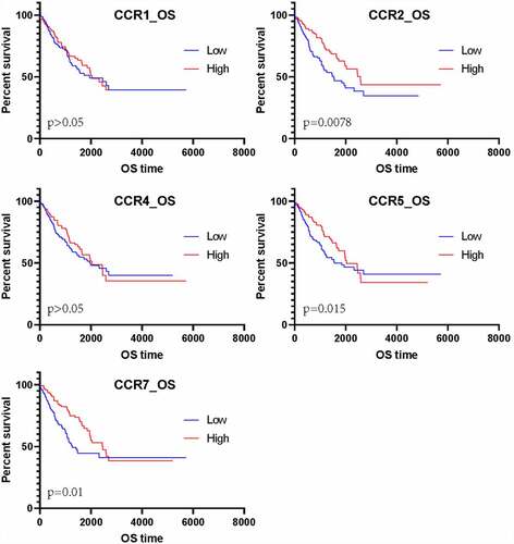
Figure 7. Immunohistochemical evaluation of CCR family protein expression in cancer and adjacent tissues. CCR2 in leiomyosarcoma (a) and synovial sarcoma (b). CCR4 in leiomyosarcoma (c) and synovial sarcoma (d). CCR5 in leiomyosarcoma (e) and synovial sarcoma (f). The expression of CCRs in tumor tissues is weaker than that in adjacent tissues in the same tumor at 200× magnification. The picture at the bottom right of each slice image is magnified 10 times again
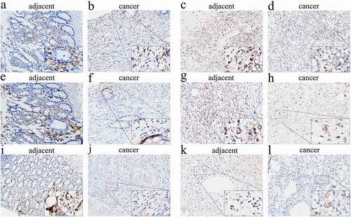
Table 1. Immune-related gene-based sarcoma prognosis prediction model
Figure 8. The prognostic risk assessment of immune-related genes in sarcoma. (a) Univariate regression for immune genes. (b) RS values, distribution of survival status, and heatmap for the seven prognosis-related immune genes are shown from top to bottom. (c) Kaplan–Meier curves of the two groups. (d) Violin map of seven prognostic immune genes expressed in the high – and low-risk groups
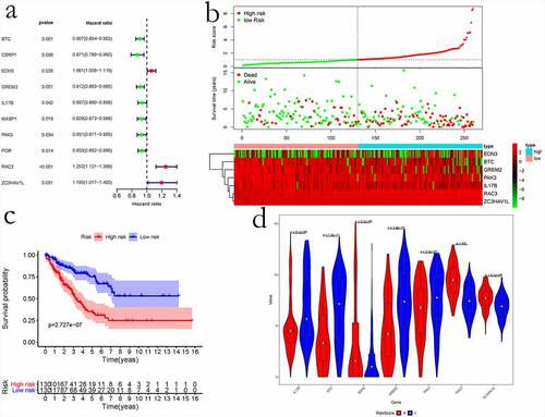
Figure 9. Evaluation of the immune-related gene-based prognostic model. a, ROC analysis to predict sarcoma prognosis according to the risk score value. b, Univariate and multivariate regression analyses are shown from left to right
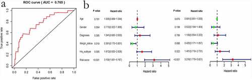
Figure 10. Kaplan–Meier analysis for event-free survival and overall survival in high – and low-risk patients with sarcoma derived from the GSE17674 dataset
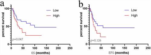
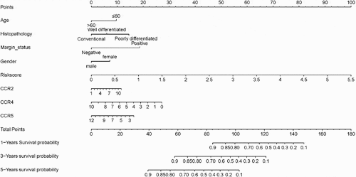
Figure 11. The nomogram for predicting 1-, 3 – and 5-year overall survival of sarcoma patient
Supplemental Material
Download ()Availability of data and materials
The data used for analysis are available on the online public and free open platforms (TCGA: https://portal.gdc.cancer.gov/; GEO: https://www.ncbi.nlm.nih.gov/geo/; IMMPORT data: https://www.immport.org/), and the specimens used for verification are available at our institution.