Figures & data
Figure 1. Computational flow of hindcast experiment and forecast experiments.
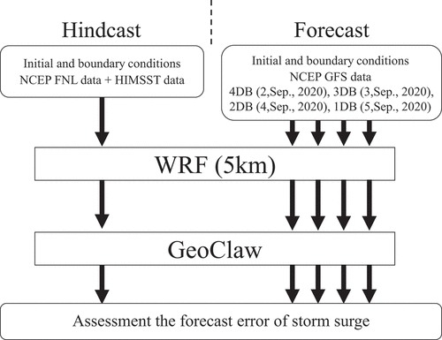
Table 1. Computational settings for WRF
Figure 2. Simulation fields of WRF and GeoClaw. (a) Green line indicates the GeoClaw simulation area, red line indicates the WRF domain 1 simulation area, and blue line indicates the WRF domain 2 simulation area. (b) Blue points indicate storm surge observation sites. 1:Reihoku, 2:Kuchinotsu, 3:Fukue, 4:Oura, 5:Kagoshima, 6:Makurazaki, 7: Aburatsu, 8:Tosa-Shimizu, 9:Uwajima,10: Matsuyama. (c) This is topography data with 270 m resolution of GeoClaw. Red points are corresponding to No. 1–4 in (b).
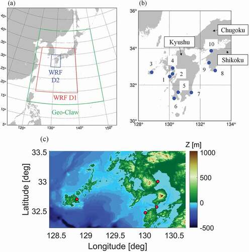
Table 2. Computational settings for GeoClaw, outline of the simulation settings
Table 3. Refinement criteria for the sea surface height Twave, water speed Tspeed, and wind speed Twind. The lists of tolerances correspond to level criteria, i.e. the first entry is the tolerance for moving from levels 1 to 2
Figure 3. Computational flow of simple ensemble experiments for storm surge (SEES) .
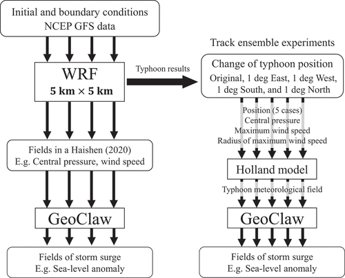
Figure 4. Time series of central pressure for Haishen (2020). Black line is JMA best track, the red diamond line is hindcast simulation (CNTL), the Orange circle line is 4 days before, the blue X line is 3 days before, the green triangle line is 2 days before, and the purple square line is 1 day before. Note that Orange, blue, green, and purple lines are the results of forecast experiments. The vertical axis represents the central pressure of the typhoon, and the horizontal axis represents the time; the typhoon attenuates from left to right.
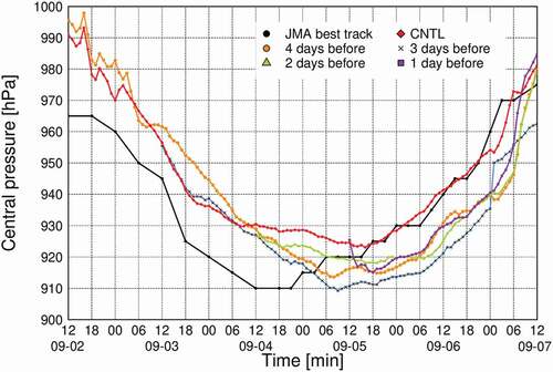
Figure 5. Typhoon tracks simulated by WRF. Each line color follows . The symbols plotted in every hour constantly. Blue point indicates the port of Oura. The daily typhoon positions by JMA best track are also shown.
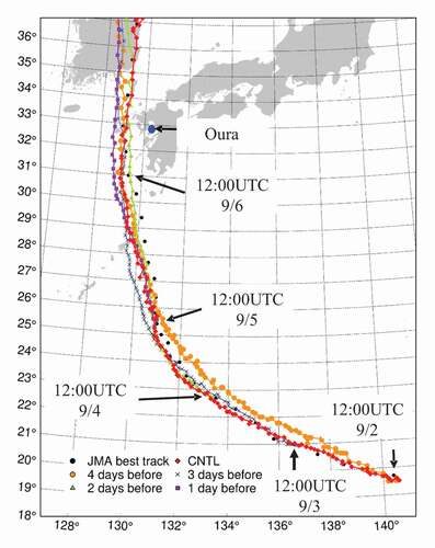
Figure 6. Scatter plot of wind speeds observed in Kyushu and western Shikoku and wind speeds by WRF. The red dots represent the values in western Kyushu near the typhoon, and the blue dots represent the values in eastern Kyushu and western Shikoku. BIAS represents the bias error, RMSE represents the root mean square error, and CORR represents the correlation coefficient. The black line represents y = x and the green line represents the regression line.
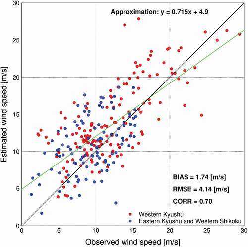
Figure 7. Time series of storm surges at the Port of Oura. The vertical axis represents the height of the storm surge, and the horizontal axis represents time. The color solid lines indicate the results of WRF-GeoClaw coupled model, and the color dashed lines indicate the results of PTC model. Each line color follows .
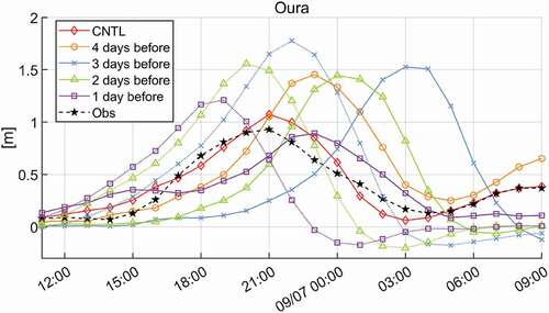
Table 4. Summary of results of storm surge forecast simulation by atmosphere-storm surge coupled model. CNTL is the hindcast simulation result. Based on September 6 2020, it is defined as 4 days before, 3 days before, 2 days before, and 1 day before
Figure 8. Differences in the maximum flow velocity of seawater flowing to the Ariake Sea between (a) 4 DB, (b) 3 DB, (c) 2 DB, and (d) 1 DB. Ariake Sea is indicated inside the black line, and yellow point means the Port of Oura. The color bar shows the flow velocity, blue is low flow velocity and red is high flow velocity.
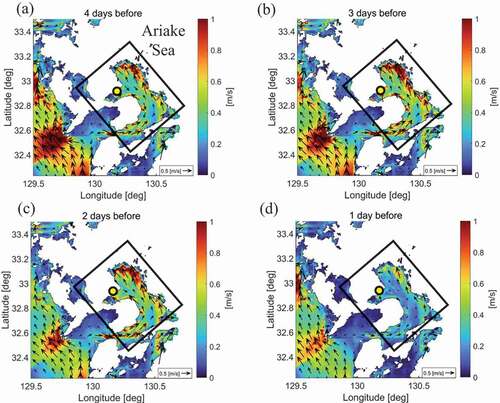
Figure 9. Time series of storm surges at the Port of Oura by SEES ((a) 4 DB, (b) 3 DB, (c) 2 DB, and (d) 1 DB). The vertical axis represents the height of the storm surge, and the horizontal axis represents time. The red diamond line is original from the WRF results, the Orange circle line represents moving the typhoon track east at 1 degree, the blue X line represents moving the typhoon track west at 1 degree, the green triangle line represents moving the typhoon track south at 1 degree, and the purple square line represents moving the typhoon track north at 1 degree.
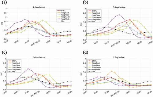
Figure 10. Scatter plot of maximum storm surge occurrence time error and storm surge deviation at each site. Orange is the result of 4 DB, blue is 3 DB, green is 2 DB, and purple is 1 DB. The shape of the symbol is the same as that in Figure 9. X represents the observed value, and the star represents the average value of all cases. Note that the results are not displayed in the figure for simulations with a time error of 720 minutes or more.
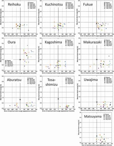
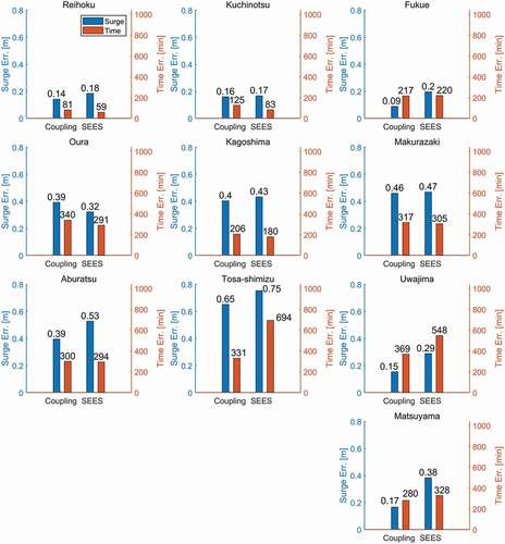
Figure 11. The averages of the error by WRF-GeoClaw coupled model and SEES for the 10 sites of the storm surge calculation. Blue and red indicate maximum storm surge error and peak time errors, respectively, with the left and right vertical axes corresponding to storm surge error and time error.