Figures & data
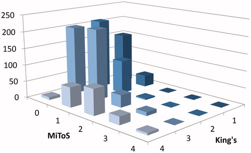
Figure 1. Flowchart of ALS staging systems and their definitions (King’s staging and MiToS staging).
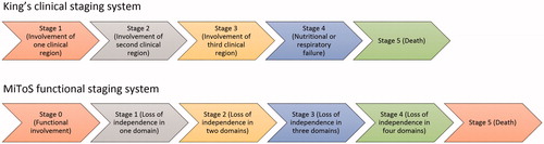
Table 1. Characteristics of LiCALS patients. Median time to death or last observation and percentage of death at last observation compared using different categories (gender, site of onset, family history and age of onset).
Figure 2. Box plot for Standardised Median Time (SMT) from onset to each disease stage. (A) SMT for King’s stages. (B) SMT for MiToS stages. The y-axis represents the proportion of disease time elapsed, where 0 is disease onset and 1 is death. Horizontal lines on each plot represent the following: minimum, lower quartile, median, upper quartile and maximum values, read from bottom to top. Mean values are marked by ‘x’ and outliers by ‘•’.
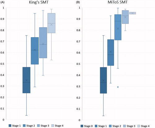
Table 2. Median number of months and Standardised Median Time (SMT) from onset to each stage. (A) King’s staging system, (B) MiToS staging system. Patients dead on last observation were recorded and median time from onset to each stage used and repeated for each stage in both staging systems. IQR = Interquartile range.
Figure 3. Three-dimensional bar chart showing the count of patients in each clinical stage by both systems. The y-axis represents the number of patients, x-axis the MiToS stage (0-4) and z-axis the King’s stage (Citation1–4) of disease progression.