
Figures & data
Figure 1. Consort diagram showing numbers of cases included in each outcome analysis.
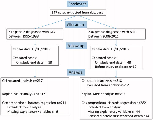
Figure 2. Kaplan-Meier graph showing proportion of people alive at different time points. The dotted line is the 2008-2011 cohort, the solid line shows the 1995–1998 cohort. We have shown the 95% confidence intervals on the graph, indicated by the shaded areas and dotted lines. Overlap of the confidence intervals does not demonstrate lack of statistical significance (Citation24).
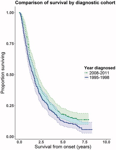
Table 1. Summary statistics showing the case mix of each cohort.
Table 2. Results of the Cox proportional hazards survival analysis. The El Escorial Category ‘clinically-probable, laboratory supported’ only appeared in cohort 2 (2008–2011) and was grouped together with ‘probable’ for the analysis. Site of onset was classified into bulbar and spinal. Spinal onset included people with respiratory and limb onset. One person had cognitive onset reported only, and as the diagnosis was of ALS rather than a bulbar subtype, they were classed as spinal onset ALS.
Table 3. Variation in data explained by model. Pseudo r-squared values were calculated using McFadden’s method (Citation18). The total variation was calculated using McFadden’s method on the overall model and by adding the calculation from each explanatory variable. As they vary slightly both values are presented here.