
Figures & data
Figure 1. An example of the images in MHSMA dataset. Both images represent the same sperm. One is 128x128 pixels, and the other one is cropped 64x64 pixels.
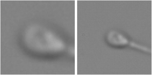
Figure 2. Images and labels of MHSMA dataset for different parts of sperm such as vacuole, tail, head, and acrosome.
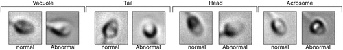
Table 1. Number of positive and negative samples in MHSMA dataset. There are 1,540 sperm images in the dataset labelled as normal or abnormal.
Figure 3. The AD procedure in our proposed method. This flowchart shows how we determine whether a raw image is normal or abnormal.
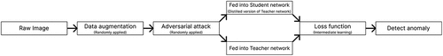
Figure 4. Visualized summary of our method, an offline distillation approach. LSn is the layer of the student network and LTn is the teacher one. Also, this figure roughly shows which layers we use as critical layers.
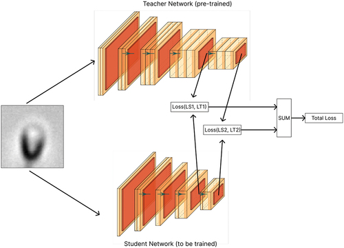
Figure 5. Distance vectors for normal and abnormal samples. This figure shows the distance of several samples of normal and abnormal sperm that we detect anomalies based on that. This graph is obtained from the actual data of this dataset after training the model.
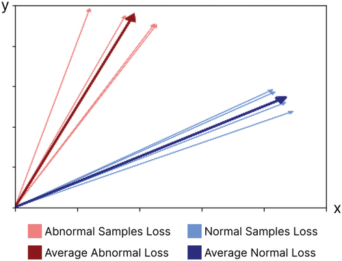
Figure 6. The architecture of the VGG16 network encoder (without the linear layers). This network is used as a teacher network in our method.
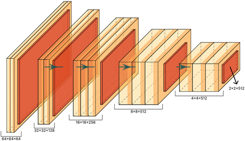
Figure 7. Model A: a simple network proposed to analyze the distillation effect. This network is used as a student network in our method.
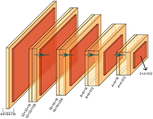
Figure 8. Model B: the architecture of proposed student network. This network is used as a student network in our method.
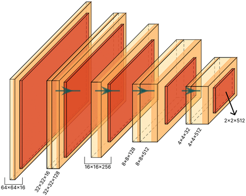
Figure 9. Example of a sperm image in the dataset with flip augmentation applied during the training phase.
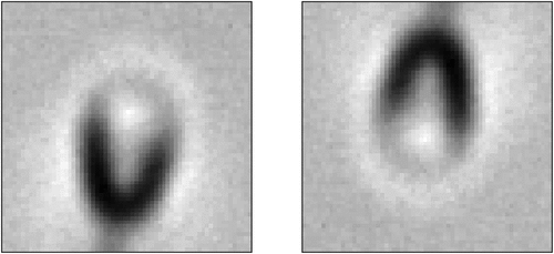
Figure 10. Example of a sperm image in the dataset with rotate augmentation applied during the training phase.
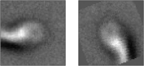
Figure 11. Gradient vector calculated from an image. This vector is used to add an adversarial attack to the image based on the value of gradients.
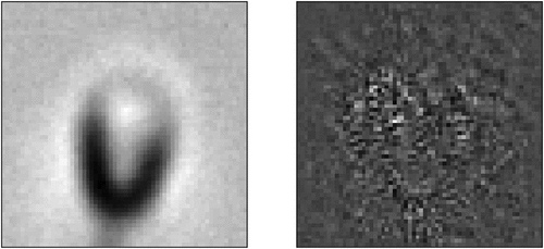
Figure 12. The steps of creating an attacked image from a normal image. Summing up the image with the epsilon portion of the sign of the gradients creates an attacked image.
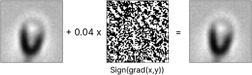
Table 2. The outcomes of each part of sperm produced by the proposed method. The optimal setup of the suggested approach on the test set yielded these results.
Table 3. Confusion matrix of the proposed method for each part of the sperm. These results are achieved from the evaluation phase on the test set.
Table 4. Comparison of our results with those achieved by Ghasemian et al. (Citation2015) and Javadi and Mirroshandel (Citation2019) on each part of sperm evaluated on the test set of the MHSMA dataset.
Figure 13. Boxplot of total loss mean for two groups. This plot indicates that the mean of the two groups is different.
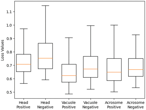
Table 5. ANOVA test results for comparison of our results with those achieved by Javadi and Mirroshandel (Citation2019).
Figure 14. Anomaly localization map on abnormal samples from the test set. This map shows which parts of the image the model paid more attention to.
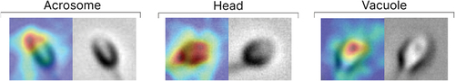
Table 6. Results achieved with distinct values on validation set. Different
values can balance the effect of multiple losses.
Figure 15. The result of using different architectures for student networks. Model a has a simple architecture. Model B has the proposed student architecture. Model C has the same architecture as the teacher network.
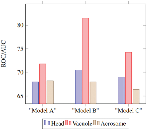
Table 7. Number of trainable parameters in three proposed models to show the effect of distillation. Changing the architecture of each network changes the number of its trainable parameters.
Table 8. Effect of critical layers on the performance of the proposed method. These results show how changing the number of critical layers in loss calculation can affect performance.
Table 9. Model performance metrics comparison with and without data augmentation and adversarial attack.
Appendix A. Table of abbreviations used in the text with their description.