Figures & data
Figure 1. Selecting k using gap statistic.
Note: The number of Monte Carlo (‘bootstrap’) samples is restricted to 100.
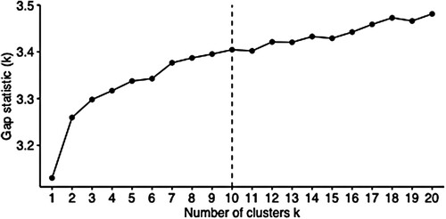
Figure 2. Total within-cluster sum of squares for iterations of k-means clustering.
Source: Census 2011 Small Area Layer; authors’ own estimates.
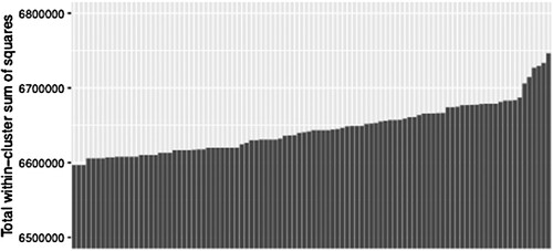
Table 1. Sensitivity test results.
Table 2. Neighbourhood types and selected descriptors.
Figure 3. Johannesburg (left) and Ekurhuleni (right).
Source: Census 2011 Small Area Layer; authors’ own estimates.
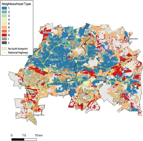
Figure 4. Tshwane.
Source: Census 2011 Small Area Layer; authors’ own estimates.
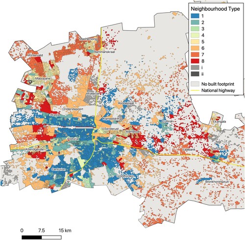
Figure 5. Cape Town.
Source: Census 2011 Small Area Layer; authors’ own estimates.
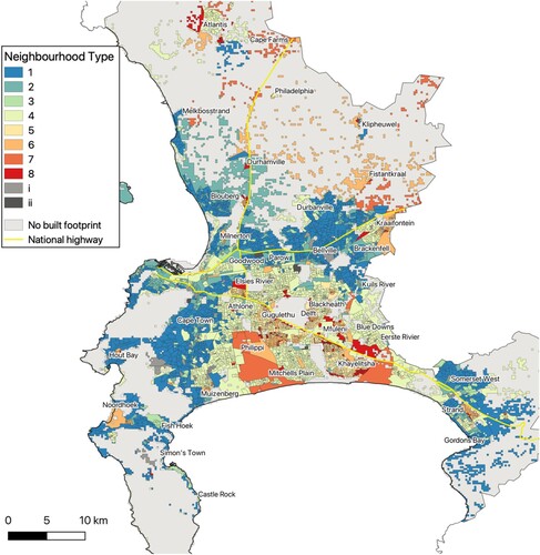
Figure 6. eThekwini.
Source: Census 2011 Small Area Layer; authors’ own estimates.
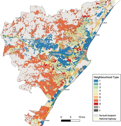
Figure 7. Nelson Mandela Bay.
Source: Census 2011 Small Area Layer; authors’ own estimates.
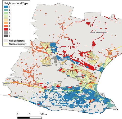
Figure 8. Buffalo City.
Source: Census 2011 Small Area Layer; authors’ own estimates.
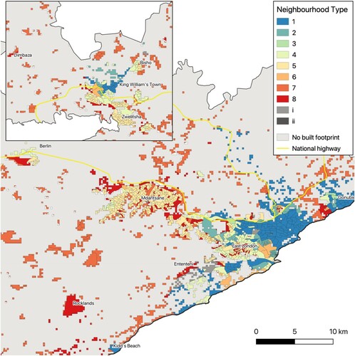
Figure 9. Mangaung.
Source: Census 2011 Small Area Layer; authors’ own estimates.
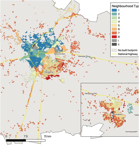
Figure 10. Racial breakdown by neighbourhood type.
Source: Census 2011; authors’ own estimates.
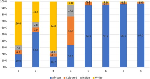
Figure 11. Social status and neighbourhood clusters.
Note: Kernel density distributions.
Source: Census 2011; authors’ own estimates.
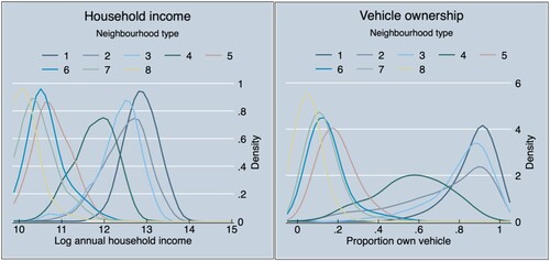
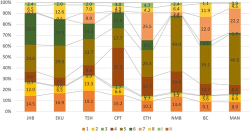
Figure 12. Population distribution of neighbourhood types across metros.
Note: JHB, Johannesburg; EKU, Ekurhuleni; TSH, Tshwane; CPT, Cape Town; ETH, eThekwini; NMB, Nelson Mandela Bay; BC, Buffalo City; and MAN, Mangaung.
Source: Census 2011; authors’ own estimates.