Figures & data
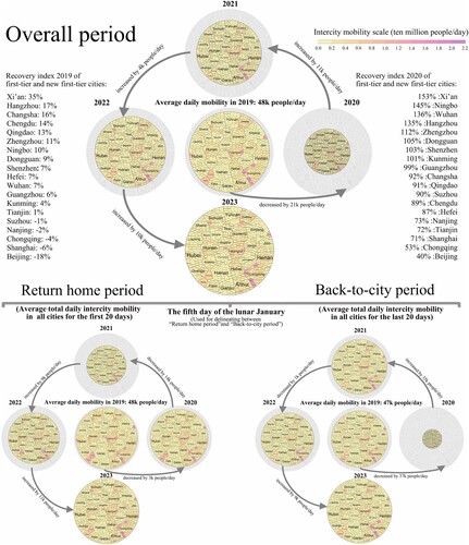
Figure 1. Intercity mobility patterns during the Spring Festival travel rush, 2019–2023.
Note: Shaded regions indicate reduced mobility. 2023 as the benchmark group with all other years being compared to it. Colour represents the intercity mobility volume of each city. Circle size represents total daily average intercity mobility for all cities in each year.
Source: Gaode Maps (https://report.amap.com/migrate/page.do).
Methods: The Weightedtreemaps package in R.  , where year total refers to total intercity mobility during the overall period in the given year.
It shows the observed intercity mobility patterns during the Chinese Spring Festival travel rush from 2019 to 2023: Three intercity mobility patterns encompassing the return home period (first 20 days), the back-to-city period (last 20 days), and the overall period (total 40 days).