
Figures & data
Table 1. The top 20 differentially expressed lncRNAs.
Figure 1. The statistical frequency of every lncRNA.
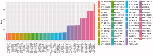
Table 2. Significantly changed lncRNAs with frequency more than 300.
Figure 2. lncRNA-Protein interaction net-work.
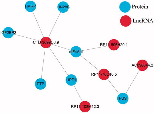
Figure 3. The AUC curves of 11 lncRNAs in multivariate survival analysis. (A) the AUC curves; (B) Kaplan–Meier survival analysis.
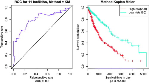
Table 3. Significant analysis and HR of seed lncRNAs.
Figure 4. Kaplan–Meier survival analysis of clustering method of 11 lncRNAs.
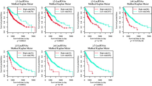
Figure 5. Box line diagram of significant p values for each model. p values were obtained from one thousand random survival analyses on the different clustering methods of six gene models.
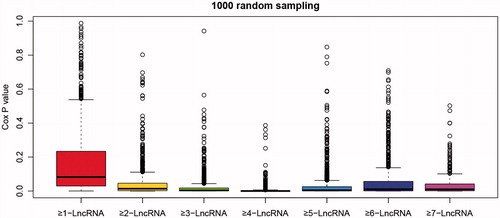
Figure 6. Kaplan–Meier survival analysis of different clustering algorithm. Each square is the risk score of clustering algorithm of 11 lncRNAs. Domains in red (marked with stars) represent the significant influences on the prognoses with p value < .05. The right ordinate is the gene model of each gene group; the horizontal ordinate is the classification according to the TNM.
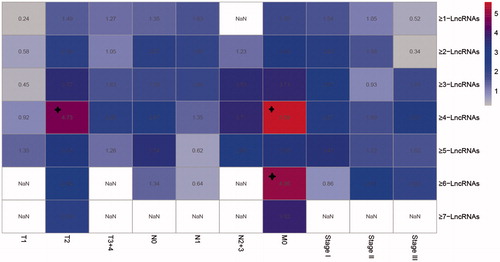
Table 4. Sample counting of TNM.