
Figures & data
Table 1. The information of TCGA-UCEC data.
Figure 1. The flow chart.
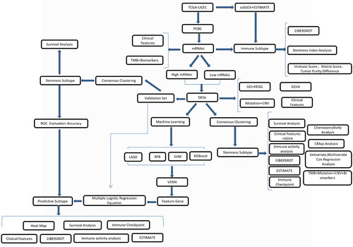
Figure 2. Correlations between mRNAsi and clinical features, TMB, and biomarkers. (A) Relationship between the mRNAsi distribution and clinical features, including subtype, immune subtype, mutation count, grade, and stage. The columns represent the mRNAsi samples arranged from low to high. Rows represent different features. (B) Violin diagram showing mRNAsi differences in the different clinical feature groups. (C) An overview of the association between mRNAsi and patient TMB and gene mutations, with columns representing the mRNAsi samples in the order of low to high and the rows representing different characteristics. (D) The relationship between mRNAsi and the different characteristic groups in the UCEC patient samples, grouped by TMB height and the mutation status of TP53, PTEN, KRAS, CEACAM5, APC, FGFR2, and MUC18. *p < 0.05, **p < 0.01, ***p < 0.001, ****p < 0.0001, ns: p > 0.05.
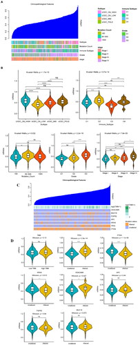
Figure 3. Analysis of the immune subtypes, mRNAsi, and immune infiltration. (A) Immune subtypes were classified according to the overall immune activity of UCEC. Behavioural immune cells were classified as samples. Red and blue indicate high and low levels of immune cell enrichment, respectively. The tumour microenvironment score is shown at the top of the heat map. (B) Box plots show the differences in the mRNAsi between the high- and low-immunity groups. Green and yellow represent high and low immunity, respectively. (C) Correlation analysis between the mRNAsi and the matrix, ESTIMATE, and immune scores which were assessed using the ESTIMATE algorithm. (D) Boxplot comparisons of the stroma, ESTIMATE, and immune scores for the different immune subtypes. (E) Comparison of the abundance of the 22 immune cell types in the immune subtypes. (F) Correlation analysis between immune cells and mRNAsi: red indicates a correlation coefficient <0, and green indicates a correlation coefficient >0. (G) The correlation curves of the abundance of 4 immune cells with strong positive and negative correlation coefficients and mRNAsi are displayed. *p < 0.05, **p < 0.01, ***p < 0.001, **** < 0.0001.
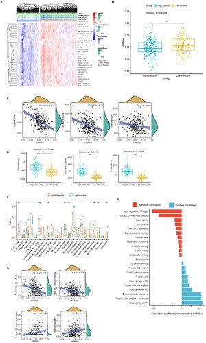
Figure 4. Clinical features of the different mRNAsi groups, GO, KEGG, mutation, and CNV of DEGs. (A) OS analysis: the red line indicates high mRNAsi and the green line indicates low mRNAsi. (B) The heat map shows the DEG expression levels between the two groups. The red group represents high expression, and the blue group represents low gene expression. (C) Differences in the clinical characteristics between high- and lo—mRNAsi groups. Columns represent samples, and rows represent known clinical features. (D) Functional enrichment analysis of the DEGs, including BP, CC, and MF. (E) Scatter plot of the KEGG pathway enrichment statistics. In the figure, the circle size represents the number of genes enriched (count), the colour intensity represents the size of q value value. The darker the red, the higher the significance level. BP, biological process; CC: cell composition; MF: molecular function. (F) The differential enrichment pathways between the high- and low-mRNAsi groups. Each small box represents the enrichment score of each patient. Colour changes indicate the enrichment score, with red and blue representing high and low scores, respectively. The grouping of each patient is shown at the top of the heat map. (G) Waterfall diagram showing the 10 genes with the highest mutation frequency from the DEGs. Different colours indicate different mutation types. (H) Circos plot shows the CNV of the DEGs, with red indicating amplification and blue indicating deletion.
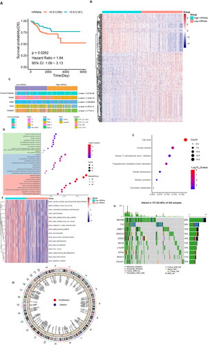
Figure 5. Identification and analysis of the stemness subtypes using their DEGs. (A) The consistency matrix graph shows the clustering situation when K = 2, which is the optimal clustering number. (B) The CDF plot shows the consensus distributions of each K; K = 2–10. (C) Delta area shows the relative change in stability; K = 2–10. (D) Survival analysis shows the differences in survival between stemness subtype I and stemness subtype II. (E) Heat map showing the expression levels of 287 DEGs, with red indicating high expression and blue indicating low expression. The stemness subtype, immune group, TCGA subtype, immune subtype, and mRNAsi for each patient are shown at the top of the heat map. (F) The consistency matrix graph shows the clustering situation when K = 2, which is the optimal clustering number. (G) The CDF plot shows the consensus distributions of each K; k = 2–9. (H) The delta area shows the relative change in stability; k = 2–9. (I) Survival analysis shows the OS differences between stemness subtypes I and II. (J) Differences in the clinical features between the stemness subtype I and stemness subtype II groups. Columns represent samples, and rows represent clinical features. (K) Differential enrichment pathways between stemness subtypes I and II are displayed. Each small box represents the enrichment score of each patient. Colour changes indicate the level of enrichment score: red and blue represent high and low scores, respectively, and the grouping of each patient is shown at the top of the heat map. (L) TCGA data set univariate Cox regression analysis. Significant factors include mRNAsi and the stemness subtype. (M) TCGA data set multivariate Cox regression analysis. The significant factor is the stemness subtype.
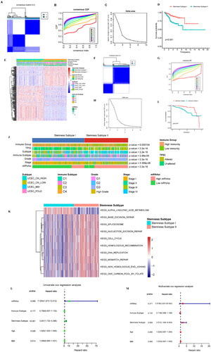
Figure 6. Analysis of the stemness subtype TMB, gene mutation, CNV, immune microenvironment, and immune checkpoint gene. (A) The violin diagram shows the TMB differences between the stemness subtypes, with green and yellow representing stemness subtypes I and II, respectively. (B) Waterfall diagram showing the 10 genes with the highest mutation frequency in the stemness subtype I and stemness subtype II samples. Different colours indicate different mutation types. (C) Analysis of the copy number differences between stemness subtypes I and II, with red and blue indicating amplification and deletion, respectively. GISTIC analysis assigned each variation a G-score, which indicated the magnitude of the variation. (D) The G-score differences between stemness subtypes I and II were analysed using box plots. (E) Gene mutations in different stemness subtypes: sky blue and brown indicate that the gene did not and did mutate in the sample, respectively. (F) Box plot showing the differences in immune activity in the stemness subtypes. (G) Differences in the immune cells in the different groups. (H) Fiddle plots were used to compare the differences in immune, stroma, and ESTIMATE scores for the different stemness subtypes. (I) Differences in the distribution of the immune subtypes in different stemness subtypes; sky blue and brown represent low and high immunity levels, respectively. (J) Immune checkpoint gene difference analysis, with red and green representing stemness subtypes I and II, respectively. *p < 0.05, **p < 0.01, ***p < 0.001, ns: p > 0.05.
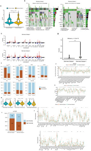
Figure 7. Prediction of the immunotherapeutic response between cancer subtypes, sensitivity analysis of chemotherapeutic drugs between stemness subtypes, and identification of potential subtype compounds. (A) Submap prediction of the immunotherapy responses among the cancer subtypes. (B) Box diagram showing the sensitivity of the chemotherapies between the stemness subtypes, with red and green indicating stemness subtypes I and II, respectively. (C) Scatter diagram showing the relationship between compounds and MoA, with rows representing MoA and columns representing compounds.
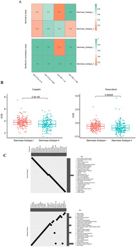
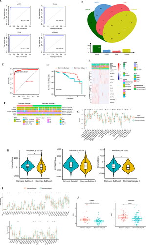
Figure 8. Machine learning approaches to build and validate a stemness subtype predictor. (A) LASSO, Boruta, SVM, and XGBoost feature selection performance evaluation; the AUC was generated using ROC curve analysis. (B) The characteristic genes shared by the 4 machine learning algorithms were determined using a VENN diagram, and 12 genes were identified as important. (C) ROC curve for characteristic gene prediction to validate the cluster stemness subtypes. (D) OS predicted by stemness subtypes. (E) The heat map shows the expression levels of characteristic genes in the validation set, with red and blue indicating high and low expression, respectively. Distribution of the clinical characteristics for each patient is shown at the top of the heat map, including the OS differences between mRNAsi, TP53 mutation status, TCGA subtype, immune subtype, grade, stage, and stemness subtype. (F) Differences in the clinical features between the stemness subtypes I and II. Columns represent samples, and rows represent clinical features. (G) Comparison of the abundance of 22 immune cells in the immune subtypes. (H) Fiddle plots were used to compare differences in the immune, ESTIMATE, and stroma scores for the different stemness subtypes. (I) Immune checkpoint gene difference analysis: red and green represent stemness subtypes I and II, respectively. (J) Case diagram shows the sensitivity of the chemotherapies between the stemness subtypes, with red and green indicating stemness subtypes I and II, respectively. *p < 0.05, **p < 0.01, ***p < 0.001, ns: p > 0.05.
Supplemental Material
Download MS Excel (87.8 KB)Supplemental Material
Download MS Excel (18.2 KB)Supplemental Material
Download MS Excel (18.9 KB)Supplemental Material
Download MS Excel (65.9 KB)Supplemental Material
Download MS Excel (14.3 KB)Supplemental Material
Download MS Excel (8.8 KB)Supplemental Material
Download MS Excel (8.6 KB)Supplemental Material
Download MS Excel (33 KB)Supplemental Material
Download MS Excel (26 KB)Supplemental Material
Download MS Excel (110.9 KB)Supplemental Material
Download MS Excel (67.1 KB)Supplemental Material
Download MS Excel (9.7 KB)Supplemental Material
Download MS Excel (12.2 KB)Supplemental Material
Download MS Excel (15 KB)Supplemental Material
Download MS Excel (10.5 KB)Supplemental Material
Download MS Excel (9.5 KB)Supplemental Material
Download MS Excel (12.6 KB)Supplemental Material
Download MS Excel (30.6 KB)Supplemental Material
Download MS Excel (9.3 KB)Supplemental Material
Download MS Excel (70.7 KB)Supplemental Material
Download MS Excel (15 KB)Supplemental Material
Download MS Excel (28.2 KB)Supplemental Material
Download MS Excel (136.4 KB)Supplemental Material
Download MS Excel (28.4 KB)Data availability statement
Publicly available datasets were analysed in this study. This data can be found here: https://www.cancer.gov/about-nci/organization/ccg/research/structural-genomics/tcgaunding.