Figures & data
Figure 1. Immune cell subpopulations and GSEA analysis (A-B) The t-SNE projection of all cells. (A) All cell subpopulations. Different colours represent different cell subpopulations, dots represent cells. (B) The detailed treatment of PBMCs. (C-D) GSEA analysis for monocytes (C), pDC cells (D). (E-F) GSEA identified up-regulated antifungal pathways for monocytes (E) and pDC cells. Running Enrichment score represents pathway activity. If it is beyond 0 represents up-regulated activity, otherwise, it represents down-regulated pathway activity.
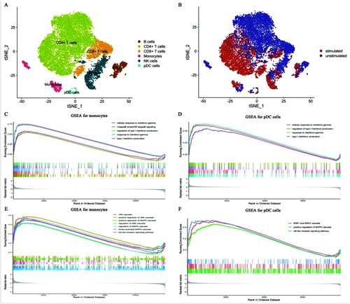
Figure 2. The results of DEGs and GO analysis (A) Venn diagram for DEGs of all cell subpopulations. The bar diagram showed the numbers of DEGs among different immune cells. (B-D) GO analysis was conducted for shared DEGs (B), unique DEGs of monocytes (C), and unique DEGs of CD8+ T cells (D). Nodes represented the enriched terms. Size of nodes corresponding to significant levels. The thickness of the line represented the numbers of shared genes between terms.
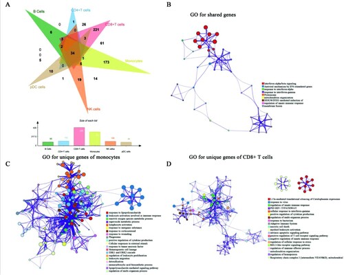
Figure 3. Heterogenous pathway activities and the transcript levels of immune checkpoints (A) The heatmap for pathway activities of all cell subpopulations. Red represented high viability and blue represented low activity. Monocytes up-regulated several immune pathways during infection. (B) The violin diagram showed the average score of pathways among all immune cells. Monocytes showed the highest pathway activity. (C) t-SNE identified the single-cell expressions of immune checkpoints and costimulatory molecules. High expression was in yellow and red nodes, while low expression was drawn in blue.
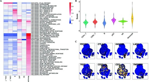
Figure 4. LAG3 and HAVCR2 were highly expressed during C. albicans infection. After infection, PBMCs were analyzed by flow cytometry. (A) The percent of live CD45+CD3+CD8+LAG3+. (B) Statistical analysis of live CD45+CD3+CD8+LAG3+ from 3 healthy donors. (C-D) The flow cytometry results of HAVCR2 based on 3 healthy donors. (*p < 0.05; **p < 0.01; ***p < 0.001). CD45+CD3+CD8+LAG3+ and CD45+CD3+CD8+LAG3+ increased cell numbers after C. albicans infection.
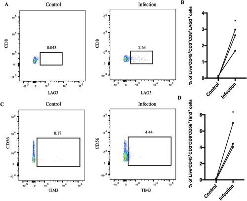
Figure 5. Single-cell transcript levels of immune checkpoint’s ligands (A) The ligands for Tim-3/HAVCR2. (B) The ligands for LAG-3. High expression was in yellow and red nodes, while low expression was drawn in blue.
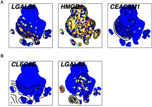
Figure 6. WGCNA for monocytes (A-C) The results of WGCNA. (A) Gene dendrogram and module colours. The genes with similar expression patterns were divided into the same modules. (B) The relationships between all modules and traits. Red represented positive correlations and blue represented negative correlations. The blue module was identified in the subsequent analyses. (C) Scatter plot of module eigengenes in the blue module. This represented the correlations between genes and the blue module. (D) The single-cell transcript levels of top 10 hub genes.
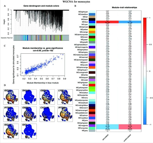
Figure 7. WGCNA for CD8+ T cells (A-C) WGCNA screened out the hub genes of CD8+ T cells. (A) Gene dendrogram and module colours. The genes with similar expression patterns were divided into the same modules. (B) The relationships between all modules and traits. Red represented positive correlations and blue represented negative correlations. The turquoise module was identified in the subsequent analyses. (C) Scatter plot of module eigengenes in the turquoise module. This represented the correlations between genes and the turquoise module. (D) The single-cell transcript levels of top 10 hub genes.
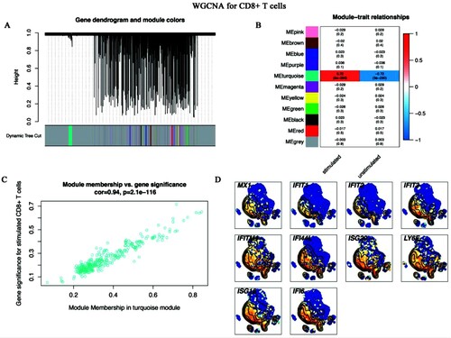
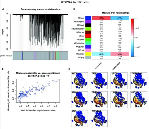
Figure 8. WGCNA for NK cells (A-C) WGCNA algorithm was used to construct co-expression modules. (A) Gene dendrogram and module colours. The genes with similar expression patterns were divided into the same modules. (B) The relationships between all modules and traits. The blue module was identified in the subsequent analyses. Colours corresponding to the degree of correlations between clinical traits and modules. (C) Scatter plot of module eigengenes in the blue module. This represented the correlations between genes and the blue module. (D) The single-cell transcript levels of top 10 hub genes.