Figures & data
Table 1. Participant and survey characteristics.
Figure 1. Kinetics and decline of antibody responses to SARS-CoV-2 over nine months. Total anti-NP antibody titres were analysed using the Roche Elecsys test (a), anti-NP IgG antibody titres with the Abbott Architect (b), and virus neutralizing antibodies (sVNT) using the GenScript cPass test (c). All tested samples are shown as dots, the lines connect the samples of donors who were tested longitudinally. The red line indicates the median antibody titre index at the different timepoints post infection. The grey area shows the assay detection limit. The pie charts below the graph indicate the percentage of donors who tested positive for the antibody test at the different time points. (D) Summary of the percentage of donors who tested positive for none, 1, 2 or all 3 antibody tests performed at each timepoint post infection.
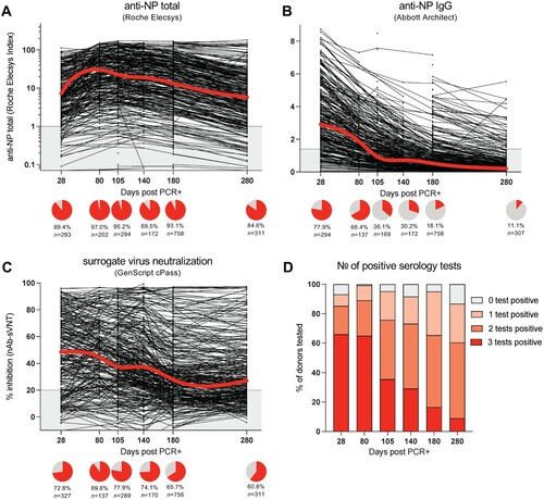
Table 2. Serology results.
Figure 2. Different SARS-CoV-2 neutralizing antibody profiles over nine months post infection. (a) Neutralizing antibody levels measured by percentage inhibition compared to negative control sample using cPass. Antibody levels were classified into five groups based on their kinetics and linear regression model for each group was applied. (b) The percentage of study participants in each group is as shown. (c) Group mean of the neutralizing antibody percentage is connected at days 28, 80, 105, 140, 180 and 280. Each point represents a single study participant. (d) Superimposed violin and box plots showing median, interquartile range, lowest and highest range of neutralizing antibody positive days in Borderline, Seroreverter and Persistent groups. p-value was calculated by Wilcoxon signed-rank test using the Persistent group as the reference group.
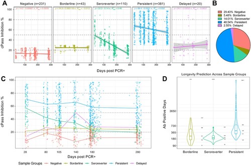
Figure 3. Kinetics of SARS-CoV-2-specific T cells over nine months post infection. (a) The frequencies of IFN-γ-spot forming cells (SFC) reactive to the peptide pools of Spike (S), Membrane (M) and Nucleoprotein (NP1 and NP2) are shown for donors tested at 105 (n = 67), 180 (n = 48) and 280 (n = 30) days post infection. Circles below represent the frequency of a positive (IFN-γ-SFC ≥10/106 PBMC) response (red) to the individual peptide pools. (b) Bar graphs show the percentage of donors reacting to the number of peptide pools tested. (c) Summary of the percentage of donors who tested positive for none, 1, 2, 3 or all 4 peptide pools tested at each timepoint post infection. Individuals who tested positive for at least 2 pools are were considered positive and the percentage of positive donors is indicated on the top of the graph. Cross-reactive T cell responses in unexposed donors (n = 51) are shown for comparison [Citation18]. (d) The frequency of IFN-γ-SFC reactive to the peptide pools S, M and NP2 are shown. All tested samples are shown as dots, the lines connect the samples of donors who were tested longitudinally. The red line indicates the median T cell frequency at the different timepoints post infection. (e) The frequencies of donors with low (10–50 SFC/106 PBMC), medium (50–100 SFC/106 PBMC), high (100–200 SFC/106 PBMC), and very high (>200 SFC/106 PBMC) T cell responses are shown for the three timepoints post infection.
![Figure 3. Kinetics of SARS-CoV-2-specific T cells over nine months post infection. (a) The frequencies of IFN-γ-spot forming cells (SFC) reactive to the peptide pools of Spike (S), Membrane (M) and Nucleoprotein (NP1 and NP2) are shown for donors tested at 105 (n = 67), 180 (n = 48) and 280 (n = 30) days post infection. Circles below represent the frequency of a positive (IFN-γ-SFC ≥10/106 PBMC) response (red) to the individual peptide pools. (b) Bar graphs show the percentage of donors reacting to the number of peptide pools tested. (c) Summary of the percentage of donors who tested positive for none, 1, 2, 3 or all 4 peptide pools tested at each timepoint post infection. Individuals who tested positive for at least 2 pools are were considered positive and the percentage of positive donors is indicated on the top of the graph. Cross-reactive T cell responses in unexposed donors (n = 51) are shown for comparison [Citation18]. (d) The frequency of IFN-γ-SFC reactive to the peptide pools S, M and NP2 are shown. All tested samples are shown as dots, the lines connect the samples of donors who were tested longitudinally. The red line indicates the median T cell frequency at the different timepoints post infection. (e) The frequencies of donors with low (10–50 SFC/106 PBMC), medium (50–100 SFC/106 PBMC), high (100–200 SFC/106 PBMC), and very high (>200 SFC/106 PBMC) T cell responses are shown for the three timepoints post infection.](/cms/asset/c0795ddd-9c3c-4274-9aeb-e01a4ce61310/temi_a_1999777_f0003_oc.jpg)
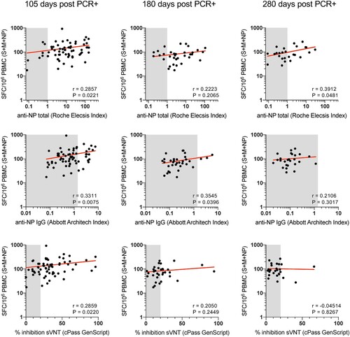
Figure 4. Correlation of SARS-CoV-2-specific T cells with levels of total anti-NP IgG, anti-NP IgG and sVNT-nAb. The frequency of SARS-CoV-2-specific T cells, as quantified by IFN-γ ELISpot, reactive to all (Spike, M, NP) proteins tested were correlated with levels of total anti-NP (upper panels), levels of anti-NP-IgG (middle panels) and levels of sVNT-nAb (lower panels) at 105, 180 and 280 days post infection. Spearman correlations.