Figures & data
Figure 1. Clinical manifestation and 1-year outcome of COVID-19 patients. (A) The clinical symptoms upon admission and sequela of patients with COVID-19 at 1-year after infection (n = 48). (B) The sequela constitute of COVID-19 for the 13-months convalescents (n = 50). According to their peak disease severity, four groups were classified: asymptomatic (group 1), mild (group 2), moderate (group 3), and severe (group 4).
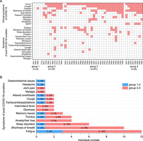
Figure 2. Dynamic changes of SARS-CoV-2 circulating antibodies and the memory B cells responses at 1-year after infection. Four times sampling (<0.25, 0.75, 6, and 13 m) were conducive for patients. (A-B) Continuous monitoring of the RBD-IgM and RBD-IgG levels (ELISA) in the four indicated time points based on consecutive sampling to 30 subjects. Friedman test with subsequent Dunn’s multiple comparisons was performed. The dotted line represents the cut-off value. (C-F) The RBD-IgM levels were compared between group 1–2 (milder) and group 3–4 (severer) patients, shown as data from discontinuous monitoring to all patients. Mann-Whitney test was performed. Median values and the number of subjects are shown above the X-axis. Blue-filled circles, blue-hollow circles, red-hollow circles, and red-filled circles represent the patients of groups 1, 2, 3, and 4, respectively. The dotted line represents the cut-off value. (G-J) The RBD-IgG levels were compared, similar analysis and labelling as RBD-IgM. (K) The heatmap of the neutralization antibody levels, shown as the highest dilutions that has neutralization activity. (L) The gating strategy of RBD+ class-switched memory B cells. (M-N) The comparisons of RBD+ class-switched memory B cells between convalescents and healthy donors (M), and between the mild and severe groups (N). Mann-Whitney test was performed. Grey circles represent the healthy donors; coloured circles have the same meaning as above.
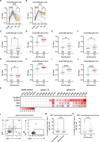
Figure 3. Sustained SARS-CoV-2-specific memory CD4+ T cell responses in convalescents of COVID-19. (A) In vitro expanded PBMCs from convalescents or healthy donors were stimulated with or without SARS-CoV-2 S1, S2, NP, M, E/ORFs peptide pools or all peptide pools for 16 h. IFN-γ producing T cells were detected by ICS assay. Flow cytometric plots representing IFN-γ-expression CD4+ T cells (x-axis) upon stimulation in the indicated convalescent or healthy donor. (B) Pie chart shows the frequency of convalescents (n = 39) or healthy donors (n = 20) who responded to 0–6 peptide pools. (C) Comparison of the relative proportion of SARS-CoV-2 peptide-pool-reactive CD4+ T cells between convalescents (red dots) and healthy donors (grey dots). Mann-Whitney test was performed, and bars represent median with 95% confidence interval (CI). The dotted line represents the cutoff value for absolute positive, defined as mean + 2SD of the detected frequency in no-peptide groups. (D) Percentage of convalescents or healthy donors who responded to S1, S2, NP, M, E/ORFs, or to all peptide pools.
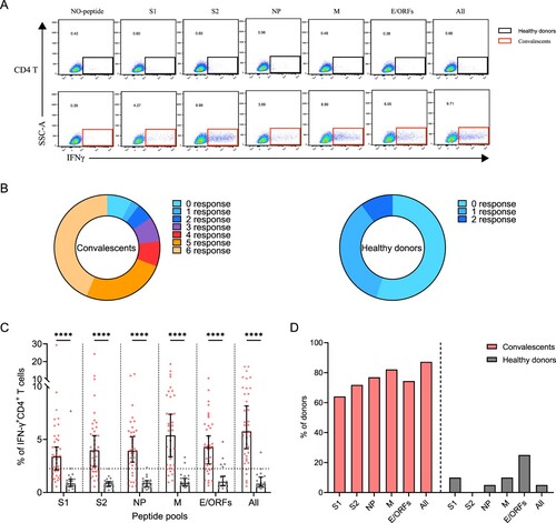
Figure 4. Sustained SARS-CoV-2-specific memory CD8+ T cell responses in convalescents of COVID-19. (A) In vitro expanded PBMCs were stimulated with or without SARS-CoV-2 S1, S2, NP, M, E/ORFs peptide pools or all peptide pools for 16 h, and the IFN-γ producing T cells were shown. (B) Pie chart shows the frequency of convalescents (n = 39) or healthy donors (n = 20) who responded to 0–6 peptide pools. (C) Comparison of the relative proportion of SARS-CoV-2 peptide-pool-reactive CD8+ T cells between convalescents (red dots) and healthy donors (grey dots). Statistic method and symbols are the same as in . (D) Percentage of convalescents or healthy donors who responded to S1, S2, NP, M, E/ORFs, or all peptide pools. (E-F) The comparisons of IFN-γ+/CD4+ T cell (E) and IFN-γ+/CD8+ T cell (F) between different severity groups (n = 37, two child-convalescents were excluded). Unpaired t test was performed in these comparisons. Mean values (solid line) or cut-off (dashed line) were shown for each group. Blue-filled circles, blue-hollow circles, red-hollow circles, and red-filled circles represent the patients from groups 1, 2, 3 or 4, respectively.
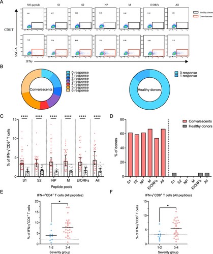
Figure 5. The presence of SARS-CoV-2-specific polyfunctional memory and the effector memory CD4+ and CD8+ T cells. (A-B) Gating of antigen-specific CD4+ and CD8+ T cell that are secreting both IFN-γ and TNF-α (polyfunctional T cell) after stimulation with SARS-CoV-2-specific peptide pools. (C-D) Percentage of antigen-specific polyfunctional CD4+ and CD8+ T cells in the T cell population. The statistic method and symbols are the same as in (C) and (C). (E) Phonotype characterization of SARS-CoV-2-specific memory CD4+ and CD8+ T cells. Cell markers used: T naïve (CD45RA+, CCR7+); central memory T cells, Tcm (CD45RA-, CCR7+); effector memory T cells, Tem (CD45RA-, CCR7-); and effector memory RA+ T cells, Temra (CD45RA+, CCR7-). (F-H) Phenotypes of antigen-specific CD4+ (F) and CD8+ T (H) cells responding to the indicated peptide pools of SARS-CoV-2 in convalescents of COVID-19. Bars are shown as median with 95%CI. (G-I) Frequency of the effector memory CD4+ (G) and CD8+ T (I) cells (CD45RA-, CCR7-) responded to SARS-CoV-2 S1, S2, NP, M, E/ORFs or all peptide pools. Bars are shown as median with 95% CI.
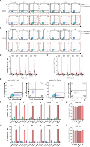
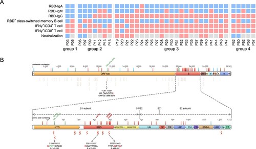
Figure 6. Analyzing the immune protection against Omicron variant. (A) SARS-CoV-2-specific immune memory components (n = 37). Pink and blue represent positive or negative responses, respectively. Grey represents no testing. (B) The conserved CD8+ T cell epitopes in Omicron variant. Bars with blue, red, and green on the genome represent synonymous, missense, and deletion variants respectively. Wave lines below the genome represent CD8+ T cell epitopes. The details of the four epitopes that contain mutations are shown.