
Figures & data

Figure 1. Prevalence of SARS-CoV-2 variants in South Korea (a) SARS-CoV-2 lineage proportion in South Korea during the study period. (b) Delta VOC prevalence over the study period. Grey shaded bars indicate variant incidences per 100,000 people. The red boxes denote periods of increased social distancing (17 July–31 October 2021 and 21 December 2021–18 February 2022, respectively). The yellow box represents the period of eased social distancing (1 November 2021–20 December 2021). The black arrow indicated the start of second round of two-dose vaccination (14 October 2021).
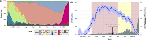
Figure 2. Distribution of samples and sequences for each region and immune status. (a) Distribution of cumulative incidence of SARS-CoV-2 among regions and the number of sequences for each region from 14 May 2021 to 22 January 2022. (b) Correlation between the proportion of the number of AY.69 sequences in the 642 dataset and the proportion of incidence of various regions of South Korea. The sizes of circles represent the number of sequences. (c) The number of sequences for each region per month in our 642 AY.69 dataset (d) Proportions of immune groups in our 642 AY.69 dataset (bar graph) with cumulative vaccination rates in South Korea (line graph). The cumulative rate for the partially vaccinated group also accounts for those who have proceeded to become fully vaccinated. (e) The number of sequences for each immune status per month in our 642 AY.69 dataset. FV, fully vaccinated; NV, non-vaccinated; PV, partially vaccinated. BS, Busan; CB, Chungbuk; CN, Chungnam; DG, Daegu; DJ, Daejeon; GB, Gyeongbuk; GN, Gyeongnam; GG, Gyeonggi; GW, Gangwon; IC, Incheon; JJ, Jeju; JN, Jeonnam; SJ, Sejong; SU, Seoul; US, Ulsan. R2, the correlation coefficient; and p-values indicating the level of statistical significance, where *** P < 0.01, ** P < 0.05, and * P < 0.1.
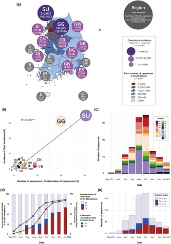
Figure 3. Effective population size of AY.69 from May 2021 to January 2022 and phylogeography analysis in South Korea. (a) Bayesian skyline plot of effective population size of AY.69. X-axis, time in months; y-axis, logarithmic effective population size. Red line, median; blue shaded area, 95% highest posterior density. (b) Phylogenetic tree of AY.69 depicting maximum clade credibility summary of Bayesian inference. (c) Chord diagram of between-region transmission events. Chords distant from the edge represent influxes. Chord width indicates the number of flows. (d) Several captured animations of viral-spread routes and magnitudes in SpreaD3 of Supplementary Video 1. Colours indicate regions. BS, Busan; CB, Chungbuk; CN, Chungnam; DG, Daegu; DJ, Daejeon; GB, Gyeongbuk; GN, Gyeongnam; GG, Gyeonggi; GW, Gangwon; IC, Incheon; JJ, Jeju; JN, Jeonnam; SJ, Sejong; SU, Seoul; US, Ulsan. Ne, effective population size.
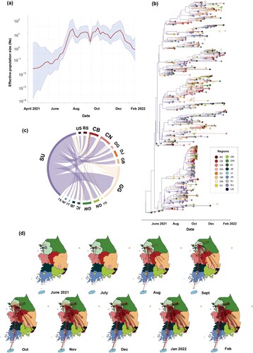
Figure 4. Phylodynamic analysis of AY.69 lineage of SARS-CoV-2 between immune groups in South Korea. (a) Chord diagram of introduction events between immune groups. Chords distant from the edge represent influxes. Chord width indicates the number of flows. (b) Monthly numbers of transmissions among immune groups. (c) Maximum clade credibility summary tree of Bayesian inference.
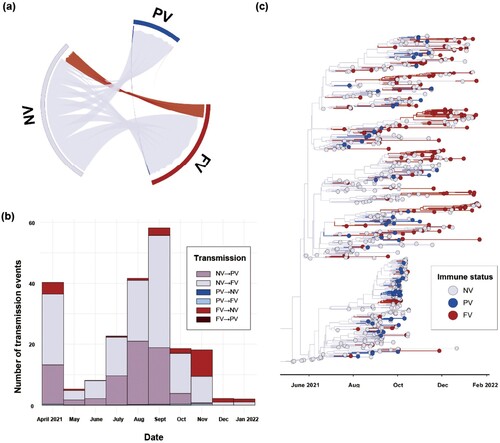
Figure 5. The result of Generalized Linear Model (GLM) for without or with the number of sequences as a predictor. (a) GLM analysis of inter-region viral transmission and its predictors. (b) GLM analysis of inter-region viral transmission and its predictors including the number of sequences. Support for each factor is represented by an inclusion probability (right) and its contribution by the mean GLM coefficient on a log scale conditional on the predictor included in the model (left).
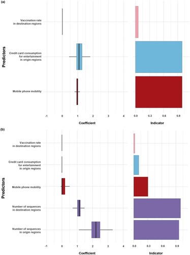
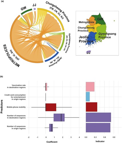
Figure 6. Phylogeographic transmission analysis and GLM analysis for six provinces. (a) Chord diagram of between-province transmission events. Chords distant from the edge represent influxes. Chord width indicates the number of flows. Colours indicate regions. (b) GLM analysis of inter-provincial viral transmission. Support for each factor is represented by inclusion probability (right) and its contribution using the GLM coefficient on the log scale conditional on the predictor being included in the model (left). GW, Gangwon; JJ, Jeju.
Supplemental Material
Download JPEG Image (1.3 MB)
Supplemental Material
Download MS Word (2.4 MB)Data availability statement
All the sequences used in the study were deposited to the GISAID (https://gisaid.org/), and the accession numbers (EPI numbers) were annotated in the Supplementary Table S1.