Figures & data
Figure 1: Analysis process and dataset characteristics of a systematic review and meta-analysis of Salmonella outbreaks in China, 1949-2022. a. Preferred Reporting Items for Systematic Reviews and Meta-Analyses (PRISMA) flow diagram of search strategy and selection of articles. b. The 1134 outbreaks included in the systematic review were clustered according to three main features: food poisoning (FP), enteric fever (EF), and healthcare-associated infection (HAI). c. The number of Chinese and English publications included in the systematic review by year period.
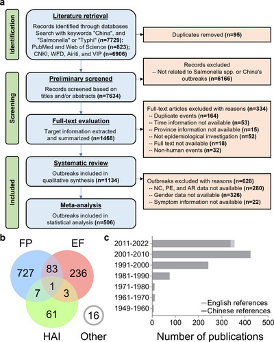
Figure 2: Temporal variation and correlation analysis of salmonellosis outbreaks. a. Hysteresis bias in the overall or three event clusters of SO reported in China between 1949 and 2022. b. Yearly variation in the number of outbreaks (the curves are sixth-order polynomial fit regressions, and the vertical line to the left is the confidence region after correction for hysteresis bias). c. Monthly variation in the number of outbreaks. d. Duration of outbreaks. e. Alterations in the monthly distribution of outbreaks of various durations. f. Correlation analysis of the potential factors (climatic in green) affecting the monthly outbreaks. g. Two-dimensional visualization of outbreak size in months through the number of new cases (NC) and mean duration. h. Correlation analysis of the potential factors (economic in yellow, demographic in orange, and climatic in green) affecting the yearly outbreaks. The abbreviations in f and h are listed in Table S6.
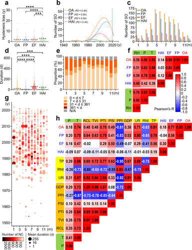
Figure 3: Spatial distribution of salmonellosis outbreaks. a. Three-dimensional visualization of outbreak size based on individual events. b. Geographic distribution of SO in China based on individual events between 1949 and 2022 (the color changes of the map and the dots correspond to the climate and the number of new cases, respectively). c. The number of outbreaks in each province, ranked from highest to lowest within the same economic region. d. The number of outbreaks in different settings. e. Trends in the geographic distribution of outbreaks in three periods of similar length.
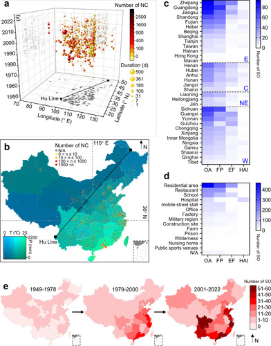
Figure 4: Diversity of serovars identified in salmonellosis outbreaks. a. The composition of serogroups (inner ring) and serovars (outer ring) that cause SO, as well as different serogroups or serovars within the same serogroup, are ranked clockwise from highest to lowest. b. Ranking the historical trends of the main Salmonella serovars responsible for outbreaks.
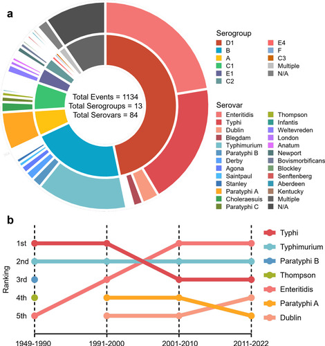
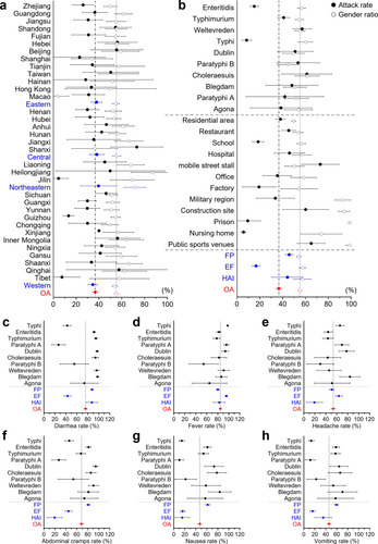
Figure 5: Forest plot for the subgroup meta-analysis: attack rate, gender ratio, and incidence rate of designated symptoms. The overall proportions are shown in red. a and b are attack rate (solid circles) and gender ratio (hollow circles) with a 95% confidence interval. a. Subgroup analysis based on provinces and economic regions (in blue). b. Subgroup analyses based on settings, event clustering types (in blue), and the top ten serovars for the number of events in the 506 outbreaks included in the meta-analysis. Subgroup analysis of the top ten serovars and event clustering types (in blue) on incidence rates of designated symptoms regarding c. diarrhea, d. fever, e. headache, f. abdominal cramps, g. nausea, h. vomiting with a 95% confidence interval.