Figures & data
Figure 1. Adriatic Sea, its position in the Mediterranean Sea (inset), the surrounding orography, the bathymetry of the basin and the position of the Venice City (top left).
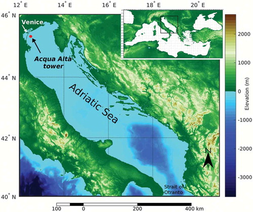
Figure 2. ASCAT-A scatterometer ascending and descending swaths over the Mediterranean Area. Typical spatial coverage pattern for a whole day (2016–02-23).
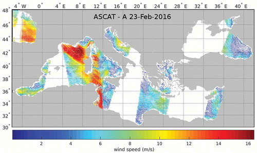
Figure 3. Ground track coverage in the Adriatic Sea. Red lines: expected crossing by Jason-1 and Jason-2. Yellow lines: expected crossing by Envisat.
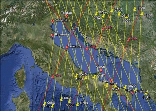
Figure 4. Scatterometer-ECMWF wind speed normalized bias (left) and wind direction bias (right) for one year of data (Octorber 2015 to September 2016). The scatterometers considered are ASCAT-A and ASCAT-B.
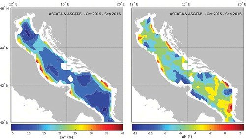
Figure 5. The mean duration of the sirocco wind during the storm surge events under consideration. The duration in the central Adriatic Sea (blue solid line) is shorter than in the southern Adriatic (red solid line). A 7 m/s wind speed is considered for the determination of the observation window width.
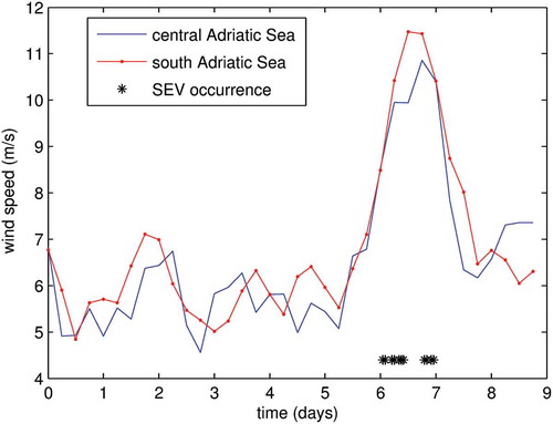
Figure 6. Scatterplot of the ECMWF atmospheric model wind speed and scatterometer wind speed. Reference (original) model data are in red. Bias-mitigated model data in blue. Dashed lines correspond to the best fits. Green solid line represents the perfect agreement. Data have been aggregated in 0.5 m/s bins before calculating the fit lines.
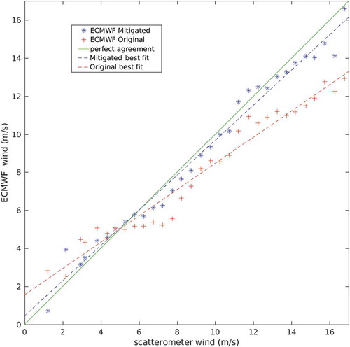
Figure 7. The Jason-1 altimeter track #0196 profile over the Adriatic Sea, on 9 November, 2004, 03:34 GMT. Left panel: the original TWLE* data (red), and the fit needed to reduce variability (blue). Right panel: The TWLE* fit (red), the SHYFEM surge background state profile along the J-1 track before assimilation (black), and the SHYFEM surge analysis state profile along the J-1 track after assimilation (blue). The inset in the left panel shows the position of the J-1 track #0196 in the Adriatic Sea.
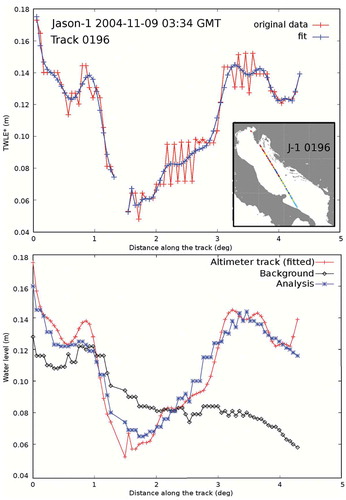
Figure 8. Left: schematic flow chart of REF (control runs) simulations. Right: schematic flow chart of the SCATT hindcast experiment simulations. Scatterometer data are ingested during the SCATT experiment.
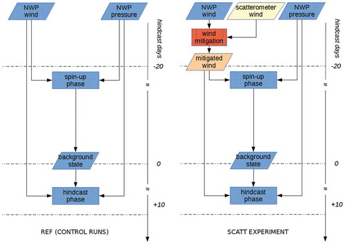
Figure 9. Left: schematic flow chart of ALT hindcast experiment simulations. Right: schematic flow chart of the SCATTALT hindcast experiment simulations. Altimeter data are ingested during the ALT experiment, while both altimeter and scatterometer data are ingested during the SCATTALT experiment.
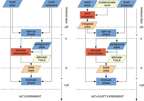
Table 1. Dates, times, levels and altimeter data availability of the SEVs used for the hindcast runs. Levels in cm.
Table 2. Summary results of the hindcast experiments.
Figure 10. Pearson’s linear correlation coefficient of the observed and modelled surge time series for all the SEV, ordered by increasing values of the REF control runs. The results of the REF experiments are in blue. The others experiments are SCATT (orange), ALT (yellow) and SCATTALT (purple).
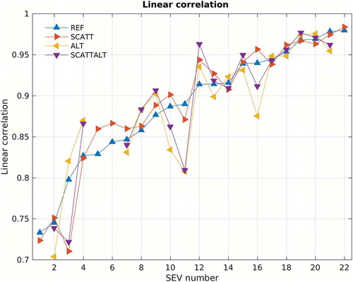
Figure 11. Skew errors of the modelled and observed surge peaks for all the SEV, relative to the observed surge (εs/obs). The results of the REF experiments are in blue. The others experiments are SCATT (orange), ALT (yellow) and SCATTALT (purple). Data are ordered with increasing value of the relative skew error of the REF runs. The black solid line marks the zero of skew error: data below the line correspond to underestimation of the observed surge peak.
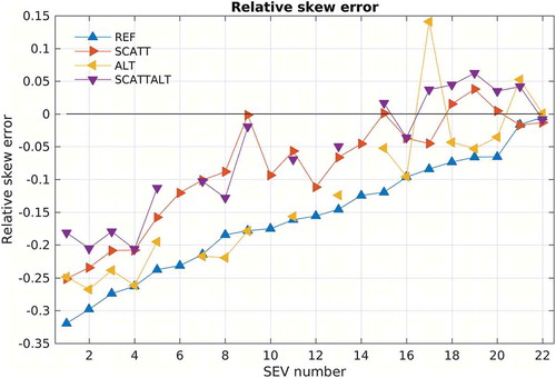
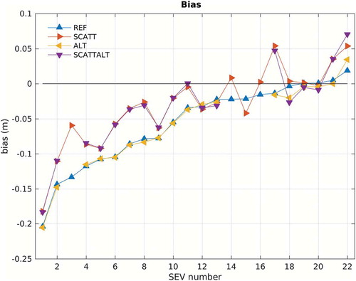
Figure 12. Bias of the modelled and observed surge time series for all the SEV, ordered by increasing values of the REF control runs: REF (blue), SCATT (orange), ALT (yellow) and SCATTALT (purple). The black solid line marks the zero bias: data below the line correspond to underestimation of the observed surge.