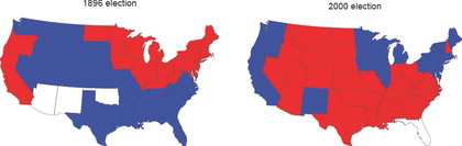
Figure 1. States won by the Democratic presidential candidates (William Jennings Bryan in 1896 and Al Gore in 2000) in blue and by the Republican candidates (William McKinley in 1896 and George W. Bush in 2000) in red. The maps are nearly exact opposites of each other.
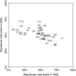
Figure 2. Republican share of the two-party vote by state in the presidential elections of 1896 and 2000. The rankings of states are nearly reversed, and the negative correlation remains after excluding the south.
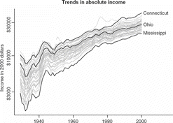
Figure 3. Average income by state (adjusted for inflation) over most of the past century. Each line on the graph shows a different state. Incomes have increased dramatically in all states, but the relative positions of the states have changed little. Connecticut, Ohio, and Mississippi are highlighted to show the trajectories of rich, middle-income, and poor states. From Gelman et al. (Citation2009).
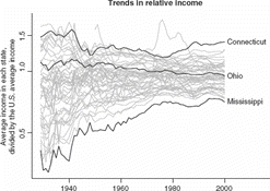
Figure 4. Trends in relative state incomes. The gap between rich and poor states narrowed until about 1980 but has remained steady or widened since then. (The state whose per capita income jumped so high in the 1970s is Alaska.) From Gelman et al. (Citation2009).
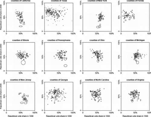
Figure 5. Republican vote share by county in 1896 and 2000, within each of the twelve largest states (shown here in descending order of population in 2000). Within each state, each county is represented by an ellipse whose width and height are proportional to the square root of its voter turnout (relative to that in the entire state) in 1896 and 2006, respectively. For example, the wide oval at the bottom of the California graph represents San Francisco, which was the most populous county in the state in 1896. The large tall oval a bit above San Francisco is Los Angeles, currently California's largest county. Both counties split roughly 50/50 in 1896 but have supported the Democrats more strongly in recent years, San Francisco more than Los Angeles.
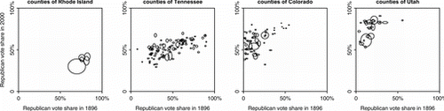
Figure 6. Republican vote share by county in 1896 and 2000, within the states where the between-county correlation of partisan vote shares were highest (ranging from 0.73 in Rhode Island to 0.51 in Utah). The ellipses represent the number of voters in each county as a proportion of the state's voters, as detailed in the caption of Figure 5.
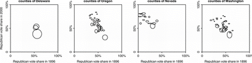
Figure 7. Republican vote share by county in 1896 and 2000, within four of the five states where the between-county correlation of partisan vote shares were highest in the negative direction (ranging from 0.81 in Delaware to 0.52 in Washington); California, the state with the fourth most negative correlation, is already shown in Figure 5. The ellipses represent the number of voters in each county as a proportion of the state's voters, as detailed in the caption of Figure 5.
Gelman, A., Park, D., Shor, B., and Cortina, J. (2009), Red State, Blue State, Rich State, Poor State: Why Americans Vote the Way They Do (2nd ed.), Princeton, NJ: Princeton University Press.