Figures & data
Fig. 1 A running redistricting example. We consider dividing a state with six geographical units into two districts. The original map is shown in the left panel where the shaded area is uninhabited. The middle panel shows its graph representation, whereas the right panel shows an example of redistricting map represented by an induced subgraph, which consists of a subset of edges.
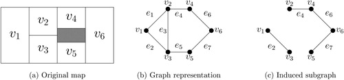
Fig. 2 Zero-suppressed binary decision diagram (ZDD) for the running example of . The blue path corresponds to the redistricting map represented by the induced subgraph in .
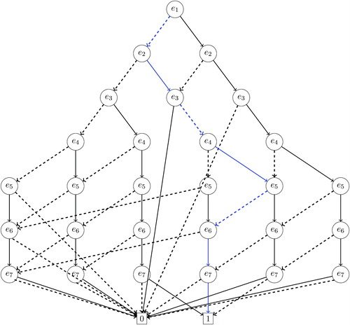
Fig. 3 Calculation of the frontier, the connected component number, and the determined connected components. This illustrative example is based on the redistricting problem shown in . A positive integer placed next to each vertex represents the connected component number, whereas the vertices grouped by the solid blue line represent a frontier. A connected component is determined when processing edge e5.
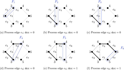
Fig. 4 An example of node merging. as shown in , these two paths merge at e3 because the connected component numbers in F2 are identical and the number of determined connected components is zero.
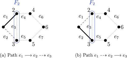
Fig. 5 An example of edge ordering by vertex cuts. To order edges, we choose two vertices with the maximum shortest distance and call them s and t. We then use the minimum vertex cut, indicated by the dashed oval, to create two or more connected components, which are arbitrarily ordered. The same procedure is then applied to each connected component until the resulting connected components are sufficiently small.
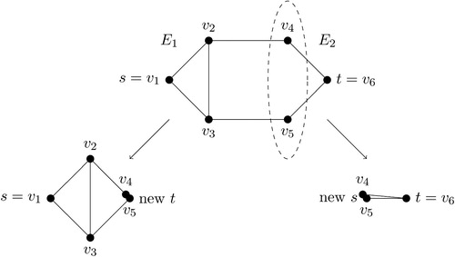
Fig. 6 The scalability of the enumpart algorithm on subsets of the New Hampshire precinct map. This figure shows the runtime scalability of the enumpart algorithm for building the ZDD on random contiguous subsets of the New Hampshire precinct map. Crosses indicate maps where the ZDD was successfully built within the RAM limit of 180GB. In contrast, open circles represent maps where the algorithm ran out of memory. For the left and middle columns, the results are jittered horizontally with a width of 20 for the clarity of presentation. (The actual evaluation points on the horizontal axis are 40, 80, 120, 160, and 200.) The left column shows how total runtime increases with the number of units in the underlying map, while the center column shows how the total RAM usage increases with the number of units in the underlying map. Lastly, the right-hand column shows that memory usage is primarily a function of the maximum frontier size of the ZDD. We show results for 2-district partitions (top row), five-district partitions (middle row), and 10-district partitions (bottom row).
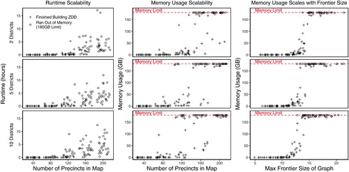
Fig. 7 A new 70-precinct validation map and the histogram of redistricting plans under various population parity and compactness constraints. The underlying data is a 70-precinct contiguous subset of the Florida precinct map, for which the enumpart algorithm enumerated every 44,082,156 partitions of the map into two contiguous districts. In the histograms, each bar represents the number of redistricting plans that fall within a 1 percentage point range of a certain population parity, that is, . The 25th (75th) percentile compactness constraint is defined as the set of plans that are more compact than the 25th (75th) percentile of maps within the full enumeration of all plans for the 70-precinct map, using the Relative Proximity Index to measure compactness. The annotations reflect the exact number of plans which meet the constraints. For example, when no compactness constraint is applied, there are 3,678,453 valid plans when applying a 5% population parity constraint, and 717,060 valid plans when applying a 1% population parity constraint. Under the strictest constraints, the 1% population parity constraint and 75th percentile compactness constraint, there are 271,240 valid plans.
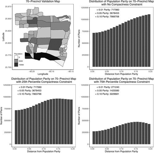
Fig. 8 A validation study enumerating all partitions of a 70-precinct map into two districts. The underlying data are the 70-precinct contiguous subset introduced in the left plot of . Unlike the random-seed-and-grow (RSG) method (red dashed lines), the Markov chain Monte Carlo (MCMC) method (solid black line) is able to approximate the target distribution. The 25th percentile (75th percentile) compactness constraint is defined as the set of plans that are more compact than the 25th (75th) percentile of maps within the full enumeration of all plans for the 70-precinct map, using the Relative Proximity Index to measure compactness.
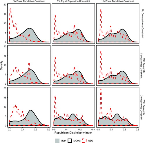
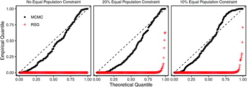
Fig. 9 Quantile-quantile plot of p-values based on the Kolmogorov–Smirnov (KS) tests of distributional equality between the enumerated and simulated plans across 200 validation maps and under different population parity constraints. Each dot represents the p-value from a KS test comparing the empirical distribution of the Republican dissimilarity index from the simulated and enumerated redistricting plans. Under independent and uniform sampling, we expect the dots to fall on the 45 degree line. The MCMC algorithm (black dots), although imperfect, significantly outperforms the RSG algorithm (red crosses). See in the appendix for discussion of thinning values.
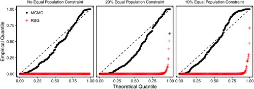
Fig. 10 Iowa’s 2016 congressional districts and the histogram of a random sample of redistricting plans under various population parity constraints. The underlying data is the Iowa county map, for which the enumpart algorithm generated an independent and uniform random sample of 500 million partitions of the map into four contiguous districts. In the histogram, each bar represents the number of redistricting plans that fall within the 1 percentage point range of a certain population parity, that is, . There are 36,131 valid plans when applying a 5% population parity constraint, and only 300 valid plans when applying a 1% population parity constraint.
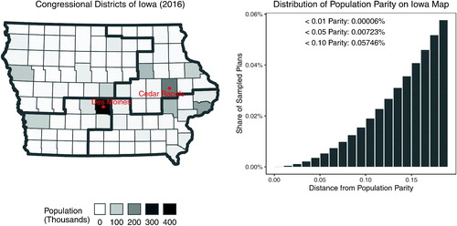
Fig. 11 A validation study, uniformly sampling from the population of all partitions of the Iowa map into four districts. The underlying data are Iowa’s county map in the left plot of , which is partitioned into four congressional districts. As in the previous validation exercises, the Markov chain Monte Carlo (MCMC) method (solid black line) is able to approximate the independently and uniformly sampled target distribution, while the random-seed-and-grow (RSG) method (red dashed line) performs poorly.
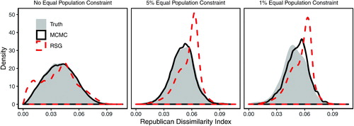
Fig. 12 A new 250-precinct validation map and the histogram of redistricting plans under various population parity constraints. The underlying data are a 250-precinct contiguous subset of the Florida precinct map, for which the enumpart algorithm generated an independent and uniform random sample of 100 million partitions of the map into two contiguous districts. In the histogram, each bar represents the number of redistricting plans that fall within the 1 percentage point range of a certain population parity, that is, . There are 10,082,542 valid plans when applying a 5% population parity constraint, and 1,953,736 valid plans when applying a 1% population parity constraint.
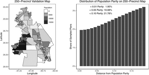
Fig. 13 A validation study enumerating all partitions of a 250-precinct map into two districts. The underlying data are the 250-precinct contiguous subset introduced in the left plot of . As in the previous validation exercises, the Markov chain Monte Carlo (MCMC) method (solid black line) is able to approximate the target distribution based on the independent and uniform sampling, while the random-seed-and-grow (RSG) method (red dashed line) performs poorly.
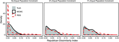
Fig. A.1 Quantile-quantile plot of p-values based on the Kolmogorov–Smirnov (KS) tests of distributional equality between the enumerated and simulated plans across 200 validation maps and under different population parity constraints. Each dot represents the p-value from a KS test comparing the empirical distribution of the Republican dissimilarity index from the simulated and enumerated redistricting plans. Under independent and uniform sampling, we expect the dots to fall on the 45 degree line. The MCMC algorithm (black dots), although imperfect, significantly outperforms the RSG algorithm (red crosses).