Figures & data
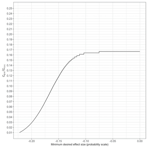
Fig. 1 Graphical example of and
. In the left panel, the gray-shaded area is where the parameter value < 0; the white-shaded area is where the parameter value
. In the right panel, the gray-shaded area is where the parameter value
; the black-shaded area is the region of the presumed practically null values; the white-shaded area is where the parameter value
. The solid vertical line is the mean within the gray-shaded area; the dashed vertical line is the mean within the white-shaded area.
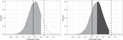
Table 1 Mean and 95% credible interval of the log odds ratio of peacekeeper deployment.
Fig. 2 Minimum desired reduction in the likelihood of local conflict continuation and the probability that peacekeeper deployment realizes such an effect. Baseline likelihood of local conflict continuation: 85%.
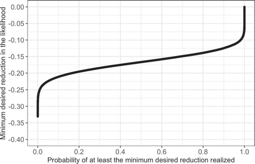
Fig. 3 Expected losses over different cost ratios. The green dots are the expected losses when peacekeepers are deployed; the red dots are the expected losses when they are not. The vertical blue dashed line indicates the cost ratio up to which the expected loss is smaller when peacekeepers are deployed than when they are not.
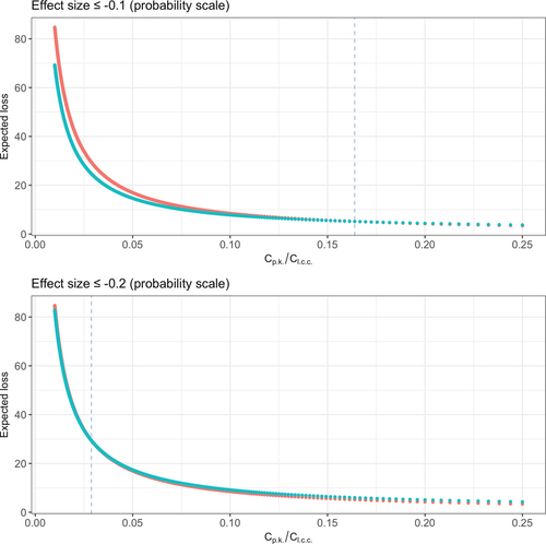
Fig. 4 Relationship between the cost ratio up to which the expected loss is smaller when peacekeepers are deployed than when they are not, and the plausible minimum desired effect sizes.